 Ask 10 people what a landing page is and you’ll get 10 different answers. Landing pages are one of the most misunderstood concepts in online marketing that I’ve ever seen. No wonder these three newbie mistakes keep popping up so regularly on the landing pages I critique.
What Is a Landing Page?
How do you define the phrase “landing page”? In the truest sense of the term, it is any page (on your site or someone else’s) where a visitor lands (thus the name) after purposely being sent there from some sort of trigger.
So, for example, a landing page could be your Home page where people land after clicking from an organic (free) search engine listing. That’s a very broad definition. More frequently, landing pages are used in targeted marketing campaigns where a trigger (a Facebook ad, an AdWords ad, an email, a banner ad, etc.) drives traffic to a page that is specifically designed and written to work with the trigger.
For instance, you might have a Promoted Post ad on Facebook that drives visitors to a particular landing page that was created to support that specific ad. Or, you may have sent a short email to your list that pushes traffic to a page designed to welcome people, provide additional information and close the sale. Regardless of the type of page or its use, you’ll want to avoid these mistakes at all costs.
Mistake #1 – Scattered Focus
Frequently, I come across landing pages that have little or nothing to do with the trigger. An email discussing a particular service (say long-term care insurance) offers a link to the company’s general Services page. Or, an ecommerce ad for one product might push visitors to the Home page. That’s too much work for your visitors.
Tighten up the focus between your triggers and landing pages.
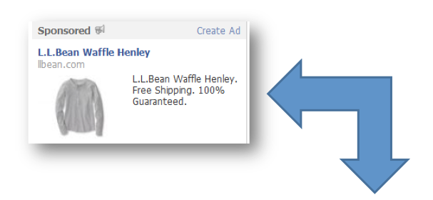
Here’s one example:
This Facebook ad leads visitors to a landing page that is specific to the ad content. The customer doesn’t have to click around or try to find the shirt that was listed in the ad. L.L. Bean dropped visitors slap in the middle of the exact page where they could buy the shirt.


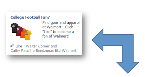
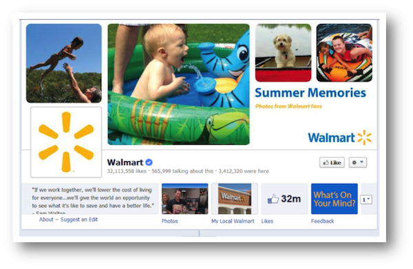
Here’s what happens when you don’t stay focused: you end up with an ad – like this one from Walmart – that touts college football gear and a landing page that has nothing to do with it.
Download your…
Time-Tested, Proven Marketing Strategies
That Actually Work
A handy checklist set that helps you drive traffic, make more money & spend less time doing it.

I understand that I will also receive weekly articles & videos plus periodic discounts, product notices & more. I can unsubscribe at any time.


Mistake #2 – Complicated Calls-to-Action
Just imagine how frustrating it is to click from an email/ad/social media post to something you think you really want and not be able to get it. This is the challenge your visitors will face if your calls-to-action aren’t clear and simple.
Use these suggestions to make sure it is ultra-easy for visitors to take the action you want them to take.
- Forms – Only ask for information you need immediately at that phase of the process. if you’re doing lead generation, then you may be tempted to ask for too many details up front. Resist the urge. Think of your own experiences: how much information are you willing to give right off the bat to someone you don’t know?
- Buttons – Create buttons in colors that contrast with your other design elements. Buttons that blend in with your scheme are much less noticeable and harder to find. Buttons also need to be large enough to be instantly visible.
- Contact Information – The same goes for your phone number or email address if you’re using these as calls-to-action. People will not scour your page to find this. There are too many other choices online. They will simply leave if you don’t make the process simple and seamless.
Mistake #3 – Trying to Do Too Much
In many cases, you can use an existing page of your site as a landing page. However, keep in mind that leaving certain elements in place can also cause serious decreases in conversions.
If you find your landing pages aren’t performing well, one frequent culprit is trying to do too much on the page.
Try this:
- Remove Site-Wide Navigation – Leaving the navigation links to the rest of your site can distract visitors. They could easily lose their way to the page they started on, get frustrated and leave. Eliminating the navigation bar helps customers focus on the task at hand.
- Only Make One Offer – The more choices customers have, the more confused they get. Rather than offering several options and multiple calls-to-action (buy a product, click to other pages on the site, sign up for a list, call for more information, etc.) only give one. The simplest pages often perform the best.
Understanding how people behave on different types of landing pages can go a long way to increasing your conversion rates. Correcting these common mistakes can help you get the results you’re hoping for.
Want real help with boosting the conversions of your landing pages, web copywriting and more? Karon’s Marketing Words Newsletter delivers useful how-to articles every week that can make you more money.


