
I first met Steve Chou (my guest for today’s blog post) about nine months ago (I think) when he invited me to do a webinar for his group on ecommerce copywriting. Because he’s such a smart guy when it comes to all things ecomm, I asked him to show you how he improves pages that aren’t performing well. The information below is extremely helpful in hammering out issues with pages that just don’t seem to do their jobs.
Help me welcome Steve to the Marketing Words blog and feel free to ask your questions below. Steve, take it away……………
One of the best ways to improve conversions for your online business is to track visitor behavior and to make adjustments to your site to simplify navigation. You also want to constantly test your conversion funnels to see what’s working — and what can be improved.
It’s tempting, when trying to understand visitor behavior, to stick with a free tool like Google Analytics.
Unfortunately, while Google Analytics can be helpful in terms of learning about audience demographics and getting an idea of how long visitors stick around and which pages they prefer, the tool isn’t very specific when it comes to what potential customers are actually doing on your page.
Google Analytics won’t let you know which buttons a visitor is clicking on, nor will it tell you which parts of your webpage are being read the most. You can’t even find out whether or not your website visitors are scrolling down the page to read your content.
This is where heat maps and scroll maps can help you improve your content and its placement in order to boost conversions. I was able to use these tools to improve my own online store conversions by 9.3%.
What are Your Visitors Doing?
Understanding how visitors interact with your website as a whole, and your individual pages (especially landing pages), is the first step to tweaking your content and yielding better conversions.
I currently use Mouse Flow to create heat maps and scroll maps of visitor use, but the examples below were created using CrazyEgg, another tool that I’ve used in the past.
Both Mouse Flow and CrazyEgg offer great visuals that show exactly what visitors are clicking on when they visit your website. They also provide you with an idea of how often potential customers scroll down through your content.
If you discover that visitors lose interest in your landing page before they get to the bottom of the page, it makes sense to include a call to action and a button higher up. That way, they can click on the button before they are disengaged.
Here’s an example of a scroll map for one of my long form sales pages. The red areas indicate sections of the page that are hot whereas cooler colors like blue and green indicate areas of the page that are not read as often.
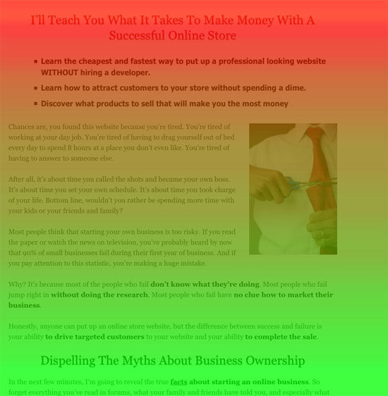
You can also use heat maps and scroll maps to split test different layouts and content choices. As you tweak your webpages, pay attention to how visitors respond. You can then compare different options and see which are more likely to see higher engagement and result in conversions.
Below is a heat map of how people click on the front page of the same sales page above. As indicated below, a lot of people are clicking on the big green button which is what I want them to do.
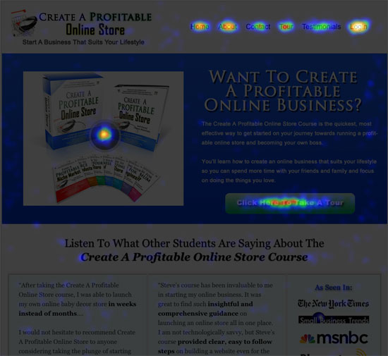
How I Used Heat Maps to Boost My Own Sales 9.3%
I’ve always used heat maps and similar tools to create an effective sales funnel for my blog and related online course. However, I hadn’t been using these tools on Bumblebee Linens, the ecommerce site I run with my wife.
We sell personalized handkerchiefs for special occasions, offering several different style choices and thread colors. In theory, this allows the customer to customize his or her handkerchiefs without a lot of help from customer service.
However, I noticed that we ended up with a lot of confused calls from potential customers who didn’t understand the process. Many were under the impression that they had to stick with whatever was “displayed in the photo” when several other personalized choices were available.
Here’s a picture of what our personalized handkerchief landing page looked like in the very beginning prior to any changes being made.
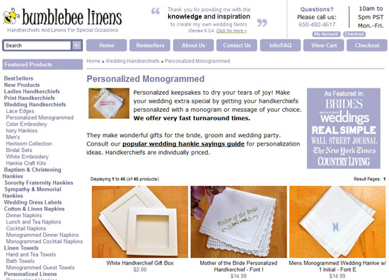
Because this page wasn’t working well, I began tweaking the pages so that they displayed all the style and thread color options (using small images) to cut down on confusion.
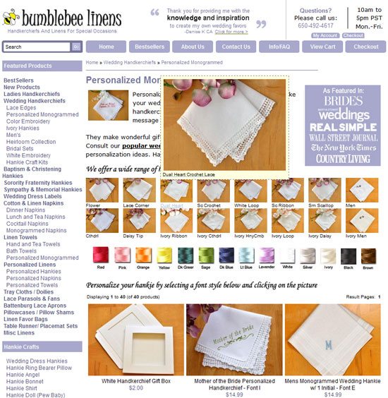
Unfortunately, even changing this approach didn’t reduce customer service requests — or boost sales. Customers were still getting confused so I decided to use a heat map tool to see what, exactly, website visitors were trying to accomplish.
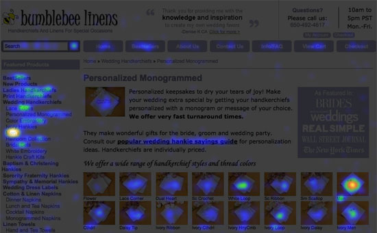
After analyzing the heat map, I realized that many customers were clicking on the small, tiny product pictures, expecting for something to happen. However, these small pictures weren’t links, and nothing happened when customers clicked them.
I also realized, after talking to a friend I had test the page, that there were no clear instructions on how to personalize a handkerchief.
A scroll map also indicated that not enough customers were scrolling further down the page to see the “real” products, rather than the samples. I didn’t want to keep pushing products down the page, but I also wanted to provide vital information to potential customers.
In the end, after considering the data shown by the heat maps and scroll maps, I decided to provide an informational popup explaining the handkerchief personalization process and remove the thread color graphic so that the products appear higher on the page.
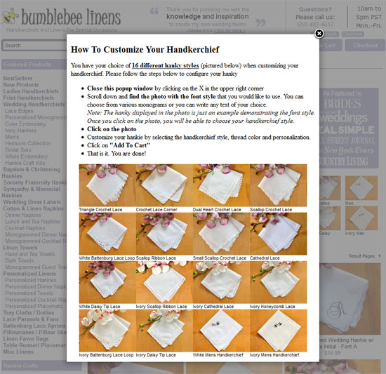
Once the change was implemented, we not only stopped receiving customer service calls about this issue, but we also saw our conversion rate rise by 9.3%, boosting our sales and more than making up for the cost of the tools we used.
Google analytics can be helpful, but it does not offer you the specific information you need to improve conversions on your ecommerce site. If you really want to know how visitors respond to your site, use heat maps and scroll maps to observe behavior and then change your pages in ways that encourage them to take the next step.
 Steve Chou is a successful ecommerce business owner and Amazon seller who managed to replace his and his wife’s 6-figure salaries within one year selling online. Want to follow in his footsteps? Pick up his FREE 6-day mini course and discover how to create a niche online store in 5 easy steps.


