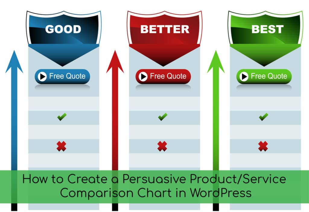
 Put your customer hat on while you read this blog post, OK?
When you are clicking around the ‘Net, looking for a product or service, do you find a comparison chart helpful when making a decision? I’m betting you do because most people would answer “yes” to that question.
Whether you’re:
- Shopping on an ecommerce site
- Reading a blog post about what to look for in a juicer
- Looking for a new battery charger on Amazon
- Checking out website hosting plans
- Buying a new cell phone plan
- Or lots more…
… comparison charts help us make confident decisions.
Why Does Creating a Comparison Chart Boost Conversions?
Here are a few reasons why learning how to create a comparison chart can improve your sales/conversions.
When you create a comparison table, it compacts information into snackable little bites wrapped in an attractive, attention-getting package. The concept is quite simple and logical.
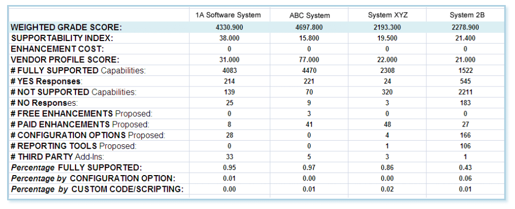
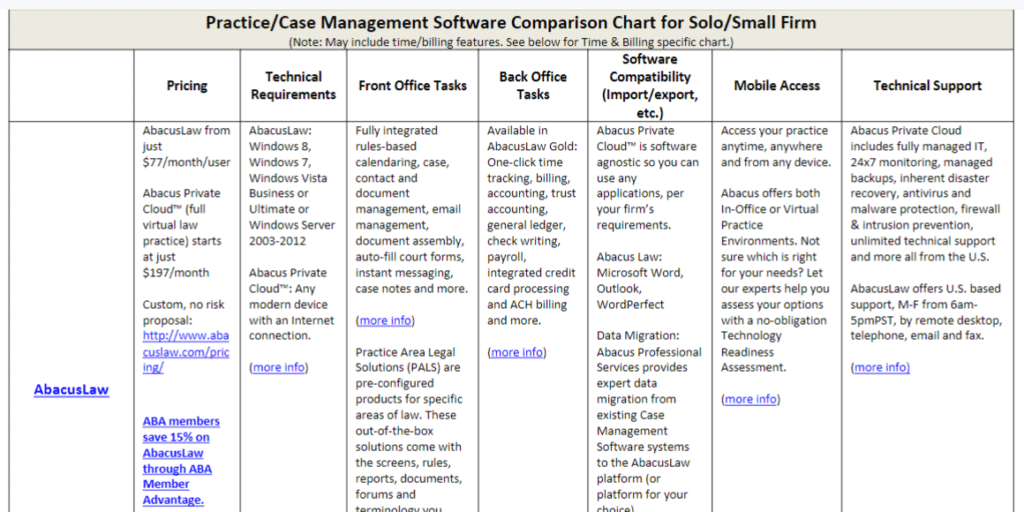
However, when it comes to the type and design of comparison charts, there are lots of choices. For instance, which is more visually appealing and easier to understand?
Rather plain feature table:
Ditto:
Comparison Chart From Depositphotos
Stock photo sites also have graphics. Many, including Depositphotos, offer pricing tables available in EPS file format. However, you would need graphics software (such as Photoshop) in order to separate the layers, move them, change the shape or colors, etc.
Online software such as Canva or Picmonkey cannot open or work with EPS files.
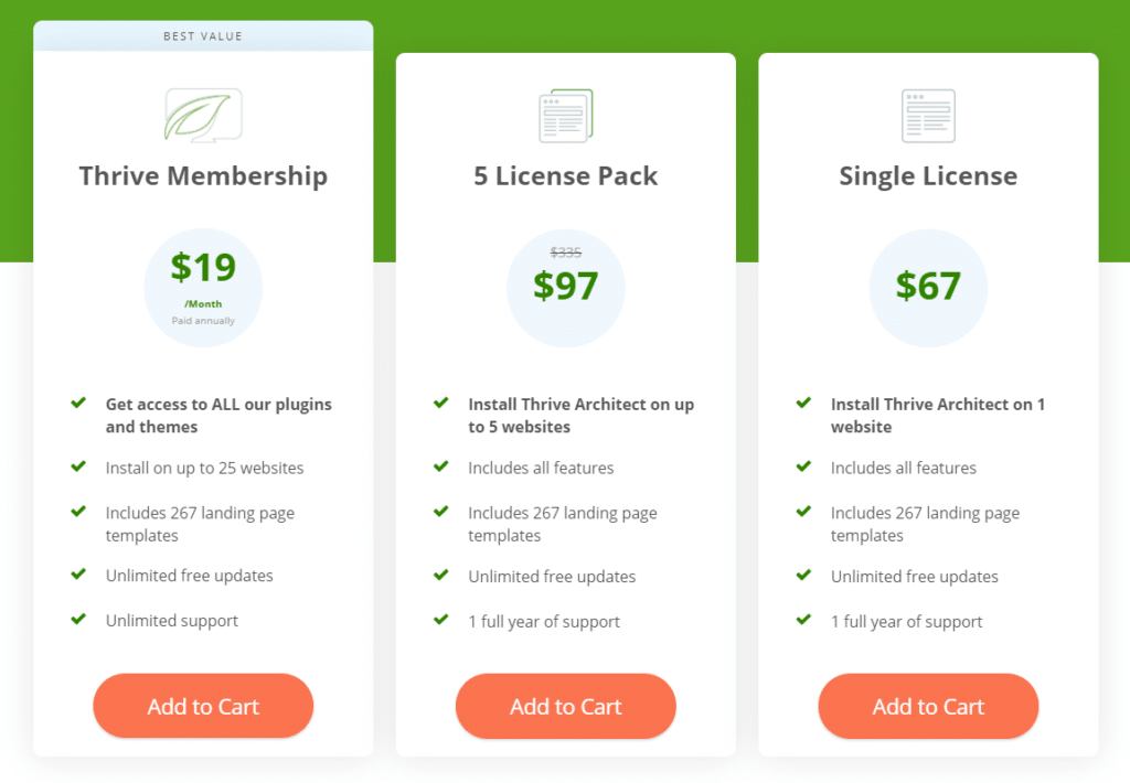
Feature & Pricing Comparison Table Included in Thrive Architect
This is not a comparison table plugin, but rather a WordPress web-page-builder plugin that includes the comparison chart feature. This is a chart from Thrive’s own website, where it shows that you can get access to ALL the Thrive plugins (including Architect, which has the comparison charts) for only $19 per month, or you can buy only Architect for a one-time fee of $67.
Thrive Architect is what I started using a while back to build WordPress pages and it is what I recommend to our clients. I was so impressed that I not only bought the entire suite of Thrive products for $19 per month, I also became an affiliate.
Check out their video to see the other cool features and functions it offers then give it a whirl!
Here are a few more examples. These are completely and totally customizable, so you can turn the templates into pretty much any design you want.
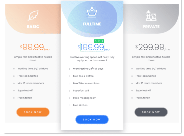
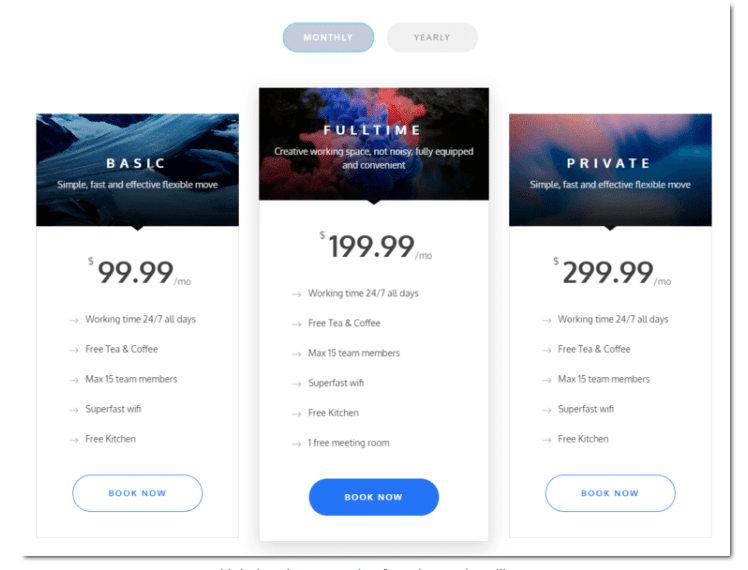
From essential oils to health insurance, you can create branded comparison tables in just a few steps. I’ll walk you through how to do it in Thrive Architect.
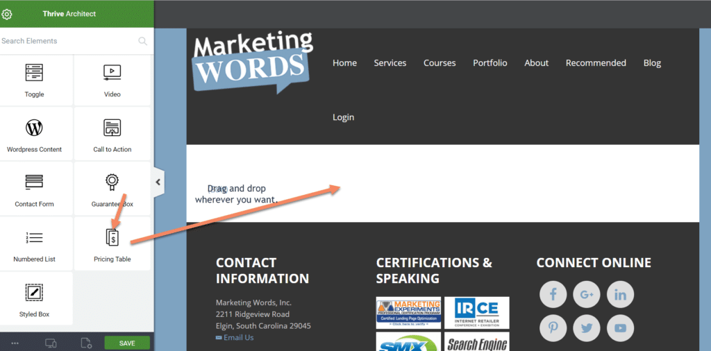
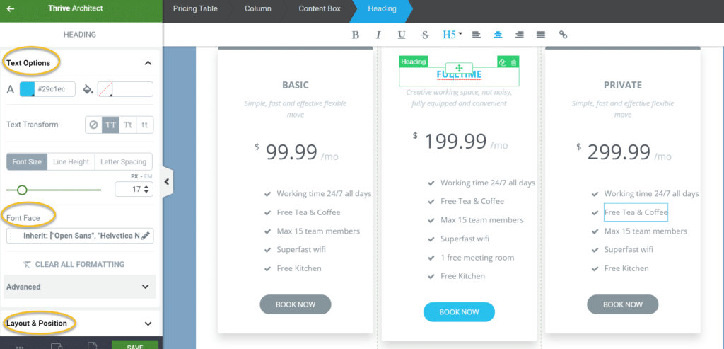
Once you install this WordPress plugin, open your page template and scroll down until you see Pricing Tables. Yes, this feature is called a pricing table, but I will show you how to use it to create pretty much any comparison chart.
The basic pricing table will appear.
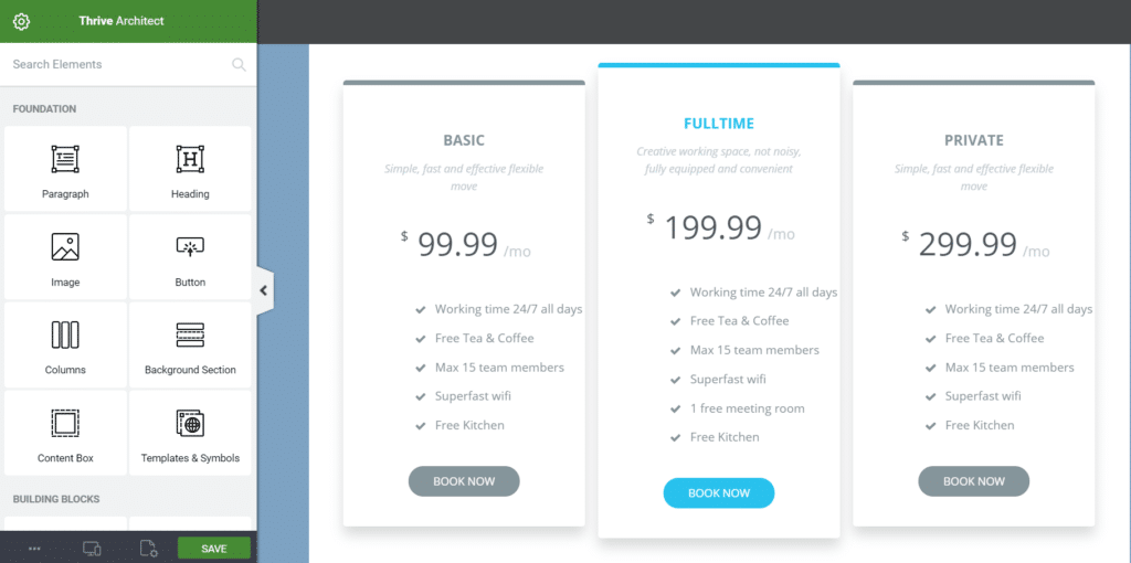
Click on any section to customize the font style, font size, font color, background color, text, to add images, increase or decrease the number of columns, and much more.
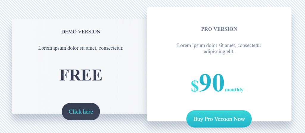
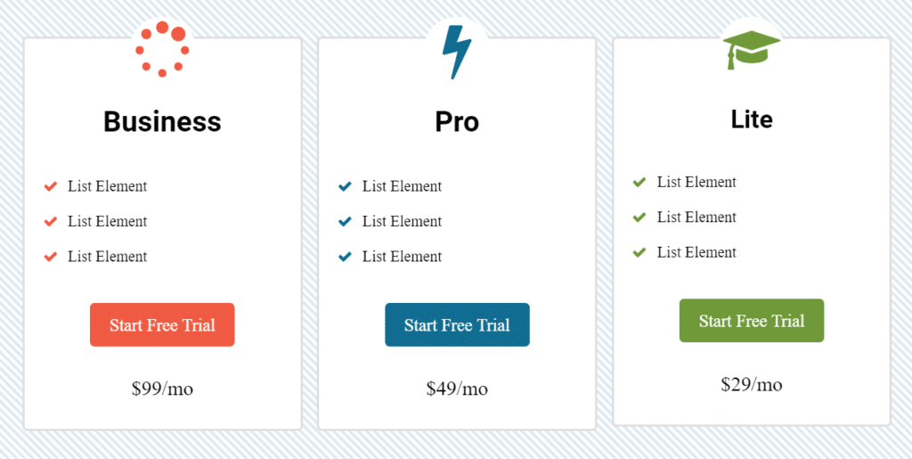
Here are a few quick comparison charts from the Element Template section. As you can see, it is easy to fill in the blanks and customize colors.
What Info Should Be Included When Creating a Product Comparison Table?
Typically (but not always), 3 is the magic number. That’s because our brains are geared to sort and group into threes. If you have 5 or 6 or 10 variations, you will want to add more columns to your comparison chart.
Three is also a simple number that gives choices to customers without overwhelming them. Think of good, better, and best. Or beginner, intermediate, and professional.
As seen in the Thrive Architect template above, you can also highlight one of the columns in some manner to make it stand out as the preferred choice.
How Do I Write the Copy for a Service or Product Comparison Chart?
One of the key features of a good comparison or pricing table is that the text is short and easy to consume. Your copy should stay along those lines. If too much text gets inserted into the chart, it will defeat the purpose of making it simple to read.
Most often that means keeping your descriptions to just a few words. However, for more complex comparisons, you might go with something like this example from Williams Sonoma (copyright is theirs).
https://www.williams-sonoma.com/pages/comparisoncharts/kitchenaid-comparison-chart.html
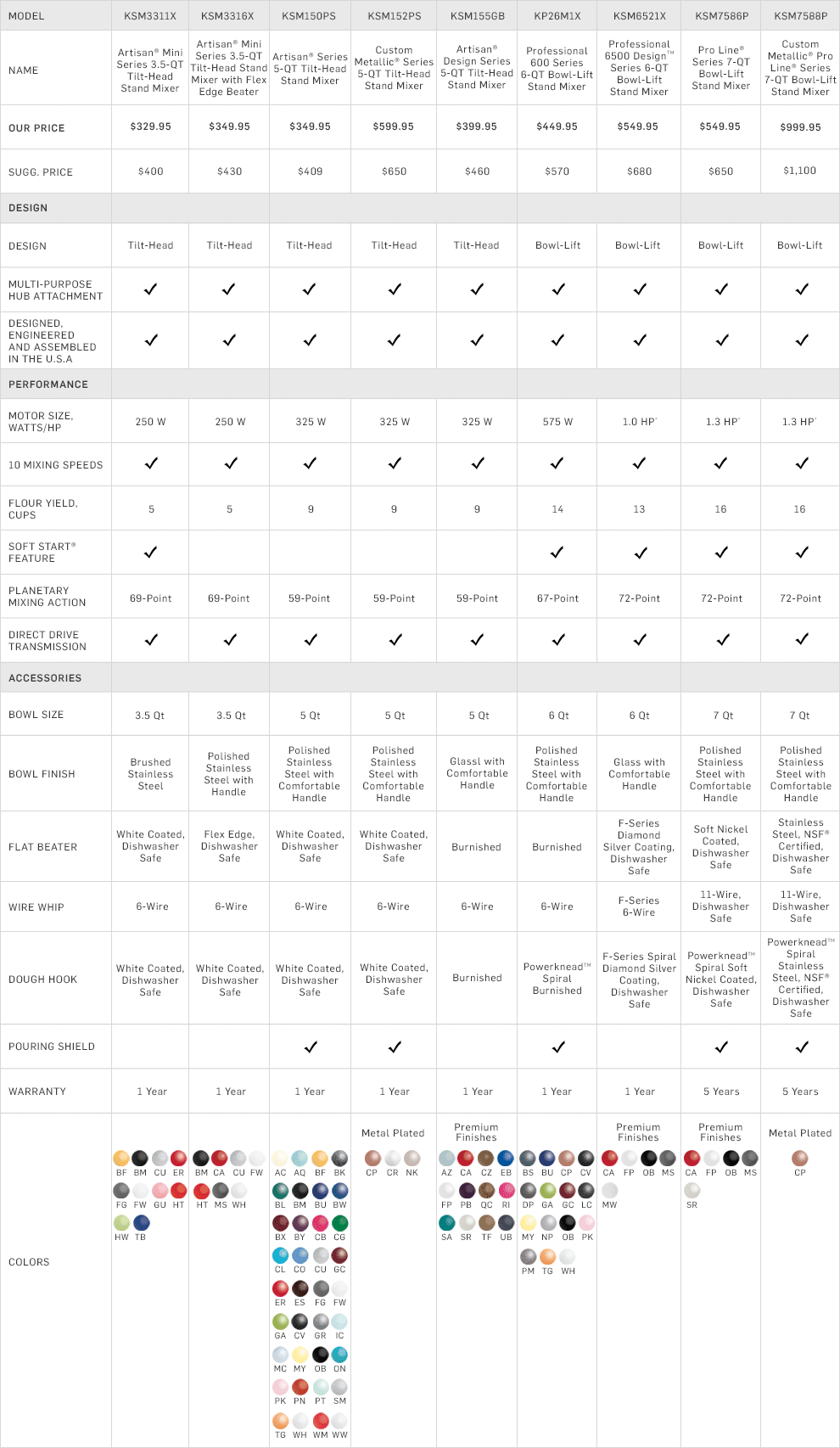
Even with this level of complexity, it is still a breeze to find out which model of mixer is right for you because the text is kept to a minimum.
What Colors Are Best When I Design a Comparison Chart?
When deciding how to design a comparison chart, think of the main purpose. You want your table to capture attention and provide an easy means for making a decision. While color choices vary greatly, my recommendation is to use colors that stand out so that your table is easily seen.
One trick for choosing colors is to visit web design template sites or even home paint websites (such as Sherwin Williams) to look at color palettes. This can help you choose a collection of coordinated colors to use for the border, fonts, design elements, and more.
You can also search Google Images for comparison charts. When I did that just now, these stood out to me. The colors used caught my attention as I was scrolling.
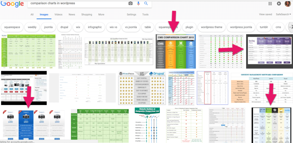
Whatever colors you choose, work them into the chart with the purpose of making it easy to assimilate the information in a short period of time.
Once customers have a quick way to gather information about all the options, evaluate it and make a confident decision; you will likely see your sales / signups / conversions increase. All thanks to a fancy table.

Ready to up your blogging game with more traffic, engagement & sales? Get my “Blogging Advantage: How to Create Blog Posts That Entice & Engage” ebook today. Save $10 when you use code BLOGADVBLOG (all caps).
Have questions about how to create a comparison table in WordPress? Talk to me below…
Related Articles
Building an Email List Designed to Convert
Keyword Strategies for Finding Popular Blog Post Topic Ideas


