Every now and then I come across an interesting landing page that provides an opportunity for learning. When I was introduced to this one, I immediately saw several things that caused me to stop and take notice.
Let me share my observations with you so you can compare this PPC ad/landing page combo with what you’re doing.
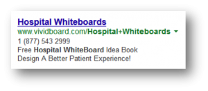
Here’s the PPC ad that lead me to the landing page.
1. The Offer – Start with the basics. Do people actually want what you’re advertising? If the offer isn’t appealing, it doesn’t matter how good your ad or landing page copy is.
Is this free idea book something that prospects are actually interested in receiving? Check your microconversions. If surfers click from the ad to the landing page, the ad offer is probably valid.
2. Singular Focus – PPC ad and landing page combos work best when they have a singular focus and call-to-action. Clicks may be hindered in this ad by the use of a phone number. If you want people to click to the landing page to get the free idea book, why add a phone number? A very common mistake made with PPC ads and landing pages is to try to accomplish too much.
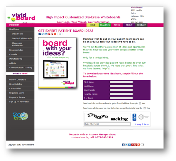
This is the page I was taken to.
© VividBoard , Used with Permission
3. Eye Path – This page is very colorful and my eye was flittering around at the speed of light. I didn’t know where to look at first. You want to create a clear eye path for your visitors. One that leads them straight to your call-to-action. Instead of using colored bars and colored text and colored forms, opt for adding color only in strategic places that will help guide the eye.
Which is easier on your eye? The image above or this?
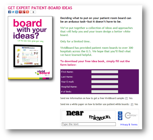
Repeat 2. Above – There is too much going on here. The navigation bar was left across the top and down the left side rather than creating a textbook landing page that stands on its own. In addition to all the nav links there are three calls-to-action on the page: click social media icons, fill out the form or call an account manager.
4. Form Optimization – If you’re doing a subscription or download, it is imperative that you test your form. Rule #1 of form optimization is that you only put fields for information that you absolutely have to have at this particular stage of the lead-development process. In order for people to be added to this list and download a free ebook, all they need to give is an email address. Most people ask for a first name so they can personalize the confirmation message.
This form, however, asks for the last name, hospital name, number of beds and for permission to send a product sample and a whitepaper. When VividBoard follows up with these leads, it can then set measures in place to collect the rest of the information it wants. For now, they are asking for too much information in exchange for a free ebook, in my opinion.
In addition, there is a Capcha security form on the page. I would never do this on any lead-generation form because it adds one more element of friction that visitors have to overcome in order to take action. In addition, people notoriously have issues with Capcha because the type on many of the words is very difficult to read. After a time or two of failing to get the correct word combination, I’m sure leads just give up and leave frustrated.
5. The Copy – You’ve got copy in two places with this type of campaign. First, in the PPC ads itself. Secondly, there is copy on the landing page.
The ad copy is pretty straightforward. That’s not a bad thing, if you’re getting the result you want. I would test more specific headlines for this ad, however. Rather than just using a keyphrase, I’d mention the ebook, talk about generating ideas or mention some problem that the ebook can solve.
Curiously, except to say that it contains a collection of ideas, the copy on the ebook landing page doesn’t talk about the ebook. Instead it is mostly written about the company rather than to the site visitor. “We’ve put together a collection…” “VividBoard has provided…” “We hope you’ll find what we have found…”
I’d flip the copy on its head and make it all about what the prospect can learn, accomplish and/or benefit from when choosing to download the ebook. Answer the question, “What will this ebook help me do?”
Want hands-on help boosting the conversions of your landing pages? As Certified Landing Page Specialists, we can write business landing page copy for you or offer copywriting consulting to help you do it on your own.
If you found this post valuable, others might, too. Please share (below) on your favorite social media sites. Thanks!
