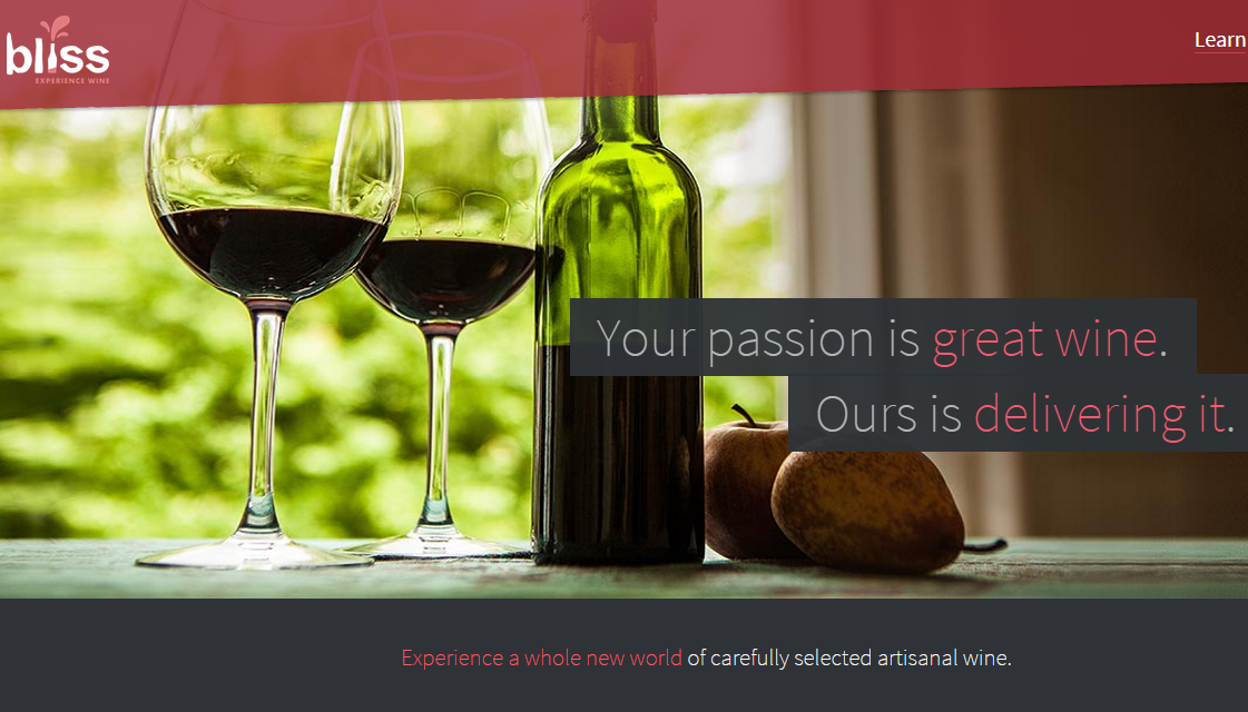
When it comes to ecommerce websites, driving traffic to your site and directing its flow within your pages is critical to your success. These are just two of the elements we draw attention to in this website review.
Want one of your web pages to be reviewed? Subscribers of the Marketing Words Newsletter are eligible to enter the monthly drawing and have your page evaluated by our team of pros.
Recommendations from Justin Deaville of Receptional Digital Marketing
I’m reminded of a truism my brother mentions occasionally when discussing the wine trade (he runs Handford Wines in London). He reckons there is an easy way to make a small fortune in the wine business: Start with a large fortune, time will do the rest.
It’s true that marketing in the wine business is tough. Yet, in many ways, the wine industry is well suited to attracting search engine traffic. That’s because Google likes websites that have a logical structure.
There are many ways of classifying wine. By color: white and red wines. By country: France, Spain, USA. By region: Alsace, Beaujolais, Bordeaux, and so on. And, of course, by taste: sweet, dry, fruity.
That’s very helpful for search marketing because we can use keyword research to identify what potential customers are searching for whether that’s: cheap, dry champagne, sweet white French wine, or whatever. We would use the results of our keyword research to plan our site structure and create content to match these keywords. We might, for example, create a blog post about the “10 best Portuguese red wines for easy drinking.”
Keyword research = site structure
Here’s how we might show a simple site structure:
In our case, the home page might target a keyword such as “international wines” or “imported wines,” while the categories might be “red wine” and “white wine.” Depending on your inventory, we might insert a sub-category for wine-producing countries or regions. Finally, the product pages would include content about individual bottles or producers.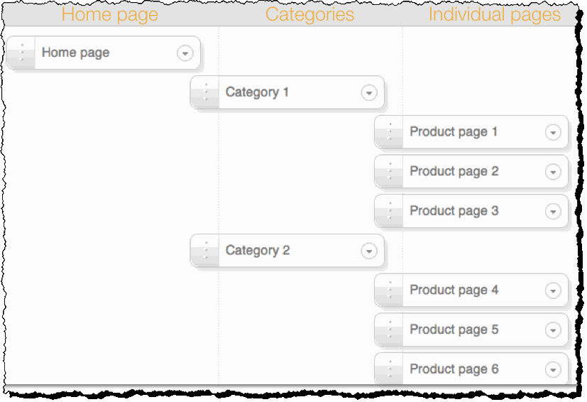
Why am I banging on about keywords? Well, it’s because you’re in a competitive market and your competitors will be considering and targeting keywords carefully. You should try to do the same. At the moment the title of your home page is “Bliss wine imports | Best dry red wine and dry white wine.” Yet you’re also targeting that keyword phrase on many other pages. Which is confusing for Google.
Let’s imagine one of your potential customers was searching for a nice rioja; they’ve heard of Tritium Tempranillo, so search for that. Google would really like to send the searcher to a page with that title. Yet your Tritium page doesn’t mention the wine in its title. So I’d guess that you’re not seeing much traffic arriving from Google.
If you want to attract traffic from Google, I’d suggest rewriting each of your page titles so they better reflect the content.
Enough About Keywords
So, enough about keywords. Let’s look at your home page.
When visitors arrive at the home page, I’d like them to be able to take action quickly. Many of your visitors will be in a hurry, so we need to help them find the information they need and take action.
At the moment, there is no clear call to action on your home page:
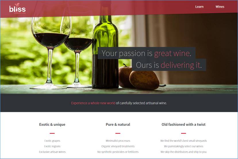
There are only two possible places to click: “Learn” and “Wines.” (It’s not clear what the difference is between these two links, and neither is prominent.)
I would add a clearer call to action as part of the main image. Decide what you’d like your customers to do, then suggest they do it.
Comments from Kurt Scholle of WebsiteSuccessCourse.com
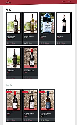 When I land on BlissWineImports.com, I find an attractive website that is clearly about wine. I like the positioning statement: “Your passion is great wine. Ours is delivering it,” and “Experience a whole new world of carefully selected artisanal wine” pulls me in.
On my larger monitor, I can see “Exotic & unique,” “Pure & natural” and “Old fashioned with a twist.” The words below those headings are difficult to read because the fonts don’t show up well. The fonts all over your site could be larger, in my opinion.
When I see a callout for “Learn,” I’m expecting to learn something about wine or selecting wine. Every website needs an About page, and that’s what I thought this was. However, it turned out to be more about why someone should buy from you instead of tips and expertise. “Reviews” takes me to the bottom of the page, where there is a single testimonial. Not what I was expecting.
With the other callout, “Wines,” I’m offered a very small list of choices, which all may be fine wines, but I was disappointed in the lack of selections. It may make it easier to decide because there are fewer options, but if I’m a wine aficionado, I might not find the site compelling. There is also no context as to why these wines appear or why they were selected. In my opinion, this page is an unnecessary extra link that visitors must click before they can get to the good stuff. You might consider removing the page. If you keep it, I’d suggest providing a line or two of copy about why this particular wine made your exclusive list, such as “grapes from 107-year-old vines.”
How Do I Order?
The biggest problem I found with the site is that I was unable to determine how to order the wine. I know selling wine online can have its legal issues because my company built a site for a wine, cigar and liquor chain a number of years ago. But there is no buy button, shopping cart or phone number listed. There is an email address on your Contact page, but that is insufficient. There is no sales funnel on the site.
I do see (on the FAQ page) that you are asking people to email you to create a custom case of wine until you get your ecommerce platform ready. If that’s your best option for the time being, then you should put it on all sales pages. I would recommend making the font darker on the FAQ page as well.
As for navigation, many people will never see the footer links, so you might consider making those pages more obvious above the fold. Also, there should be links from the Winemakers pages to their wine. There is no site navigation on those pages, not even the footer links you have at the bottom of other pages.
Email is one of the best-converting marketing methods. You’ll want to put some effort into building your email list (perhaps sending regular wine tips and announcing new varieties, etc.). There is an opt-in on the blog, but it should be more apparent throughout the site as well.
On the blog page, I see navigation that includes “About,” but that links to the Home page. Confusing.
I would write a blog post about each wine you sell and why you love it. I would optimize the articles for the search engines so you can attract wine drinkers and brand loyalists. I would link to the proper sales page that relates to the wine you’ve written about. Google loves blog posts, so it’s usually a good idea to optimize for long-tail keywords related to each wine. You should also attract visitors or drive traffic by using paid ads and social media, and then ask visitors to engage you, or even better, BUY your wine.
Use Your Blog to Educate, Engage and Empower Your Audience
As for the content — without knowing more about what your target personas are interested in, I can’t say for sure, but I question whether “6 solid minutes about some new types of wine start-ups” would appeal to wine drinkers who are not in the wine business.
The headline, “Sneak peak (should be “peek”) into a Chicago event for wine importers only” is interesting, but not when you advertise “what was essentially a sh** show of an event in Chicago.” That’s a turnoff for me.
I would love for you to succeed and begin to generate lots of revenue! There is much potential. Good luck. Cheers!
Suggestions from Me! Karon Thackston of Marketing Words
My experience on the BlissWineImports.com site was a bit of a conundrum. My first impression led me to believe yours was an ecommerce site because of the promise in your headline that you delivered wine. As I scrolled down the Home page, I noticed what I thought to be categories, but none of the words (exotic, pure, old-fashioned) were clickable. My expectation was to be taken to pages that offered these types of unique wines for sale.
As I continued to scroll, I found a pink “Start Learning” button, so my first assumption (about buying wine) was then replaced with another assumption — that this was an educational site. I clicked to follow the trail to see where it would lead me.
Appearance
Nice colors and lovely photos, but as Kurt Scholle suggests, I’d make the pale font darker throughout. Remember that, as people age, their eyes have a harder time reading low-contrast text, so even though the pale font is arty, consider your target demographic here. Also, I spotted some typos in the text (“your’re” should be “you’re”; “pay off” should be “payoff”; “and wa la la” should probably be “and voilà,” etc.), so be sure to hire a good proofreader.
“Learn” Page
With phrases including “every wine we evaluate” and “our winemakers,” I bounced back and forth between believing you were an ecommerce reseller and a vineyard producing your own wine.
As I scrolled, I found a statement (that might have been misplaced) that read: Stay Updated & Get A Free Gift.” It wasn’t clickable. It had no explanation. There was no opt-in field for me to register for anything.
With dropdown boxes that read:

I began to think the purpose of your site was to review wines, not sell them.
Eventually, I came upon this at the very bottom of the page:

The Sales Funnel Hit a Dead Wall
Although I was confused, I was learning as I went along. I’d read a statement or two here or there that would pique my interest and cause me to want to see wines related to what you were saying. But there is no sales funnel in place.
You never want visitors to hit a brick wall. If selling wine via an ecommerce site is your priority, then all roads should eventually lead to an Add-to-Cart button and the process of making sales.
Think in circles, not straight lines.
The Ecomm Buying Process
Shoppers do not typically come to a site and progressively make their way through each page until they find what they are looking for. Starting with the Home page, the opportunity to purchase wine should be the very first thing a visitor sees. From my experience, you should also thread buying options all throughout your site on every page as well as on your blog.
For example, the Home page leads to a category page. From there, the category leads to specific products, and each product leads to a Buy Now button so shoppers can purchase.
If you start a sales funnel with a blog post that features a particular wine, link to the page where that wine can be purchased. On the Thank You page of your shopping cart (I did see where you mentioned that this wasn’t operational yet), you’ll want to offer additional wines for purchase… “People who bought {this wine} also loved these,” and show three or four compatible bottles.
The Marketing Words Blog has some great articles about funnels.
As it is now, with every page I click to, I come to a complete stop and am not led any further into your site. My credit card stays in my wallet and that’s a very bad thing for ecomms to face.
If you clean up the flow of the copy and content, clean up the confusion by stating clearly what you offer (artisan wine for sale) and create specific funnels designed to guide visitors from one specific place to another, I think you’ll see a big increase in sales.
Best of luck!


I agree with the points you shared here. Your landing page can create an instant connection with prospective customers, especially when it is properly optimized. Great content that use the right keywords, proper navigation, and call to action buttons are some of the factors that must never be overlooked.