 Subscribers to my Marketing Words Newsletter get the added bonus of submitting one web page for possible review. Then my collection of web experts and I point out trouble spots the site owner can correct in order to get better rankings and conversions.
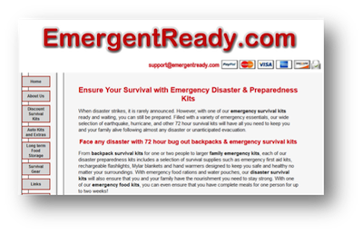
This month’s feature is a category page of an emergency survival kit ecommerce site.
The reviewers have not seen each other’s comments so pay special attention to comments that are repeated. If two or three people reference the same issues, they should take priority on your “fix-it” list.
From Kurt Scholle, WebsiteSuccessCourse.com
My first impression of the page was that the NAV bar on the left looks very simple and not overly attractive. While it pulled my eye there immediately, none of the buttons grabbed me.
I’m a fan of horizontal NAV and most people in the western world read left to right. NAV bars should be ordered by importance from left to right or top to bottom. About and Contact pages usually go last OR they can go in a secondary NAV bar so that the ‘money’ pages are featured in the primary NAV.
The graphic at the top of the page links to your Home page, which is a good thing! But I want something more attractive or useful, like a picture or an opt-in box. If you could add a picture of one of the kits, that might be helpful.
The upper left-hand corner of a website may be the most important piece of website real estate. For years, web developers have put a logo or positioning statement there. Today, the trend is to put an opt-in there. Building an email list is one of the most profitable things you can do!
You need to give them a reason to opt-in. Few will sign up for a ‘newsletter.’ But if you send them Daily or Weekly Survival Tips, that might interest them. Naturally, at least some of the time, you would want to reference one of your products. And you could always broadcast information on new items, closeout and specials. Wherever you place the opt-in, I would put it above the fold and on every page. Perhaps in a sidebar?
The site is pretty narrow – is it 920 pixels wide? In this day and age 1,100 pixels or wider is the norm. I would also make sure it is mobile-friendly as just over 50% of today’s web traffic is coming from smartphones, tablets, etc. All of the new sites we build are responsive.
The header might also benefit from a positioning statement. I would replace the support@ email address and the credit cards, both of which would be better served in other places on your site.
The header graphic comes from a file named S.gif. It’s always a good idea to have images with file names related to your keywords. When you revise the header, consider naming the file something like survival-kits.jpg. Same with other images on the site. The thumbnail for Tornado Kits is a file named sktornado.jpg. Consider changing that to tornado-survival-kits.jpg.
I think those images should be bigger. If you widen the site, you can expand the thumbnail sizes. Otherwise, consider moving from 4 columns of products to 3.
This page would benefit from a larger image of a survival kit – maybe 250-300 pixels wide, with a keyword-rich file name, like emergency-survival-kits.com.
Speaking of keywords, it looks nice when you bold words like “emergency survival kits,” “backpack survival kits,” “family emergency kits,” and “disaster survival kits.” But they are not all included in the page’s meta keywords, so I would add them. Most SEOs will tell you that meta keywords tag no longer has any effect on rankings, but we have tested that several times in the past year or two and, while it is not as effective as it once was, we believe that it does influence search rankings.
Meta keywords and descriptions should be customized for every page of your site.
I think you might benefit from grouping similar kits together with a short narrative about each group. This might be a good place to add another larger image from each type of grouping.
Your headline includes a benefit (EG: Ensure Your Survival”) I might change the primary headline to “Emergency Disaster & Preparedness Kits” which forces the keyword to the beginning of the headline and defines the page. You can then work “Ensure Your Survival” into a sub-headline.
Please make headlines more attractive by placing a carriage return in a place that prevents just one word on the 2nd line. Shorter headlines, all on one row would make it look better too!
You should probably have the benefits of your products, including the graphic at the bottom of the page, above the fold.
I look forward to watching the progress you make with your site and wish you the best of luck!
From Justin Deville, Receptional.com
The site would certainly benefit from a ‘freshening up’ of the design and copywriting. Here are five suggestion for you to consider:
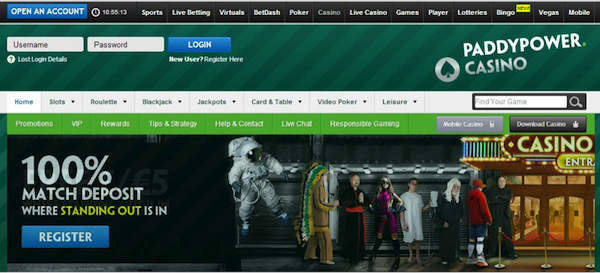
1. Is new navigation needed? Nowadays, it’s common for website navigation to appear at the top of the page. Yet, your navigation appears along the left-hand side of the screen. If I were redesigning the page, I’d move the navigation to the top, freeing up space lower down the page to show off your products. Here’s an example – Paddy Power’s casino site has several layers of top navigation that allows visitors to find their way around the site quickly and easily. Visitors expect to see a top navigation, so that’s a good place to put it.
2. Are your contact details clear? You want to make it really easy for visitors to contact you. So, you show your email prominently at the top of the page. That’s great. You might want to make it clickable, so that it’s really easy for visitors to get in touch. And you might want to add a phone number, so potential customers can give you a call. This example (from camera insurance provider Eversure) provides a good example of how to make your contact details more accessible.

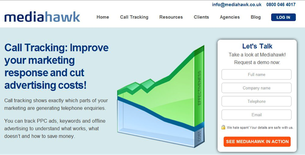
3. Would you benefit from KISS? One of my favourite marketing gurus, Claude Hopkins, wrote that “you should make an offer so clear that only an idiot would turn it down.” We refer to this approach as KISS, or Keep it Simple, Stupid. It’s an acronym that was popularised by the US Navy in the 1960s. The KISS principle states that systems work more effectively when they are kept simple rather than made complex. At the moment, your offer isn’t as clear or as simple as it could be. So what’s the key benefit that customers get from your products? Once you know what the main benefit is, try to make it completely obvious. This example from Mediahawk, the call tracking software company, goes a long way towards explaining an abstract product.
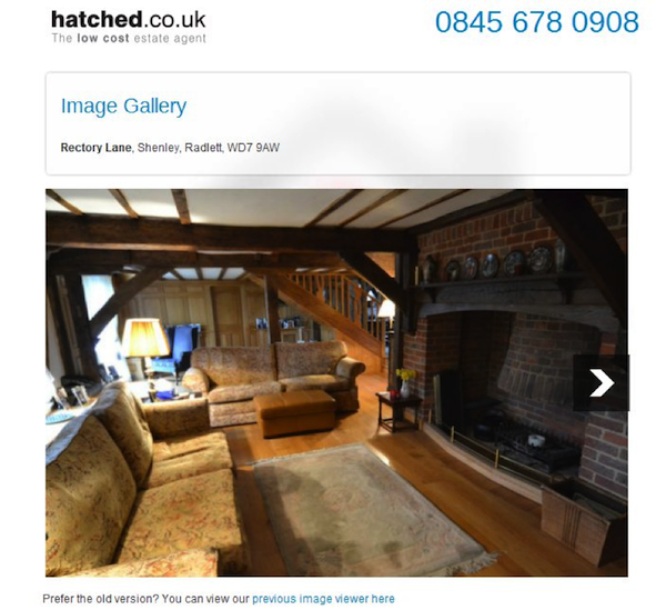
4. Are your images helping you sell? The web is a visual medium, so we often find that good quality images can help sell your products. When looking at a product image, it should be really clear to potential customers what they’d receive were they to make a purchase. Your images aren’t clear; in fact I’d say they’re likely to be offputting for potential customers. If you’ve bought or sold a house recently, you’ll know that the internet has revolutionised the way that homes are now sold. Real estate agents, such as online agent, Hatched.co.uk, are able to place many more images in their listings. Images help to convert wavering or undecided visitors into potential customers.
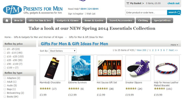
5. Is there too much text? Whenever possible, I want to show products ‘above the fold’. I mean that the products should be clearly visible as soon as the visitor lands on the page – they shouldn’t have to scroll down. At the moment, the top of the page contains lots of text. It might take several minutes to read through that text, yet you’re likely to have only a few seconds in which to grab the visitor’s attention. I’d want to try redesigning the page, so that the text is lower down, with images in the ‘sweet spot’ at the top of the page. In the image below, you can see how the gift retailer, Presents for Men, does this on their site:
I hope those tips are useful.
Justin Deaville is Managing Director at UK-based digital marketing agency Receptional and was previously chief executive officer (CEO) at Wordtracker.com.
From Karon Thackston (Me!) www.MarketingWords.com
At first glance, I wondered if this was an ecommerce site. The page is filled with words above the fold and, for those shopping on tablets or smartphones, it would take a good bit of scrolling to get to the actual products.
It may sound odd coming from a copywriter, but the text is most likely a hindrance to conversions on this page. People come to ecommerce sites to shop, not to read. This is one reason why ecommerce copywriting is usually very short. (There are always exceptions, of course.) A good rule of thumb is to make sure you have at least the first row of products showing above the fold.
The copy you have could easily be condensed to half the length that is current on this page. In addition, repositioning the copy would also make it easier for your visitors to read. It isn’t necessary to have all the copy in one place.
Organize the Copy/Products
For instance, there are currently over 30 products on the page: many seem similar. You could group all the “Guardian” kits (is Guardian a brand?), group all the 4-person kits, survival kits for pets, etc. Then, with each section, give me (as the customer) a brief description about the group as a whole. That will help me narrow down which type/site of kit I might want. This way, I don’t have to click to all 30+ of them to see what each offers.
You may even want to go one step further and make this a category page that then branches off into sub-category pages.
I’d also recommend making the images bigger. As it is, I’m not able to determine what each kit includes.
Banner Improvements
As far as conversions go, the top banner is extremely important to ecommerce sites. As it is, your banner has your web address, your payment options and your email. Typically, in addition to contact information, you would want security/privacy, an offer such as free shipping, sales, etc., shopping cart icons and possibly your USP/tagline.
Disney Store and Amazon are great examples to follow.


Search Engine Optimization
I, personally, would change your title tag to something a little more compelling. In fact, it appears that Google has done that for you. The title tag you have listed for this page is:
Emergency Disaster & Preparedness Kits for
Survival of Any Catastrophy
(NOTE: Catastrophy is misspelled. It should be “catastrophe.”)
And it looks as though Google changed your title tag to:

The use of “discount” sets you apart from other listings and helps differentiate you from the competition. (Google could have pulled this from the text in your navigation link.) You could also mention “72 hour” in the title tag.
The meta description tag (which appears to be used on several pages) has also been altered. Google removed the “buy now” call-to-action that you had listed in your HTML code.
There is a disconnect between your tags, your navigation and the page itself. The navigation mentions “discount” and the version of the title tag Google uses mentions “discount,” but there is no other discussion of discounts on the page other than once in a product link. If you offer discounted survival kits, talk it up in the copy.
Karon Thackston is a Certified Landing Page Specialist. Looking for website pages that rank well and convert even better? Contact Karon today for business landing page copywriting or copywriting consulting and start getting results.
