

Have you ever scrolled through a font menu and wondered how you’re supposed to choose from all those options? There are elegant scripts, clean minimalist fonts, bold display styles, handwritten lettering, traditional serifs and dozens of others. Many of them look wonderful on their own. The challenge begins when you try to put two or three of them together in the same design.
I’ve seen beautiful digital products weakened by font combinations that compete with each other or make the words difficult to read. I’ve also seen very simple designs look polished and professional because the creator chose fonts that worked well together. You don’t need formal design training to do that.
Once you understand a few basic font-pairing principles, it becomes much easier to recognize which fonts complement each other—and which ones probably shouldn’t share the same page.
In this post, we’ll look at several popular font styles and the qualities each one brings to a design. Then I’ll show you how contrast, readability, hierarchy and mood can help you create strong pairings. You’ll also see plenty of examples, including combinations that work and ones that don’t, so you can choose fonts for all your digital products with more confidence.
Start Looking at Fonts Through a Designer’s Eyes
To have a clear idea of which fonts to choose, it helps to begin looking at them through a designer’s eyes. A designer doesn’t simply decide whether a font is pretty, fun or easy to read. They also consider what that font communicates, how it makes someone feel and whether it supports the purpose of the design.
Font pairings can work through contrast or in unison. Fonts can also have moods and personalities, and they help tell a visual story before someone reads a single word. Not terms you’re used to hearing? No worries! We’ll go through what they mean, and I’ll show you examples along the way.
Once you begin noticing these qualities, choosing font combinations becomes much easier. Instead of randomly scrolling through Canva and trying one font after another, you’ll have a better idea of what you’re looking for and why a particular Canva font pairing does—or doesn’t—work.
Should Fonts Contrast or Work in Unison?
Font pairings can work because the fonts contrast with each other or because they have qualities in common. Neither approach is automatically better. The best choice depends on the look you want to create and the message your product needs to communicate.
Font pairings can work because the fonts contrast with each other or because they have qualities in common. Neither approach is automatically better.
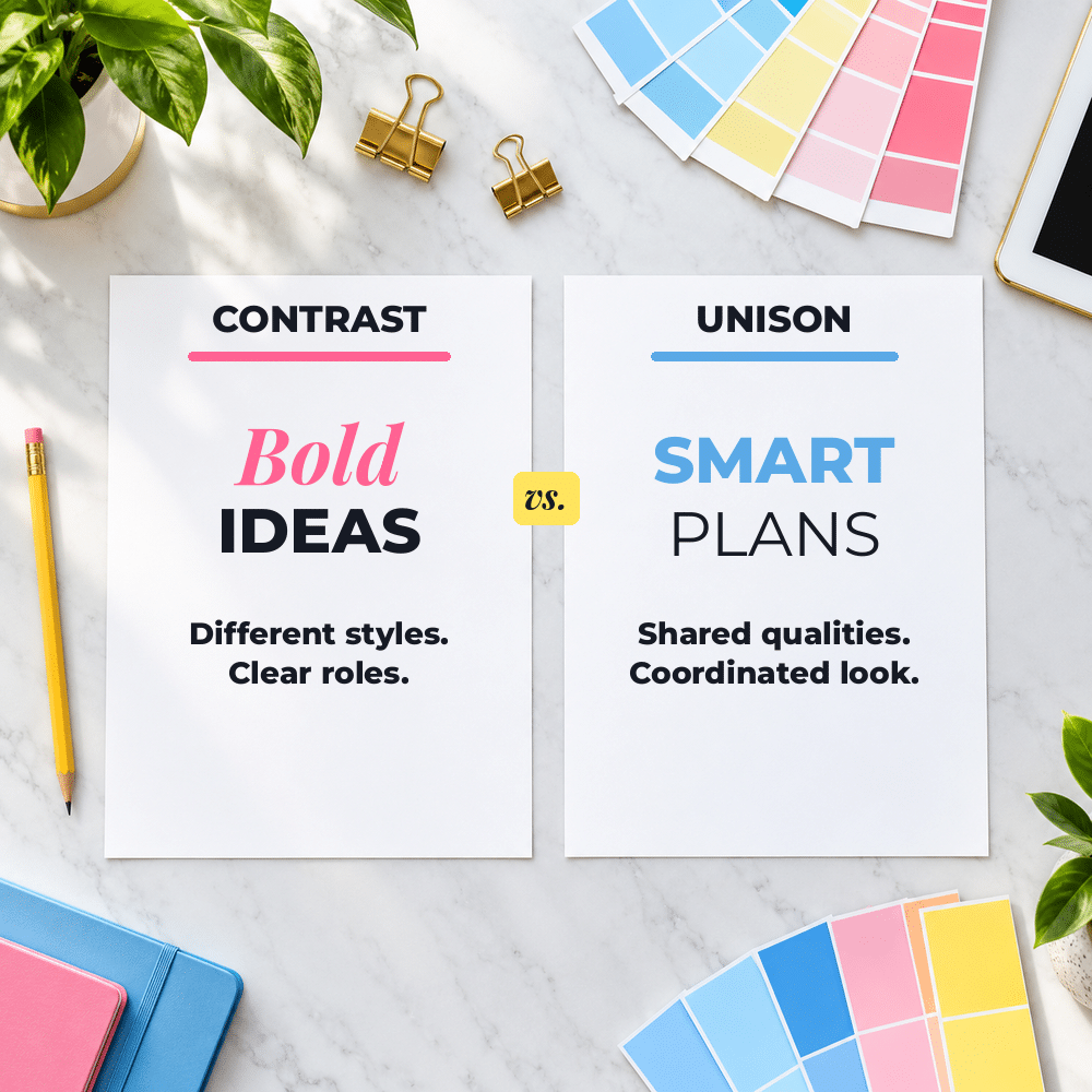
The best choice depends on the look you want to create and the message your product needs to communicate.
Contrast makes the role of each font easy to recognize. You might pair a bold display font with a clean sans serif or a traditional serif with a simple handwritten accent. One font attracts attention while the other delivers the information clearly. If two fonts look almost the same but don’t quite match, however, the combination can appear accidental rather than intentional.
Fonts can also work in unison. They might share similar letter shapes, line thicknesses or proportions, even though they aren’t identical. You can also use different versions of one font family, such as regular for body copy, semibold for subheadings and bold for titles. This approach often produces a clean, coordinated design without requiring several different fonts.
Whether you use contrast or unison, the fonts still need to communicate a compatible mood. A retro font and a luxury font, for example, may both be attractive and full of personality, but they usually tell very different visual stories.
The retro font might suggest nostalgia, fun or a particular time period, while the luxury font communicates elegance, refinement or exclusivity. Using them together could send two conflicting messages and leave the reader unsure of the feeling the design is meant to create.
Imagine a playful, rounded font paired with a rigid corporate typeface. One suggests fun and informality while the other feels serious and businesslike. Unless that tension is intentional, the reader may sense that something is off without knowing exactly why.
Learning to recognize the mood and personality of different font styles will help you avoid those mismatches and create Canva font pairings that support the message you want to send.
Give Each Font a Clear Job
Once you’ve chosen fonts with compatible personalities, decide what job each one will perform. One font might attract attention to the title, while another makes subheadings, instructions and longer passages easy to read. Giving each font a specific purpose keeps the design organized and prevents them from competing with one another.
Readability should always carry more weight than decoration. Script, handwritten and elaborate display fonts can add personality to a title, short quotation or small accent. Used throughout a workbook, journal or ebook, however, they can quickly become tiring and difficult to read. I generally use the more distinctive font sparingly and let a clean serif or sans serif handle instructions, prompts and body copy.
This division of jobs creates what designers call visual hierarchy. Visual hierarchy simply shows readers what to look at first, second and third. The title is usually the most noticeable, followed by section headings, subheadings and body text. Font choices, sizes and weights work together to guide the reader through the content without making them stop and figure out where to begin.
You don’t always need two different font families to create that hierarchy. A single family that includes regular, semibold and bold versions may give you all the variety you need. You could use bold for the title, semibold for subheadings and regular for body copy. This type of font combination often works well when you want the design to feel especially clean, modern or coordinated.
When considering Canva font pairings, test the fonts with your actual words instead of relying only on a sample graphic. A Canva font pairing that looks impressive in a large headline may be much less successful in a small printable, on a phone screen or across several pages of instructions. Try it at the size your customer will see, and make sure every font can do its assigned job clearly.
Get to Know the Main Font Styles
Before you can create strong font pairings, it helps to recognize some of the styles you’ll encounter. A font may belong to a broad category such as serif or sans serif while also being described as modern, elegant, playful, minimal or retro. Those additional words tell you more about its appearance and personality, which can help you find other fonts that work well with it.
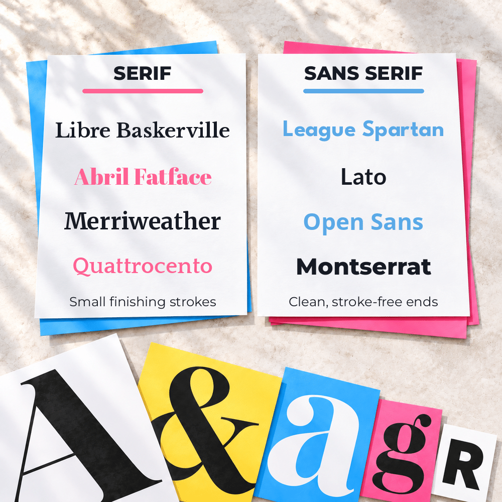
Serif and sans serif fonts are two of the most common categories. Serif fonts have small finishing strokes on the ends of their letters and often feel traditional, established or editorial. Sans serif fonts don’t have those strokes. Their cleaner shapes can feel modern, simple or informal, although the exact mood depends on the individual font. Because they’re visually different but generally easy to read, serif and sans serif fonts are frequently paired together.

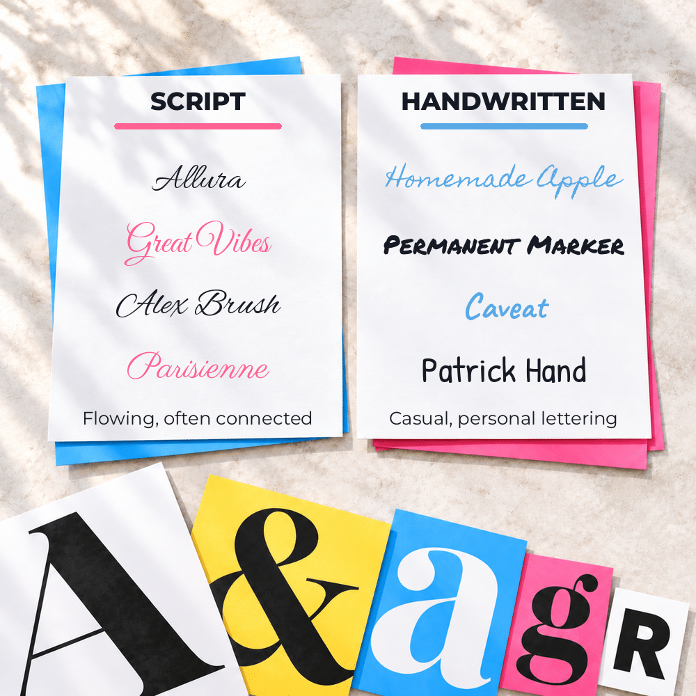
Script and handwritten fonts imitate lettering created with a pen, brush or marker, but they don’t all communicate the same mood. A flowing script may feel elegant or romantic, while a loose handwritten font can appear casual, personal or playful. These fonts usually work best for titles, short phrases and accents. Pairing a script font with another script or a highly decorative handwritten font often creates too much visual activity and makes the design harder to read.
Display fonts are created to attract attention. They may be bold, decorative, unusual or built around a specific theme. You’ll often see them used for covers, titles, posters and large headings rather than body copy. Because a display font already has a strong personality, it usually needs a quieter partner that won’t compete with it.
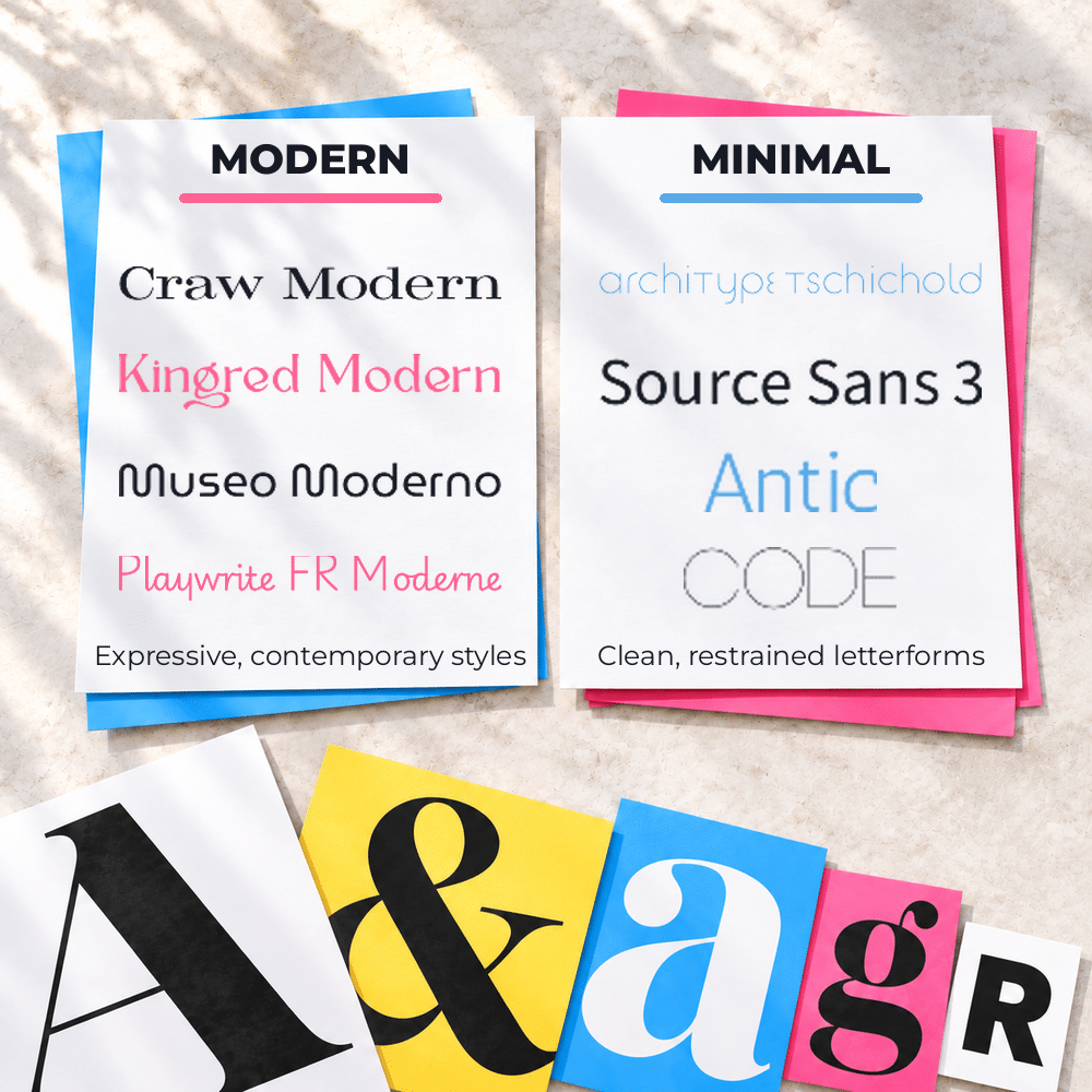
Modern and minimal fonts often use clean lines, generous spacing and simple letterforms, but these descriptions can overlap with other categories. A modern font might be a serif or sans serif, and a minimal font isn’t necessarily plain or boring. These styles are popular in Canva font combinations because they can give a design a polished, uncluttered appearance while leaving room for a more distinctive accent font.
More Font Styles and the Impressions They Create
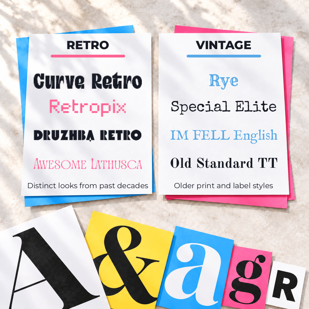
Retro and vintage fonts borrow details from past decades or historical periods. One might bring to mind a 1950s diner, while another resembles lettering from an old newspaper, travel poster or product label. Because these fonts create such a specific visual setting, their partners should support that feeling without making the entire design look like a costume.
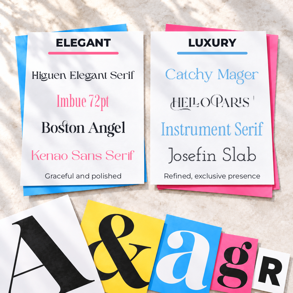
Elegant and luxury fonts often use graceful curves, fine lines, high contrast between thick and thin strokes, or generous spacing. They tend to create a sense of refinement, sophistication or exclusivity. An elegant font doesn’t have to be a script, however. Many serif and even some sans serif fonts can communicate luxury through their proportions and details.
Elegant and luxury fonts often use graceful curves, fine lines, high contrast between thick and thin strokes, or generous spacing. They tend to create a sense of refinement, sophistication or exclusivity. An elegant font doesn’t have to be a script, however. Many serif and even some sans serif fonts can communicate luxury through their proportions and details.
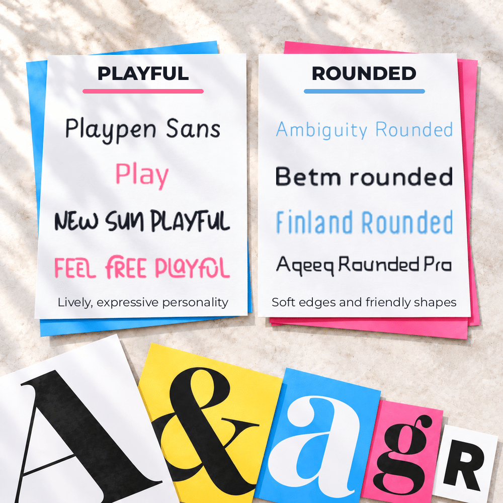
Playful and rounded fonts use soft edges, unusual shapes or bouncy letterforms to create a friendly, lighthearted mood. Some feel youthful, while others are simply relaxed and approachable. Since these fonts can attract a lot of attention, pairing them with another highly playful font may make the design feel busy or disorganized.
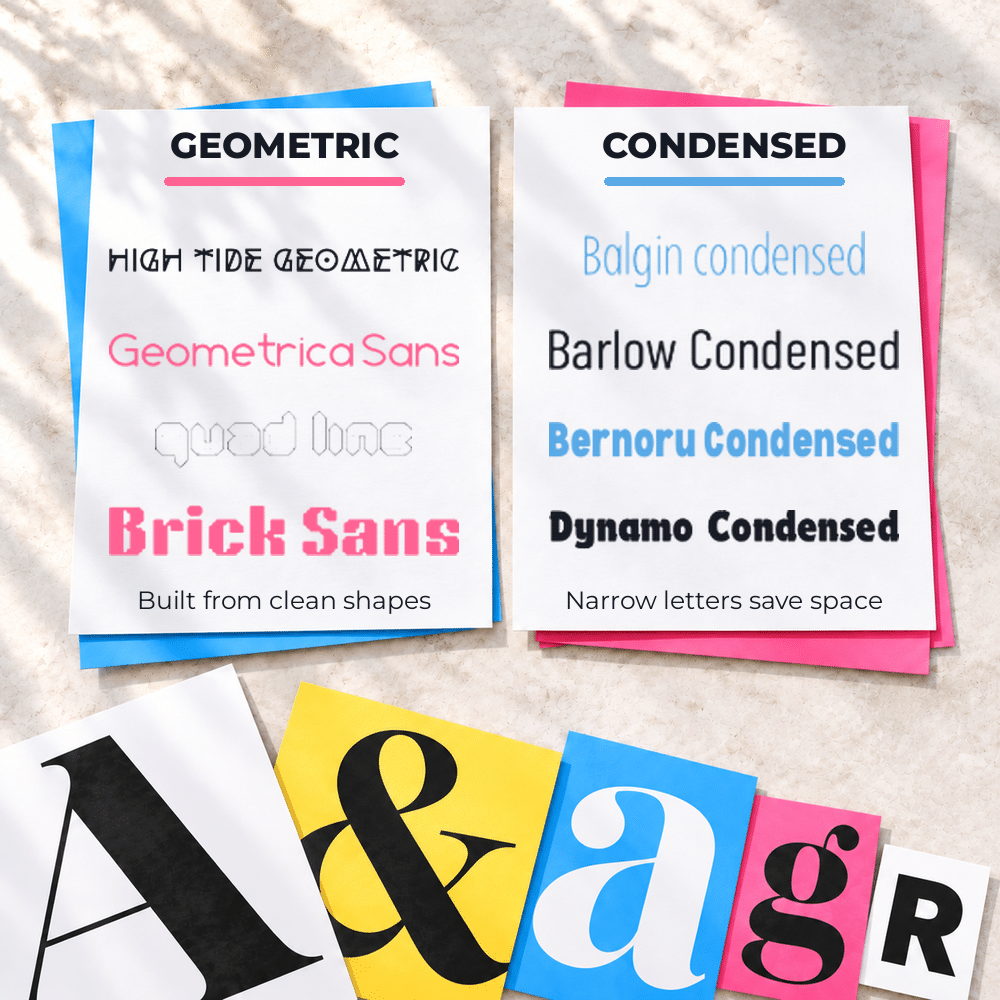
Geometric and condensed fonts are identified more by their construction than their mood. Geometric fonts use shapes such as circles, squares and clean straight lines, which can make them feel orderly and contemporary. Condensed fonts have narrower letters that fit more text into a limited horizontal space. Either style can look bold or understated depending on its weight, spacing and use.
Typewriter and rustic fonts often include irregularities that make them feel aged, handmade or imperfect. A typewriter font may suggest history, simplicity or personal correspondence, while a rustic font might look weathered, hand-painted or inspired by old signs. These styles have strong visual character, so a simpler companion font usually gives them room to stand out without overwhelming the design.
A Simple Process for Choosing Font Pairings
- Start with the message, not the font menu. Before you search for fonts, decide how the design should feel. Should it appear polished, cheerful, calming, bold, elegant or informal? This gives you a general direction and helps you eliminate fonts that may be attractive but don’t support the message you want to communicate.
- Choose your main font first. This is usually the font that carries the most personality and appears in the title or another prominent area. It becomes the anchor for the rest of the design. If your main font is decorative, bold or unusual, you’ll know that its partner probably needs to be quieter and easier to read.
- Look for a partner instead of another star. The second font doesn’t need to be equally interesting. Its purpose may be to make subheadings, instructions or body copy clear while allowing the main font to stand out. When both fonts demand attention, the reader’s eyes don’t know where to go.
- Build a small sample before formatting the entire design. Add a title, subheading and short paragraph using the fonts and sizes you’re considering. This lets you see whether the font combination creates a clear visual hierarchy and whether the mood remains consistent. It’s much faster to correct a small sample than to replace fonts throughout a finished design.
- Test the pairing wherever your audience will encounter it. View it on a computer and phone, and print a copy if the design will be printed. Check the smallest text as carefully as the title. A font pairing isn’t successful simply because it looks beautiful at full size in Canva; it also has to remain clear and comfortable to read on a sales page, social post, printable, digital product or any other place you use it.
Common Font-Pairing Mistakes to Avoid
- Using too many fonts can make even a well-planned design feel scattered. Two font families are often enough, although a third may work when it has a specific and limited purpose. Before adding another font, see whether changing the size, weight, capitalization or spacing of one you’re already using will create the distinction you need.
- Choosing fonts that are too similar can make a pairing look like a mistake. Two sans serif fonts with almost identical shapes, for example, may appear mismatched rather than coordinated. If you want a subtle, unified appearance, different weights from the same font family will usually look more intentional.
- Making every font decorative leaves the design without a place for the reader’s eyes to rest. A script title, handwritten subheading and playful body font may each look appealing separately, but together they compete for attention. Keep the personality where it has the most impact and use a simpler font for the supporting information.
- Forgetting about weight and spacing can cause good font combinations to look unbalanced. A very thin title font may disappear beside a heavy body font, while tightly spaced letters can feel cramped next to an airy, elegant typeface. Adjusting the font weight, letter spacing and line spacing can sometimes improve a pairing without changing either font.
- Ignoring the actual words in the design may lead to unpleasant surprises. A font can look wonderful in Canva’s sample text but behave differently when used with a long title, all capital letters, numbers or punctuation. Type the real headline, button text, price, instructions or other copy before deciding that the pairing works.
Canva Font Pairings to Try
- League Spartan and Libre Baskerville combine a strong geometric sans serif with a traditional serif. League Spartan creates a clean, structured title, while Libre Baskerville softens the design and makes longer passages comfortable to read. The fonts contrast clearly but still produce a polished, balanced appearance.
- Abril Fatface and Lato create a bolder contrast. Abril Fatface is an attention-getting display serif with dramatic curves, making it best suited to titles and short statements. Lato is quieter and more versatile, so it can carry subheadings and body copy while allowing Abril Fatface to remain the star.
- Homemade Apple and Raleway pair a casual handwritten font with a straightforward sans serif. Homemade Apple adds warmth and personality when used for a short title or accent. Raleway brings clarity to the supporting information and prevents the handwritten style from overwhelming the design.
- Six Caps and Josefin Slab demonstrate how differences in width can create contrast. Six Caps is tall, narrow and designed for short, attention-getting headlines. Josefin Slab has more open, spacious letterforms, giving the reader a comfortable visual change for subheadings or supporting text.
- Permanent Marker and Open Sans combine a bold, marker-inspired font with a clean, readable sans serif. Permanent Marker creates energy and impact, while Open Sans provides a calmer place for the reader’s eyes to land. The pairing works because the expressive font has a limited role and the supporting font handles the information clearly.
10 More Canva Font Pairings to Try
- Julius Sans One and Archivo Narrow create a refined pairing using two noticeably different sans serif fonts. Julius Sans One has wide, delicate letterforms that work well for short titles. Archivo Narrow is more compact and practical, giving supporting text greater strength and readability.
- Montserrat and Oswald show how differences in width can create contrast between two clean sans serif fonts. Montserrat has broad, open letterforms, while Oswald is narrower and more condensed. The combination feels coordinated, but the distinction between their shapes keeps the design from looking flat.
- Sniglet and Cabin share rounded qualities without looking identical. Sniglet has a playful, whimsical personality that attracts attention, while Cabin is quieter and easier to read. Their common softness helps the fonts work in unison, and their difference in intensity gives each one a clear role.
- Merriweather and Special Elite combine a traditional serif with a typewriter-inspired font. Merriweather provides a solid, readable foundation, while Special Elite introduces texture and vintage character. Using Special Elite for a short accent rather than lengthy body copy keeps the effect interesting without sacrificing readability.
- Roboto and Roboto Condensed demonstrate how related fonts can create hierarchy without introducing a completely different personality. Roboto provides clear, balanced body copy, while the narrower Roboto Condensed can distinguish a heading or subheading. Because they come from the same font family, the finished design remains especially cohesive.
- Source Sans Pro and Source Serif Pro were designed to complement each other. Source Sans Pro has a clean, straightforward appearance, while Source Serif Pro adds a more traditional touch. Their similar proportions help them work in unison, and the presence or absence of serifs provides enough contrast to separate their jobs.
- Cinzel and Quattrocento create a more formal pairing influenced by classical letterforms. Cinzel has a strong, carved appearance that can give a title presence and authority. Quattrocento is gentler and more readable, allowing it to support the design without diminishing Cinzel’s impact.
- Kollektif and Gidole rely on differences in weight and width. Kollektif is round, bold and visually strong, while Gidole is finer and more condensed. The contrast allows Kollektif to attract attention and Gidole to provide supporting information without the two fonts competing.
- Sifonn and Bebas Neue combine geometric structure with dramatic differences in proportion. Sifonn is broad and substantial, while Bebas Neue is tall and condensed. Both fonts have a strong presence, so the pairing works best when one is clearly given the leading role and the other is used more sparingly.
- Playfair Display Black and Playfair Display Italic show how one font family can produce a complete pairing. The Black weight gives titles strength and prominence, while the Italic version introduces movement and elegance. The styles are different enough to establish hierarchy but similar enough to create a unified visual story.
Use the Rules as a Starting Point
Font-pairing rules give you a dependable place to begin, but they aren’t meant to eliminate creativity. A combination that seems unusual may still work when the fonts support the same message, have clearly defined jobs and remain easy to read. The goal isn’t to follow a formula perfectly. It’s to make deliberate choices instead of selecting fonts simply because you like them individually.
Use the Canva font pairings in this post as examples you can try or as inspiration for creating your own combinations. Change the weights, sizes and spacing, then test the fonts with your actual words. A small adjustment can completely change the balance of a design.
Most of all, remember that successful font combinations help people understand your message. When the fonts establish a clear hierarchy, communicate a compatible mood and stay readable wherever the design appears, they’re doing their job.