OK, call me a landing-page geek, but I actually save emails and screen shots of landing pages and study them in my spare time. It’s amazing what you can learn when you take a look at the approaches different companies take.
Website Security
Here’s one from a company called Sucuri. I, personally, use one of their products, so I was open to receiving their emails. I was predisposed to what they offer, or I probably wouldn’t have read the message. Still, it did get my attention.
The trigger (whatever bit of marketing was designed to send me to the landing page) was an email.
Subject Line: Sucuri CloudProxy – Web Application Firewall (WAF) Out of Beta
The subject line wasn’t all that exciting, especially because I didn’t know what CloudProxy was or that it was even in beta. I use Outlook, so I see the subject line and the first portion of the message at the same time.
What got my attention were the image and the line “The Website Application Firewall with Virtual Patching.” While I had no idea what “virtual patching” was, it sounded intriguing. Since I’ve had issues with hackers, I wondered if this might be something I needed.

The email copy was half full of technical terms I didn’t understand and half full of very basic benefits. I’m guessing these folks have to cater to two audiences: average website owners and technically adept web developers. Here’s a snippet from the message:
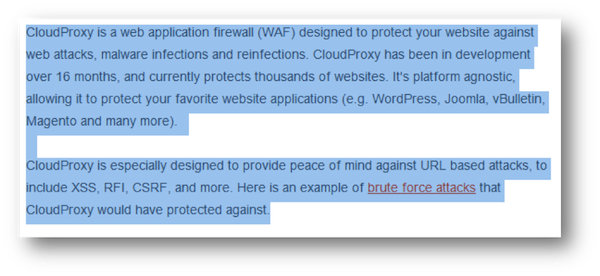
I’m not a techie person by any stretch, so terms like “web application firewall” and “platform agnostic” are lost on me. But, what I did understand was that CloudProxy would protect my WordPress, Joomla, vBulletin or Magento website against attacks, malware infections and brute force attacks (suffered through one of those!).
That was enough to get me to click to the site for more information.
The call-to-action was a mention that this offer was only available to Sucuri customers for the time being, that it had a free trial and a special price. The button copy read, “Get CloudProxy Now.”
When I clicked, I landed on a page asking for my Sucuri login. (Makes sense being that this is for existing customers only.) After entering my user name and password, I was taken to a short page that gave additional information.
The landing page did not repeat what was in the email. While it still had a lot of technical info, it also did a decent job of presenting benefits that average website owners would recognize. It also explained a bit more about how the service works.
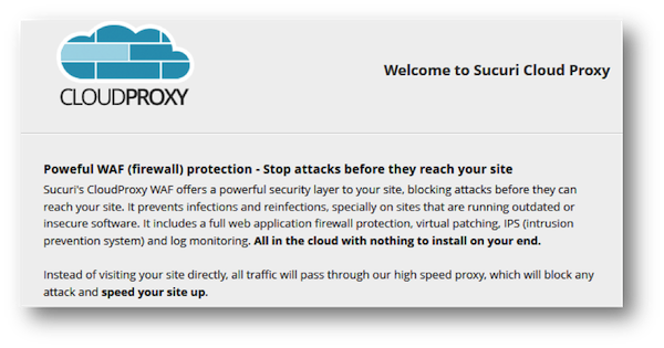
While I didn’t buy, I did send the info to my technical advisor and asked her if she thought this was something I needed.
Bedding Sets
As I was searching for a new comforter for my bed, I came across this PPC ad on Google (which was the trigger for this campaign).
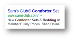
The headline is what I didn’t like. “Sam’s Club Comforter Set”? Do they have their own brand of comforters? That stopped me in my tracks… and not in a good way. I was confused, and – even though the copy was fine (liked the “members’ only prices” bit), I was going to click a different ad. Then I decided to give it a try.
What I saw first was a banner ad that would take me away from the category page I landed on. (Not good if you want people to shop.) Below that was some pretty elementary copy that repeated itself. Under the copy was another banner ad (for snacks… how does that relate to bedding?) that would also take me away from the page where I might make a purchase.
In fact, everything above the fold would actually prevent me from shopping, instead of encouraging me to do so. I saw no products above the fold. (Also not a good thing if you want people to shop.)
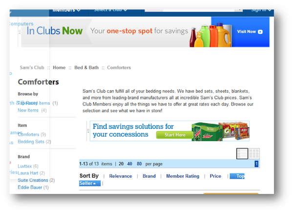
The PPC ad and landing page could have been more connected, and the layout of the landing page should have been geared more toward converting on-page visitors, instead of selling memberships and snack foods.
Weight Loss
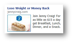
The trigger for this campaign is a Facebook ad. The copy got my attention, especially with the price point of $15 a day for all three meals and a snack.
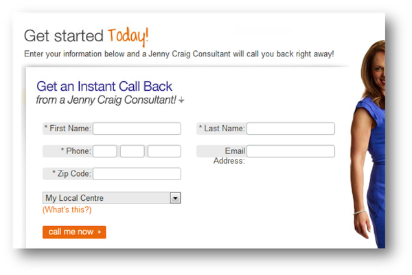
The landing page, however, turned out to be little more than a form. No additional information. No nothing. Just fill out the form and they’ll call you. There’s a big leap from a PPC ad to committing to a weight-loss program. I, for one, would need more details before I even wanted to talk with a consultant.
Landing pages come in all shapes and sizes. While I can express my opinion about these campaigns, at the end of the day, the only thing that can qualify their effectiveness is their conversion rates.
What do you think? Would any (or all) of these work for you?
Disclaimer: The opinions expressed in this article are strictly my own. Each website has full copyright to its material. Examples used in this blog post are in accordance with U.S. Copyright Office’s Fair Use provisions.
If you found this post valuable, others might, too. Please share (below) on your favorite social media sites. Thanks!



Ha ha! I followed the logic perfectly – new comforter for your bed, eat some snacks in bed, gain weight & need Jenny Craig. Seriously, thanks for these reviews they are very helpful and give me much to think about.
LOLOL… well, not quite. There are so many different types/style of landing pages that I’m like a kid in a candy store.
I enjoyed your article and will be looking more closely at landing pages from now on.
I can see that the best landing page, while not perfect, is the Securi one. Now if only they hadn’t used tech-speak.
Thanks Sharon. Well, as I said, I’m sure Sucuri is writing for a split audience of website owners and website developers. I wish they’d toned down the tech speak a bit, but I do understand why it’s there.
I agree with your observations on #2. If I’m shopping around, I want to be able to easily find my product and the details that will help me make up my mind. No pictures or prices of bedding above the fold? I’m likely to click the back button before I try to scroll through unrelated ads.
Exactly, Faith. I’m the same way. I tell my ecommerce clients all the time that they need to have images showing above the fold on their category pages. People come to ecomm sites to shop so they need to see products immediately.