 Selling artistic products can be a challenge. Much of what brings a site visitor to the point of purchase is sheer personal taste. That’s what made this particular web page review so interesting.
Subscribers of my Marketing Words Newsletter get the chance to enter their sites into a monthly drawing for a review. (Just reply to the newsletter with the exact URL you want entered.) Each month’s winner gets reviewed by my team of experts who offer ideas and point out issues that might require fixing in an effort to bring about improvements.
Here’s what the panel had to say about this issue’s winner. Please note that the reviewers do not see each other’s comments when compiling their recommendations.
Suggestions from Kurt Scholle, WebsiteSuccessCourse.com
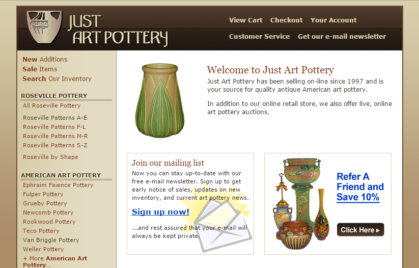
I like the domain name for your site. It’s very specific, but I think you would also benefit from a positioning statement that defines your value or unique benefit. I like the short header, which brings more site content up the page, but the secondary navigation being in the header leaves little room for the positioning statement like “Investment-Quality Art Pottery,” that you have in the footer. You might put the positioning statement on the same line as “Just” in a font that is slightly smaller and maybe a pretty color. Then if you shorten the secondary NAV labels to “Cart – Checkout – Account – Customer Service – Newsletter” it would fit in the header.
I might also recommend putting the primary NAV bar just below the header with drop downs, if needed. Labeling is important and prioritizing from left to right (or top to bottom if you keep the vertical NAV bar) is important. You might be able to use simply, “New,” “Sale” and “Search.” You could put the Roseville patterns in a drop down, if you like, but is there an advantage? A link to the Roseville main page might be sufficient, unless you think most of your visitors would know the pattern, such as “Florentine.” I think you can do the same with everything under American Art Pottery and European Ceramics and I’ll explain why below.
If you move the vertical NAV to a horizontal NAV bar just below the header that would allow you to use that left sidebar for something else, like featuring your newsletter or Refer-a-Friend promotion. I would also add a testimonial above your Customer Sure graphic. Your mailing list CTA and Refer a Friend don’t really belong in the main space. Your products do. Promote main paths to your site instead, such as New Additions, Sale Items, Roseville Pottery and American Art sections of your website. The Home page serves as kind of a table of contents for your site and the job or your site is to sell quality pottery.
Google likes to see About and Contact Pages on the site, so I would include links to those pages in site NAV, if possible. I see that they are included in the footer links. They like the address on the page and in the footer is fine. And studies have shown that having the phone number prominently displayed improves sales. Most will include it on the right side of the header, but you may have some choices if you leave the secondary NAV there. Maybe the secondary NAV needs to go elsewhere?
Karon knows better than I, but please don’t use “Welcome to my website!” anywhere on a website. Nobody cares. Instead put a slogan or benefit that people will resonate with in the 5-8 seconds they will spend on your site before deciding whether to hit the back button, find a snack in the refrigerator or watch “The Voice.” For people looking for products, services or solutions, they need to immediately understand that you are what they are looking for. “Welcome” does not support that.
I would like to see a little more color on the site. 2-3 shades of brown needs more pop. It may be that you intended that the pottery provide the color and interest, which makes sense, but the Home page is a little dull.
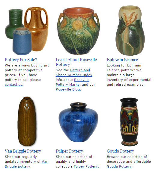
 And narrow. The header is only 756 pixels wide in a day when 1024 or 1280 pixel width is acceptable and supported on most monitors and browsers. Making the site wider will allow you to move more information up. I like having all Home page content above the fold, if possible. But you might put the 4 primary paths up and then put the Ephraim Faience, Van Briggle, Fulper and Gouda links below that on the page.
Building an email list is one of the best marketing tactics around, but people are stingy giving out their e-mail addresses, despite you saying “…and rest assured that your e-mail will always be kept private.” Give them more incentive that you are offering unique value by saying something like, “Sign up for Art Pottery Today for Preferred Customer notices of new items and special pricing. Each month, learn the stories behind art we offer.” What’s up there now is rather pedestrian in my opinion.
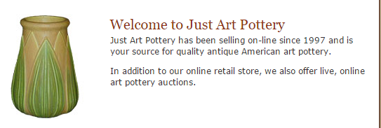
The copy under your Welcome to Just Art Pottery headline is, too. Nobody really cares that you’ve been selling online since 1997 or that you do live online auctions. What can you do for me today? What is your Unique Selling Proposition?
If you link from the Home page to pages like All Roseville Pottery, please consider providing the visitor with information about the brand, including the history. Add more context than just listing pieces for sale. Testimonials on these pages would work well too.
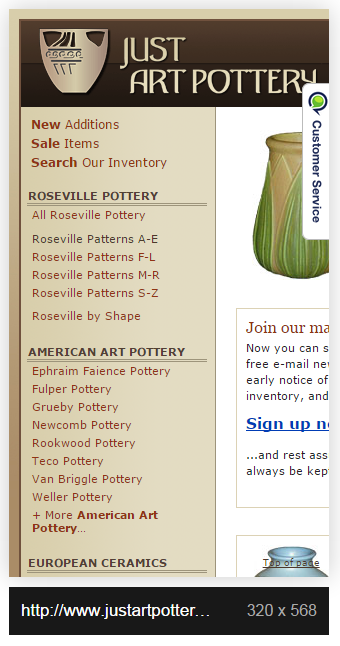
Your site is not optimized for mobile. 50+% of Internet traffic today is from mobile devices, so you should use a “responsive” or “mobile-friendly” theme. You can see what your site looks like on many devices using Screenfly. For instance, JustArtPottery.com looks like this (right) on an iPhone 5.
I will enjoy watching your evolution online and I hope our suggestions will help. Here’s to a prosperous new year!
Comments from Justin Deaville, Receptional Digital Marketing Agency
As I have mentioned in previous posts, I am managing director at Receptional, a UK-based digital marketing agency. Before we start a campaign for a new client we draw on our experience to evaluate the effectiveness of the site’s existing marketing. We have completed healthchecks for hundreds of client sites and, below, I have listed some of the key assessments we make.
One of the first things we look at is the site’s on-page SEO. Is the site well optimised for search engines? Is it targeting relevant keywords?
On-page SEO
You probably already know that search engines want to provide the best possible results for their users. So it is important to ensure your website’s content is relevant to what people are searching for. Adding keywords to your pages is the first step. We’d want to focus on the most important page elements: the titles, descriptions and headings.
Nowadays, many sites are well optimised. But, where we feel there is room for improvement we would undertake keyword research to ensure that we are targeting the most profitable keywords.
We would rewrite the website’s titles and descriptions to make sure that each is of an appropriate length, reads well and targets the most appropriate keywords.
At the moment, the keyword you are targeting in the title of the home page of your site is:
American Art Pottery, Roseville Pottery, Rookwood, Weller, Van Briggle, Arts and Crafts Accessories – Just Art Pottery from Just Art Pottery from Just Art Pottery
You can see the title in Google’s listing:

That’s way too long and you’re trying to cover too many subjects. You should really be thinking of something simpler that better expresses what you do.
Keywords such as ‘Rookwood pottery’ belong on your category pages, not your home page. They would be much more relevant on a page that is all about Rookwood.
Also each page on your site should have a unique title. You have lots (hundreds) of duplicate titles, which won’t help Google to know which pages are important.
Similarly, your pages descriptions don’t sell your products and services effectively. The descriptions appear in Google’s listings and should be written to encourage visitors to click through to your site.
At the moment, the listing isn’t very appealing:

It would be better to let searchers know about your business – why do you stand out? And why should the reader click on your listing? Including a ‘call to action’ is likely to increase the number of clicks you get.
Site indexing
It looks like there may be an issue with the way the search engines index your site.
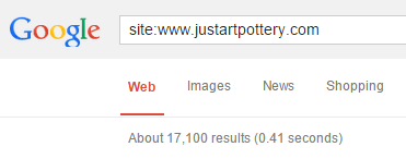
Google sees 17,100 pages:
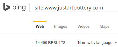
While Bing sees fewer pages, 14,400
I would suggest that there are actually far fewer real pages on your site. The search engines are seeing duplicate versions of some pages. So, for example, Google will be seeing lots of Roseville pages:
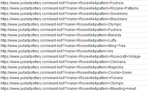
That makes it difficult for Google to know which page to rank in its listings when someone is searching for ‘Roseville.’
 Ideally, you would have one category page that lists all of your Roseville products.
This duplication is a very common problem on ecommerce sites. I would suggest working with an SEO consultant to add some code to the pages. This code will let Google know which pages you want to rank.
Mobile design
One of the key things we look for in our initial healthcheck is whether the site is designed for mobile.
Over the past 12 months or so, most of our clients have seen a sharp increase in the amount of mobile and tablet traffic arriving at their website. While this additional traffic is welcome, we rarely see a proportional increase in conversions or sales. Mobile users aren’t getting the same quality of experience as desktop users.
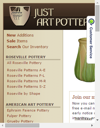
I see that http://www.justartpottery.com/ isn’t responsive, so mobile users will only ever see the desktop site. Which is likely to look something like this (right)…
Clearly, that’s not hugely helpful.
As an initial piece of work we would want to investigate to find out what proportion of your traffic comes from mobile devices.
Some of our clients are seeing more than half of their traffic coming from mobile devices. And if you’re seeing 20% or more of your traffic coming via mobile or tablet, I would investigate the costs of developing the site so that it is responsive (ie, the layout changes for mobile users).
You can see how desktop and mobile visitors are behaving on your site by logging into your site’s Google Analytics account. Simply click on Audience, then Mobile in the left-hand sidebar:
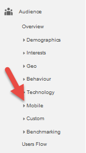
Should you find that your site isn’t delivering conversions from mobile visitors, we would want to set up a mobile version of the site.
For users who have an existing mobile site, we would want to review the mobile site and make recommendations about how to improve users’ experience. Often, some simple changes to the marketing messages and screen layout can dramatically improve conversion rates.
I hope that’s a helpful overview of some of the factors we consider when reviewing a site for the first time.
Suggestions from Me! Marketing Words Website Copywriting
When it comes to website copy, you have to find balance between what your site visitors want and what the search engines require. Because of Google’s advances in technology over the last few years, it has actually become much easier to write copy that appeals to customers and engines without having it sound forced or stiff.
The largest bit of text on the home page is your headline. Think of your own online shopping experiences. Your eyes are flittering around the page at the speed of light, you have dozens of other sites you want to click to before making a decision and – so far – none of the sites you’ve been to have made a memorable impression.
I suggest foregoing the overused “Welcome… we are your source for {fill in the blank}” and offering customers something that engages and entices them. What is different and/or better about your site that they won’t find on any of the other sites they have visited? Maybe you have more rare pieces to offer. Perhaps your prices are lower than the competition. Maybe it’s that you custom source what clients want or that you buy other people’s art. You would have to decide what your most unique competitive advantage is. Once you know, turn that into your headline so that shoppers don’t just glance past your copy, but read it and think, “Wow! I need to spend some time on this site.”
Your first paragraph could also use a massage. While this is good information to know, people likely won’t care about the year you started until they are closer to a buying decision. (You also need to watch the consistency of your spelling. You have “on-line” and “online” use here.
The copy that leads visitors to your various category pages is rather generic. The first one (for Ephraim) is the best of the lot. The others don’t give any detail or enticement.
What about your Van Briggle pottery is so great? Why would I want to buy from you instead of all the other choices I have available? Do you have pieces from earlier time periods or do you offer a continuous selection of popular art that can be hard to find?
I have no idea if this is an accurate statement or not but, for the sake of example, you might say something like, “A constant supply of hard-to-find Van Briggle pottery makes every visit an antique collector’s dream.”
I question the positioning of your newsletter signup announcement and your refer-a-friend box. If those are the two actions you want visitors to take the most then leave them where they are. However, I would think that you would prefer people shop for and purchase pottery. My suggestion is to move these elsewhere (perhaps in the sidebar) and rearrange the other items so that they are aligned on the page in order of importance.
My guess is that the links to your category page would come first followed by the “Pottery for Sale” and “Learn About Roseville.” As it is now, the page seems to be upside down.
Please do come back to the blog and let us know if you make changes to your site and what improvements you see.
Need help making your site reach maximum performance? Karon, Kurt and Justin are available to help through consulting and a variety of services.



I really enjoy reading these reviews because I learn so much. It’s interesting to see common themes among reviewers and the different points of view, such as strategy, SEO and content.
It might be cool to include a response from the site owner. I’d love to hear their feedback to these recommendations.
I do, too. It’s a lot of fun to find little tweaks that can help website owners convert better, rank higher and make more sales.