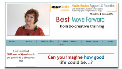
 About once a month, my team of experts and I get together and thoroughly pick apart a web page from one of my Marketing Words Newsletter subscribers. (With the site owner’s permission (and blessing), of course.)
The goal is to offer extensive ways to improve rankings and conversions. During the process, you can also look over our shoulders at techniques that may help bolster the performance of your site, too.
This month’s candidate is Jean of Best Move Forward.com.
As a reminder, the expert panel does not discuss the page we are critiquing. Each of us looks over the page and points out the good and bad we see. Then we offer suggestions for improvement.
From Jill Whalen, High Rankings
- Why is there an Amazon ad right at the top of the page to take people away from the site? (If it were specific to a book you wrote, that might be okay.)
- First words I see are “holistic-creative training” which I have no idea what it means. What exactly do you do? No idea from the first screenful. Lots of scrolling before I ever see the “meat” of the site.
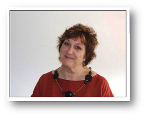
- No name associated with the photo at the top. Presumably you want to brand yourself?
- Rather than listing questions about the potential client’s life and then giving the benefits on how you can help, it might be better to ask the question, then right after it explain how your services will benefit.
- Waaaay down the page it explains what Best Move Forward is and it talks about “we.” Is it more than just the one person in the photo at the top? If so, why use the photo to make it appear as if it’s a solo coach? If not, then use I. (Seems you use both in the content so it’s unclear.)
From Kurt Scholle, Web Asylum
The first thing I saw was the banner for Amazon at the top of the page and I thought the site was about a book. Then I realized it wasn’t and found the banner distracting. That’s a primary place to place a banner, but I would take it out of the header and place it above the header or in a sidebar if generating passive income from the site is a goal and there is sufficient traffic to warrant it.
The top left corner of a website is prime real estate. For years, developers have placed a logo there, but even more recently some savvy marketers have put their email opt in there. The image of the woman means nothing to me and she isn’t even identified. I might crop the image and use it lower on the page, especially if she is part of the brand.
That would allow for making the header thinner, and move more content above the fold. Making the page wider might help too.
I looked at this page on 2 different monitors. On the first one, the fold comes about half way down the image of the guy jumping into the water. On the 2nd one, I can see down to “…to get up each morning with joy and anticipation of your day ahead?”
I think too much page real estate is taken up with that question and the picture. Maybe that question should replace “holistic creative training?” The you could move the 3 questions (Would you…Are you…above the fold.)
But even then I would like to see the benefits of what you can do for me, ALSO above the fold. People need to get a sense when they land on a page that it is the solution they are looking for. This page does not accomplish that. I’ll bet the time on the page is low and the Bounce Rate is high. I think you can improve the conversion rate for email signups too.
Your ‘benefits’ are “My promise to you,” and they are more like features than specific benefits. “Listen to you?” “Be your biggest supporter?”
I’d rather see something like;
- Develop your customized Personal Mission Statement.
- Teach you 5 daily habits that will add energy to your life.
- Show you how to organize your life to be more fulfilling.
- Discuss the 5 key elements that will define your Life Plan.
- Give you my personal list of online resources that will…
I would delete the entire paragraph at the bottom. Rather than what you want for them, I would list what you know your target audiences want. They don’t want to hear what you expect of them. And to say you’re not interested in 90% of their past is just too negative. Don’t say, “What I offer.” Instead answer what’s in it for them.
I like the idea of “30 Powerful Questions,” but instead of a download, I think there is value in sending them one lesson per day. That way they will be reminded of you over a month. Each daily lesson should have a format that includes a call to action, like signing up for your paid coaching. If not your coaching then a cross-sell.
Instead of saying “30 Powerful Questions to get you thinking about your life!” I might make it more specific and benefit-rich. “Sign up for your FREE 30-Day Self Evaluation! Each daily lesson will give you insights that will help you improve your life.” Or will “make your life healthier, happier and stress-free.”
Heck, I’d sign up for that in a heartbeat!
You’ll find Kurt designing websites over at WebAsylum.com.
From Justin Deville, Receptional.com
When looking at a site, I’ll often start with the site plan, and look at the navigation. A clear, logical site structure is important – for navigation and search engine optimisation. On most sites, the navigation appears at the top of the page. That’s where visitors will expect to see it, and I’d question why the navigation appears where it is.
Also, the navigation is split, with the ‘About Me’ and ‘Contact Me’ links at the top of the page, and the rest of the navigation lower down. Instead, I might put all the navigation together, so that it’s easier for visitors to find.
I’m also interested in visitors’ first impression of the page. What stands out?

There’s a photo, an advert and a strap line.
The photo is clear and approachable. But, it doesn’t explain what the site does.
The advert also attracts the eye, particularly because it’s the only part of the page that moves. Clearly, it’s great to get revenue from having ads on the site, but there’s a danger that by putting this ad in such a prominent position, visitors are taken away from the site as soon as they arrive. I’d ask whether there revenue the ad generates is worth having?
Finally, the strapline should sell the benefits of the site, or service that’s on offer. I’m not clear what ‘holistic-creative training’ is, or how it will benefit me. Of course, I may not be part of the target audience, but the benefits should be as clear as possible – this is a key selling opportunity. Any site visitor should be able to tell what the service’s main benefits are within a second or two of landing on the page.
I’d then ask what the main objective of the page is. In this case, I’d suggest that there are two main objectives. We want visitors to get in touch about scheduling an exploratory session. There is no call to action with that offer. And I feel that’s a missed opportunity. I’d definitely add a call to action: that might be an email address, a phone number (or both).
Another area I’d look at is the secondary call to action, which encourages visitors to download a free report. This does many things well, it’s short, clear, and simple.
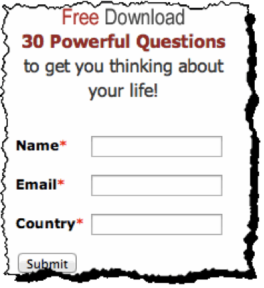
I might make the Submit button larger and add some colour so that it stands out more. And I might change the text – to something like ‘Download now’, which is more relevant to the offer.
Also, I’d question whether it’s necessary to know the country of the visitor. I’d take any opportunity to shorten a form, as that’s likely to increase the response rate.
Finally, it’s worth mentioning that I like the simplicity of the page. A clean white background is great. Big bold, pictures work well. There’s a call to action in a prominent position. That’s all good.
Best of luck with the redesign!
Justin Deaville is Head of Search at internet marketing consultancy Receptional.com and was previously chief executive officer (CEO) at Wordtracker.com.
From Me! Owner of Marketing Words Copywriting Agency
I’ll start out by saying that Jean is a relatively new student of my Step-by-Step Copywriting Course so – for her benefit – you’ll see me reference sections of the Course she needs to pay attention to. She’ll be able to use this information as she implements what she learns from the Course.
Jean, like so many others, has the three most common website mistakes on her home page. We’re about to clear those (and others) up!
SEO Tags & Copywriting
The page has some SEO issues that I think stem from a lack of knowledge about how SEO works. (Jean, Module 10 covers this in depth so go through it again for detailed help on how to fix this You can also get my new Writing With Keywords video series to help you, too.)
There are lots of keywords stuck in the keyword meta tag (which has no bearing on your rankings), but only 1 of these is in your actual page copy. In order to optimize a page, you have to use the keywords in the copy as well as in several other places. So the keywords you’ve put into your keyword tag aren’t helping you. No meta tags help your rankings. The meta description tag also has no bearing on your rankings. Google *may* show it in the search results, but it neither helps nor hurts your rankings.
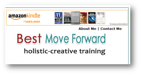
I question the decision to put an Amazon banner at the top of your web page. This just confuses visitors and sends them away from your site. I’d remove that right away.
The text under the banner is not clear. “Holistic-creative training.” What does this mean? What type of training? It doesn’t give me any idea about what you offer. (If you haven’t already, you need to review Module 6 about headlines and be sure to print out the worksheets so you can come up with a better alternative than this.)
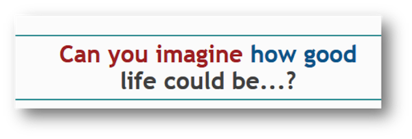
The headline “Can you imagine how good life can be” may be relevant *if* I understood that this was a life coaching website. You have just a few seconds to capture visitors’ attention. If I clicked from a Google listing for life coaching and saw the top portion of this page, I would not think it was about coaching. I would most likely click away.
 You need to define your unique competitive advantage (UCA) which is detailed in Module 2 of the Course. There are 28 ways listed along with worksheets, etc. you can use during the development process. This will set you apart from other coaches and help visitors understand how you are the obvious choice for them.
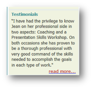
Nothing in the copy talks about coaching. The only mention of coaching is in a testimonial in the sidebar. Testimonials are good (so are the other types of proof of performance outlined in Module 7). You may want to add more trust factors.
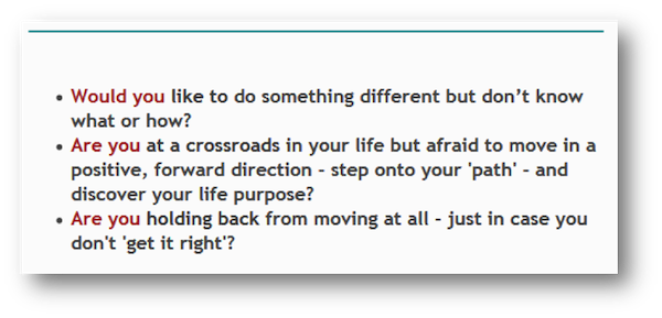
I like the questions in the first three bullet points. I think they are thought-provoking and engaging. But… they need to fall in the context of coaching.
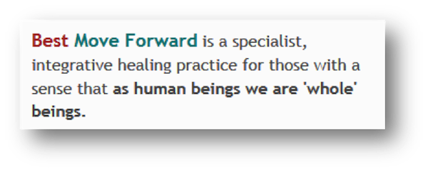
This section of copy talks about a “healing practice” not coaching so there is some confusion there as well. Also, “Best Move Forward” is not a specialist… YOU are the specialist 🙂
Best Move Forward is a specialist, integrative healing practice for those with a sense that as human beings we are ‘whole’ beings.
You are saying, “we.” Is there a “we” or should it be “I”?
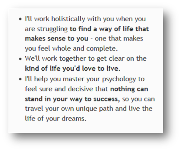
I like the end results you show after the quote by Helen Keller. (Although I think the quote could be removed.) You may want to make them more customer-focused by starting the bullet list with the sentence: “I’ll help you:” or “Together we will:” then you can begin the bullets with action benefits like “Find a way of life that makes sense to you…” and “Clearly define the kind of life you’d love to live,” etc.
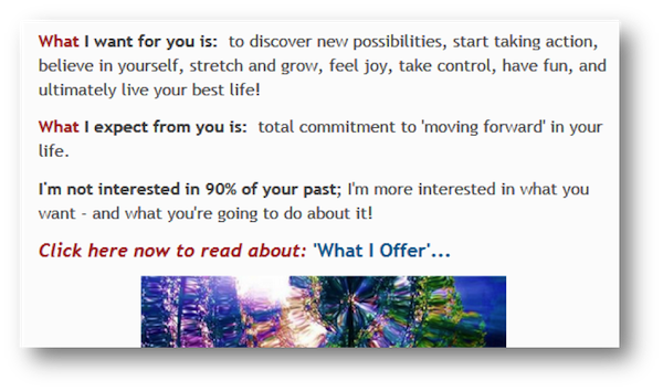
I’m not a big fan of the “What I want for you” section as it puts too much focus on you and not the target customer. You’ll find a lot of info about this in Module 1 of the Course.
 As your call-to-action, I would change “What I offer” to “what you’ll gain” or something similar so that it is customer-focused, not company-focused.
There is a picture of a smiling woman at the very top of the page. Who is it and why should I care about her? 🙂 At some point, you’ll want to introduce yourself even if it is briefly. You can then link to the About Me page with all the details.
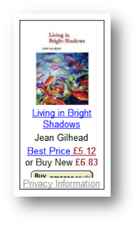 If you’re going to have an Amazon ad for your book, you need to explain that it is your book. Otherwise, visitors will think you just have arbitrary ads on your home page.
Jean, you’ve got a LOT of help available in the Copywriting Course and with your free access to the private Facebook group. You need to make time to go through all 10 modules, print off the cheat sheets and worksheets, and get started making awesome changes!
Karon Thackston is a Certified Landing Page Specialist. Looking for website pages that rank well and convert even better? Contact Karon today for landing page copywriting and start getting results.
If you found this post valuable, others might, too. Please share (below) on your favorite social media sites. Thanks!


Karon,
Thank you for posting this article. It was extremely helpful to read the critiques since I know that almost all of them apply to my landing page as well.
Randi
Excellent! Glad you got some good tips to use.
I found this review very helpful, but so are the other reviews that have been done. Thanks for doing this as it really helps me out with my website too.
You are very welcome, Kim!
Hi Karon
Thank you very much for arranging all this invaluable feedback to my site. I agree with all the comments (I was never really happy about putting the Amazon link at the top but it was suggested to me that it would be a good position by someone whose advice I respected). The website was originally put together a few years ago by a so called ‘expert’ company and I’ve tweaked it around ever since, but it has never brought me in much in the way of work – now I can see why! It’s time for a overhaul!
Again, thank you.
Warm wishes
Jean
You are most welcome! Thank you for being a subscriber. Remember to go back through the modules of the Copywriting Course and use the worksheets and other tools so you can get the results you’re looking for. And, of course, you’ve always got access to the private Facebook group, too,if you have questions. 😉
Hi, Karon. In the SEO industry, a lot of people talk aout content marketing for drawing traffic and rankings. Do you consider content marketing the same as copywriting (which has been around long before the internet), or is copywriting a different strategy from content marketing altogether?
Hi Gina. Content is informational (articles, blog posts, videos, podcasts, etc., etc.) Copywriting is persuasive/sales oriented. It is designed to get someone to take some sort of action like purchasing from a site, contacting the company for more info, requesting a brochure, asking for an appointment, subscribing to a list, etc.
Both have been around forever. Copywriting started in the 30s and 40s (depending on who you ask) and content marketing got its start with smart advertising reps landing guest articles for their clients in local papers, magazines, etc. As with most other things marketing, both copywriting and content marketing have morphed to the Web over the last 15 years or so.
How very interesting. Sometimes I think the lines get blurred online, but thank you for making that clarification.