There are millions of website owners/managers online with web pages that simply aren’t working for them. They have no idea why and it’s a constant source of frustration. That’s why I decided to hold a drawing once a month for subscribers of my Marketing Words newsletter.
For every winner, my team and I <lovingly> rip apart their page in an effort to provide constructive criticism that will allow them to make changes and see better rankings and conversions.
This month’s page is on the Body Bliss Central site. Even though our experts don’t communicate with one another about these reviews, this time they all had very similar suggestions to make.
Read on and see how your site can benefit from the advice given to Body Bliss Central.
From Justin Deville, Receptional.com
Most businesses don’t sell to about 98% of their site’s visitors. Most of our marketing is incredibly ineffective.
Our challenge on this sales page is to encourage visitors to click on the ‘Add to cart’ button.
When faced with a challenge like this my first question is: how many of our visitors are converting at the moment? Once we have a baseline figure we will try to improve it.
Using analytics software such as Google Analytics, it is possible to measure how many visitors your site gets, and how many convert.
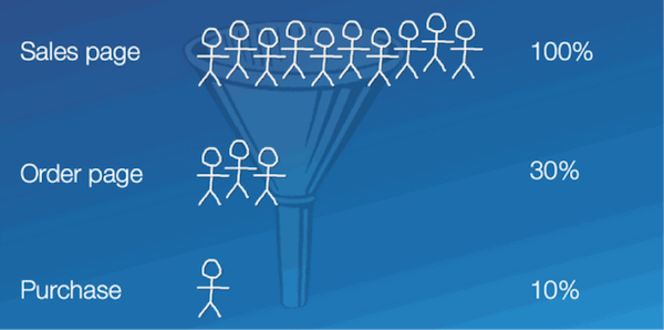
In the over-oversimplified example below we’re tracking visitors who go from our sales page, then move on to the order page and buy.

If 10 people reach your sales page, 30% make it to your order page, and one makes a purchase, we’d say that your conversion rate is 10%.
More of your visitors will convert if they like and trust you. The aim of this page is to convince readers to like and trust you – and to overcome any potential objections they have to making a purchase.
In many respects the page works well. It has a single column design, with few distractions, which is likely to aid conversion rates.
The fonts are clear and easy to read.
You break up the text using bullets – which makes reading easier.
There are calls to action throughout the page, which again will help conversion.
At my digital marketing agency, Receptional, we regularly test changes to sales pages. And there are several suggestions I’d like to test, which I believe will help conversion:
- Add testimonials. The weight loss market is one of the spammiest industries on the internet, so I’d want to see real people talking about their experience of working with you. Ideally, I’d want to see a video or a photo of named individuals.
- Add branding. For the same reason, I’d like to see your brand on the page. I want to know that you’re proud of your company and its products. Adding a logo to all of your pages helps project a more consistent and trustworthy image.
- Finally, I’d like to see a call to action ‘above the fold’. It should be clearly visible when I first land on the page. As a new visitor, it should be clear what action you want me to take.
By adding these elements, I’m sure conversion will increase. But, it’s always wise to test.
Justin Deaville is Head of Search at internet marketing consultancy Receptional.com and was previously chief executive officer (CEO) at Wordtracker.com.
From Kurt Scholle, Website ROI Guy
First, I’d like to see a graphical header on this page. Images can have a powerful effect emotionally, as well as signaling the visitor what the page is about. I would make it short and include the branding that we don’t see until the green and purple image on the left below the fold. That image could be used in the header, but smaller.
Second, when I land on the page, I don’t really have any idea what it’s about or whether it’s a solution I’d be interested in. The only image I see is the pill bottle and that signals the wrong message.
The “What If Your body Is Not the Problem…” headline misses the mark, I think. Consider a pre-headline, Headline and post headline. Your current headline might be suitable as the pre-headline, but your headline needs to be a larger font – maybe blue, something like, “Take your First Step to Body Bliss 101 – a 5 Part Course.” The post headline could be something like, “Step-by-Step Private Coaching & Support Community.”
I would also use sub-headlines throughout the page content to draw attention to the benefits and to give page skimmers an idea what it’s about. If they don’t think it’s the solution they need/want, then they’re off to other sites, never to return again!
You begin the content by defining the problem, but it needs help. I might add a sub-head, like “Does this sound like you?” Then I would indent the bullet points and bold them. The checkmarks are nice, but they might pop with more color. I would do the same with the You’re Over It! Bullets.
An appropriate image next to these 2 bullet lists would help, such as Before and After images or Frustrated vs. Happy.
I don’t like the “The Answer – Well My Answer” title for several reasons. 1st you don’t really reveal any answer. The content might be fine in a supporting role lower on the page. 2nd I’m not sure ‘your answer’ is enough proof, especially without more details. Case studies and stories are great ways to get visitors to resonate with you, and if that’s your intent, then I would tell your story here. I would also start putting testimonials in a column on the left of the page. Your story and theirs adds social proof.
Maybe share your most common client situations and solutions from your clinic instead? That would be more powerful and position you more as an authority. Tell us a little about your clinic, experience and qualifications.
You promote a 5-part course; I would define what each part is and why they are important.
Then, I would revise the “Here’s what you’ll get…” bullets to be shorter, succinct and benefit-rich. The first point says you get a private email every day (not necessarily attractive), then you mention more emails of “reading and script.” Just how many emails will I have to read?
I would not include eye opening facts as a benefit of the program. You may include those in the course, but facts like these might be more beneficial on this sales page.
I have no idea what an ETF Tapping script is or why I should be interested.
I would promote the members-only forum, which seems like an attractive benefit. Tell us more about it. Show some screen shots? It shouldn’t be the last item in the bullet list.
One other suggestion is to set up an auto-responder program to stay in touch. You could offer a daily tip, affirmation, mind-blowing fact, link or other resource (Mix ‘em up, if you like.)
2 Questions: Have you defined and documented who your target personas are (you have more than 1), what problems they have and how your solutions solve their problem? Do you blog about those issues?
Have you studied your primary competitors to see how they engage their prospects? What images do they use? What are their Calls To Action (CTA)? What is their message to market mix?
Kurt Scholle blogs about website strategy, Internet marketing and social media at www.Website-ROI-Guy.com
From Jill Whalen, High Rankings
This page seems to be some sort of landing page out of context so I have no idea what it even is. I don’t think I can really comment on it as a page like this – with no navigation or site attached to it – would not be something useful SEO-wise.
Perhaps I’m not in the target market, but every time I see a sales page such as this my first thought is “scam” and I look elsewhere.
Jill Whalen is an SEO Consultant who’s been helping companies with their website marketing since 1995. Be sure to sign up for Jill’s High Rankings Advisor Newsletter for free and informative SEO advice that’s easy to understand and fun to read!
From Karon Thackston (Me!)
I started with a quick look at the search engine optimization (SEO) of the page. It seems you’re targeting the phrase “body image problems,” but I’m not finding any evidence that you’ve optimized the copy. While the term is in the title tag, it is only included once (exact match) in the copy. For a page as long as this one, I’d suggest using it about three times.
Then you’ll want to use the individual words within the phrase several times on their own. I only see the word “body” used, but not the others.
The first thing I noticed when I opened the page is that there is no banner on the page. Maybe you’re going for an old-school sales letter approach, but your copy isn’t formatted for that style so – to me – it looks like something is missing.
While questions are one of the top three types of headlines, I’m not following what you’re asking in your headline and sub-head. These questions just come out of the blue.

What if my body isn’t the problem for what? What if losing weight again isn’t the answer to what? What question do you envision your site visitors asking that would bring about this response?
The sub-head (“Seem Impossible?) comes across as though you’re asking whether your body not being the problem and losing weight again not being the answer is possible.
All-in-all, a confusing start to my visit 🙂
In the first few words, I spot a typo.

I understand your thought process with the copy, but it seems you’re pointing a finger at me, telling me what I think and feel. “You do this and you do that and you think this and you’ve spent that…” It comes across (to me) as if you’re pointing out all my faults. That doesn’t make me comfortable.
<rant>
 Yes, I’m well aware of the people who will tell you that you have to find a pain point and push it … hard! That’s one approach. There are many. I’ll let you in on a little secret … the old saying, “the money’s in the list” is absolutely true. If you sent 1,000 visitors who had never even heard of that particular marketing guru to one of their long, scrolling sites I’ll bet you the conversion rate would tank.
People aren’t buying because the copy is super-awesome. They are buying because they’ve been presold by the marketing guru. They buyers have been on the guru’s list for years and trust them. All they have to say is, “Go buy this,” and their list does.
Does that mean long copy doesn’t work at all? No. Long copy can pull like gangbusters in certain situations, but it is absolutely not the be-all, end-all of online copywriting. Far from it.
</rant>
And since you’ve asked for a review of your page, I’m assuming you want ideas for improvement. Rather than stick to this format and style, I’d suggest shortening the copy, making it more positive and getting to the good stuff much more quickly.
The product you’re selling costs under $20. If you use the F.A.C.E. formula from my Step-by-Step Copywriting Course that helps you determine how long your copy should be, you will see that you don’t need nearly as much copy as you have.
People love stories and yours began to get my attention right about where your logo is.
 I’d use some of that and tone it down a bit. Talk to me, friend to friend, and just take me (quickly) through what happened to you and why you think it might work for me.
I’d also suggest putting a video on the page. Because weight loss is such a scam-filled industry, people are going to connect better with you if they can see you.
You could cut this page copy down by 2/3 and format it more like the world’s #1 bookseller (Amazon.com) or revise the copy and go for something along the lines of this conversion optimization specialist’s new book. Either would give you options for a site that performs better.
In addition, I didn’t see any proof of performance. That’s vitally important especially in industry such as yours. Add some testimonials, trust symbols or other elements that will boost confidence.
If you found this post valuable, others might, too. Please share (below) on your favorite social media sites. Thanks!


Great insights from all the contributors! I’m reminded of Dr. Flint McGlaughlin’s assertion that a landing page has about seven seconds to answer three questions in the visitor’s mind: 1) Where am I? 2) What can I do here? 3) Why should I do it? It’s part of his whole “Clarity Trumps Persuasion” theory…
http://www.marketingexperiments.com/improving-website-conversion/claritytrumpspersuasion.html
…and — while marketing words are important, of course — that time constraint highlights the impact of the “visual clues” you include in the pages ATF space.
This is one of my favorite articles of all time! I am a big Marketing Experiments fan.
I quote that line … “Clarity trumps persuasion” frequently 🙂