The more we look at our own websites, the more we get blinded. Seeing it from the inside looking out gives us a distorted impression. The only true way to understand what outsiders think of our sites is to ask them.
I’ve got a volunteer team of experts who help me with the web page reviews I do for subscribers of my Marketing Words Newsletter. If you’re not a subscriber, sign up today and put your web page in the drawing. In the case of this latest critique for CRF Printing, we all pretty much honed in on the same thing as a core problem: a lack of differentiation (among others).
Take a look at what the pros say about this home page and see if your site is making the same mistakes.
From Kurt Scholle, Website ROI Guy
It’s a pretty site and the headline clearly establishes that the company provides printing solutions to specific niches. Crisp with decent graphics and a white background. Nice!
I think you want a headline or sub-headline that asks a question relative to a pain point, such as, “Are you frustrated by print materials that are lower quality or not delivered on-time?” OR “Is your CRF print vendor responsive to your needs?” Or both. You address that in the 2nd paragraph, but I think it should be more prominent and questions will draw the viewer in.
I’d like to see more of the benefits of using CRF Printing. The slider is a good place to put this and I think it would have more impact as part of the image than the text sliding in below. I might eliminate that line altogether to make the slider thinner.
I would eliminate the gap between the NAV bar and the slider and consider putting the NAV bar below the slider. I think most people expect it there.
In fact, I would consider combining the header and the slider with the NAV bar below it. You can keep the header (I might trim a few pixels at the top and bottom) with the animation in the bottom 2/3 of the “new header.”
The 3 paths are an excellent idea, but they need to be above the fold. Make sure they address the solutions your prospects are searching for.
I would move the 5 paragraphs below the 3 paths and you might consider replacing much of that content with bullet points. We know that people don’t really read websites unless they buy-in in the first 5-10 seconds. Bulleted content is more scannable and helps the viewer confirm this site to be a solution for their needs. Sub-headlines, especially if they are keyword-rich, help scannability and boost your search rankings.
The page needs a Call To Action (CTA). What exactly do you want them to do? I see the phone number in the header, but let your audience know why they should call. What about the people who prefer to email? Or what if they are viewing your site after hours? Make it easy for them to contact you.
Get them on an email list. Offer a checklist or white paper in exchange for their email address. The new thinking is to put that in the upper left corner, right in your header. The “lead generation magnet” or “ethical bribe,” as it is sometimes called could also be audio or video. Maybe you can replace one of the paths with your special (opt-in) offer?
You can also offer free downloads of reports with no opt-in required, but make them viral – encourage sharing – but include your contact information and links to something special they need to opt-in for. I’d need to know more about your clients to recommend anything more specific, but if you offer more amazing content that benefits your audience, you will benefit!
Social Media? Engagement online is really powerful and some people prefer it over other communications. I don’t know if you have a Twitter account or a Fan Page, but I’d add a graphical Social Media NAV bar to your header. You might also consider a blog or YouTube channel. It’s great that you have sharing icons, but they need to be above the fold, as well.
Social Proof: Needs a testimonial, possibly from someone or a company people would respect.
Summary:
- The header/slider needs to be thinner – it takes up half of my screen.
- The paths need to be moved up above the fold.
- Offer a CTA (or 2).
- Make it easier to engage you using the media they prefer.
I look forward to watching the evolution of your site. You’re off to a good start and you have many good opportunities!
Follow Kurt on Twitter for additional ideas! www.Twitter.com/KurtScholle
From Justin Deville, Receptional.com
One of my colleagues, Syed Shehzad, has just published an 8-point usability checklist that you can use to check for usability problems on your site.
The checklist proved very useful when looking for potential improvements we could make to http://www.crfprinting.co.uk/
The first question Syed asks is: what’s the objective? What it is you are trying to communicate to your audience? When the intent of the site is clear, it makes it easier to produce content for your visitors.
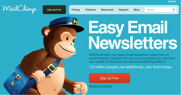
I’m not an expert in this industry, but I’m not at all clear what I’m expected to do on this page. Where’s the main call to action? The MailChimp home page is an example of a really well designed home page (I use it all the time). Just look how clear the call to action is. And look at the main headline: the purpose and benefit of this business couldn’t be clearer:

On the CRF home page, the call to action is less clear. It looks like the main call to action is ‘ACCEPT COOKIES’. Of course, it’s important to comply with the UK’s onerous cookie laws, but you definitely don’t want a message about cookies to catch the eye ahead of your main sales message. You could easily move the cookie message down the page, where it will be less distracting.
I like the fact that the telephone number is clear. It’s great that you’re making it easy to get in touch.
The images you’ve used are attractive, but they are abstract, so your straplines need to convey a clear, simple message: what your business does, and why. At the moment, your message isn’t clear: there’s too much jargon, too few benefits. For example, you mention “Variable-Data Driven Precision Printing”. I’m not sure what you mean, or why that’s of interest.
What is it that makes your business different? Why do you specialise in the medical sector? Is it speed? Security? Your knowledge? Once you’ve understood your key selling points, try to refine the text so that your message is easily understood. You might try fewer images (there are five at the moment; hardly anyone’s going to wait for all five to slide past). Instead of using a series of images would it be possible to try one striking, simple image alongside a heading, a benefit, and a big bold call to action – as in the MailChimp example?
Another point that’s mentioned in the usability checklist is navigation. Navigation is fundamental to website usability. Regardless of what kind of website you have, it is imperative that users are able to find information easily, otherwise your visitors will quickly go elsewhere.
In other words, the navigation should be clear and simple. I don’t think your existing navigation is clear, because I don’t understand the jargon you’re using.
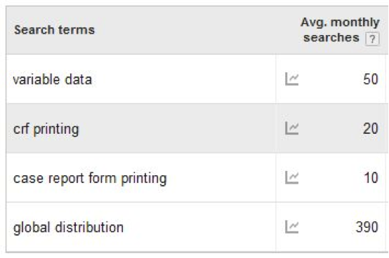
And I suspect that other people don’t use those terms much either. Here are Google’s estimates for the number of monthly searches each of your category keywords attract:

That’s not many searches. Even if you were ranked number 1 on Google for each of those terms you’d be attracting very little traffic.
It’s worth taking the time to research your category keywords. You could use a free tool such as Google, or try Wordtracker’s free trial (their new keyword data is a great improvement). I suspect you should be looking for more popular terms than the ones you have selected.
I have one final question – I don’t understand why your logo is ‘CIS’ when your company name is ‘CRF printing’. As I say, I’m not an expert in your sector, but it struck me as odd. And I’m sure other potential clients would feel the same way.
As always, I haven’t touched upon the many aspects of the site that are working well, just those things where I believe we could make improvements. I hope the feedback is helpful.
Justin Deaville is Head of Search at internet marketing consultancy Receptional.com and was previously chief executive officer (CEO) at Wordtracker.com.
From Jill Whalen, HighRankings.com
Why do I have to accept cookies? The message at the top is scary and makes me think there’s something weird going on. Also, if there’s any content that can only be seen by accepting cookies, it won’t be seen by search engines because they don’t accept cookies.
Title tag is just a list of keywords.
CRF printing, Clinical printing, Case Report Form printing
You don’t want/need to use the word “printing” 3 times as it makes it keyword stuffed.
Meta Description:
"CRF design & CRF printing, Case Report Form printing, variable-data
NCR/plain paper documents for Clinical Trials, based in the UK"
Just a list of keywords (repeating what’s already in the Title tag). It should be a description of what this page (and the company in general) is all about, using a good marketing description that will entice people to click your listing in the search engines.
Content is mainly about you, not what’s in it for me.
CRF doesn’t seem to be defined anywhere.
Jill Whalen is an SEO Consultant who’s been helping companies with their website marketing since 1995. Be sure to sign up for Jill’s High Rankings Advisor Newsletter for free and informative SEO advice that’s easy to understand and fun to read!
From Karon Thackston (Me!)
I usually like to start with the SEO of a page when I do a review. In the case of this page, the title tag simply lists three keyphrases. It seems to be written exclusively for the search engines and not for humans. I’d suggest including something – a word, a couple of words – that differentiate you from all the others on the Google search engine results page (SERP). Why should someone click to your site as opposed to the others they see listed?
I’m assuming “CRF printing” is an industry-specific term that people who need your services will understand, correct?
The meta description tag reads:
CRF design & CRF printing, Case Report Form printing, variable-data
NCR/plain paper documents for Clinical Trials, based in the UK
Again, it may be applicable, but it seems to be just a list of keyphrases and your location. In my Kindle book “SEO Copywriting Flow” I show how to develop a tag set, headline and page copy that create a flow from the search engines to your page.
In short form, you want to develop a message and continue to drip-feed it to searchers a little at a time. Start with the title tag and make it enticing as well as informative. From there, people will want to look down and read your meta description tag which should give a bit more detail.
Once searchers have read both of those, they’ll be primed to click to your site where the headline at the top of your web page will continue the message. Finally, the copy will carry the process through.
I never recommend title tags that read: Keyword | Keyword | Keyword | Company Name. B-o-r-i-n-g and it gives humans absolutely no compelling reason to click.
Keyword Use in Copy
You’ve done a pretty good job of optimizing the copy for keywords. I see that you’ve used exact-match keyphrases as well as incorporating the individual words within the phrases just as I teach in my “Writing With Keywords” mini-course.
I’m not sure if you’re using any synonyms along with the keywords, but you should be. Something to look into.
Target Audience
When we do webpage reviews, we don’t get the background of the company or any other information so – in some respects – we’re doing these blind. It would seem to me, however, that since you cater to biotech pros and others, you’d be dealing with those who make decisions slowly and require a good bit of detail before making a choice.
Headline

The headline seems very matter-of-fact. Granted, you don’t want overly-emotional copy on a site with this target group, but I would try inserting at least one differentiating point in the headline.
Copy
The opening paragraph is good, but from there the copy seems to be rather self-explanatory. Is there anything on this page that you can do which other companies can’t? Or are you saying the same things your competition is saying?
You list a lot of services you offer, but I don’t see much about how it will benefit the client to work with you instead of another firm. There’s a lot of “us” and “we” and “our” and not so much “you” and “your.”
Things like “running smoothly” and “accuracy” are to be expected. I don’t necessarily see those as benefits that prospects would get excited about. What can they get from your business that they can’t get elsewhere?
Proof of Performance
I don’t see any proof of performance on the home page. Awards you’ve won, honors, testimonials, case studies… something to let people know you can offer solid proof that you are as good as you (and others) say you are.
Call-to-Action (CTA)
What do you most want visitors to do after reading through this page? If it’s to call you, in addition to having your phone number in the upper, right corner also include it at the bottom of the page with an express CTA.
If it’s to fill out a web form for a quote, etc., test adding a form to your home page or put an explicit CTA that leads to a form.
All the advice I’ve given here is explained in much greater detail in my two courses: Step-by-Step Copywriting Course and Writing With Keywords.
If you found this post valuable, others might, too. Please share (below) on your favorite social media sites. Thanks!


Karon
For me, the one thing that stands out above all others in these reviews is the question ‘What is it that makes your business different?’.
The web has now made it possible for prospective customers to check out and compare any number of competing businesses. So if you don’t say what’s different about yourself then, in all likelihood, you’re gonna lose out to someone who does.
You are absolutely correct, Kevin! And that’s one of the hardest things for companies to do, it seems.
Too true, Karon – even copywriters themselves seem to struggle to come up with a USP of their own.
(I kinda talk about this in my own blog post in your CommentLuv link below.)
I think it deals with the misguided thought that they have to do all things different or better than the competition. In truth, it only takes 1 thing and that’s enough to sway someone from the competition to you.
Terrific indepth analysis, Karon. Amazing how much of a difference a few seemingly small changes (e.g. button copy or headline) can make!
Thank you Damien. Glad you found it helpful. Yes, I’ve found in numerous cases that making some small changes can have big impact on your conversions/rankings.