When you’re working in a highly competitive market (such as website hosting and design), it is imperative that you differentiate your products/services from the rest. Left without any guidance, people who view all services to be the same will default to price and/or recommendations from friends to make their buying decisions.
With this month’s web page review, our panel of experts advise the owner of a hosting company on how to make his home page better.
Want your web page reviewed? Become a subscriber of the Marketing Words Newsletter and you can enter yours into the drawing.
From Justin Deville, Receptional.com
One of the first questions I ask my clients when we’re reviewing their site is: what’s your objective? What are you hoping your site’s visitors will do?
It’s crucial you have a clear objective, particularly on your home page, which is usually your site’s most important page.
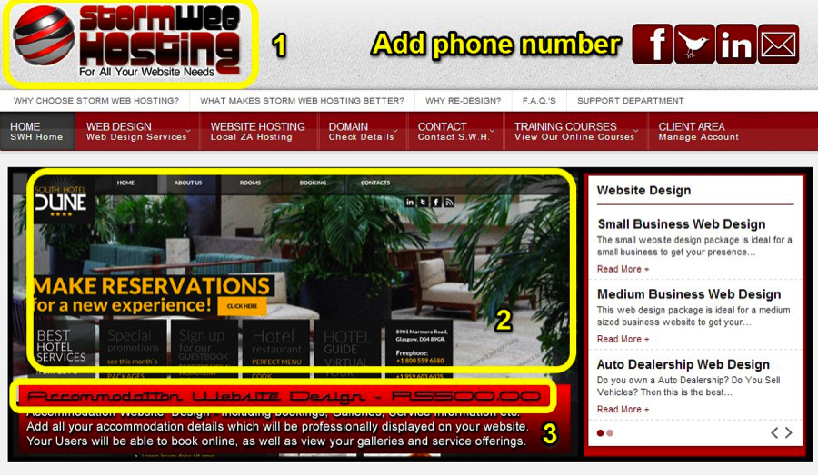
When I look at http://www.stormwebhosting.co.za/ it’s not obvious what action I can take. It would be great to see a clear call to action on the page. You might also want to add a phone number at the top of the page, so that it’s easy for potential clients to get in touch. There’s plenty of space in the header where it would be possible to add a phone number, and maybe an email too.
At Receptional, the digital agency I work for, we have recently had lots of success using call tracking software to track incoming phone calls. Once the software is in use, every visitor to a site sees a unique telephone number, which means it’s possible to track the source of every incoming call. The benefit for marketers is that you know exactly which of your marketing efforts are generating enquiries. You’re then able to invest in the sources of traffic that generate leads.
Returning to the home page, I’ve taken a screenshot showing the page as it appeared on my screen. As I mentioned, it should be obvious what the objective of the page is. Yet, some of the text is difficult to read. The fonts look creative, but aren’t legible. I’ve highlighted the three problem areas in the screenshot below:

It looks like section 2 is a screenshot showing an example of a site the company has designed. Yet, by shrinking the example it’s more difficult to read, so it’s not helping visitors or showing the work off to best effect. Instead of trying to squeeze in an example, it might be better to link to another page where there’s more space to show off the designs. As a replacement it might be worth adding testimonials from happy clients. Testimonials are a great way of proving that your business is successful and highly-regarded.
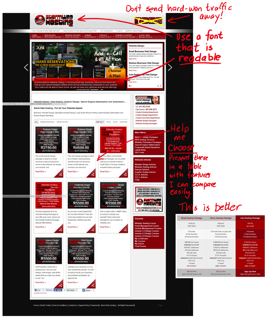
Lower down the page there are similar problems. It’s important that visitors are able to choose the service that suits them best. When we present choices to visitors, it’s likely that we’ll reduce response rates. So, it’s crucial that choices are presented as clearly as possible. Yet the fonts in the ads aren’t easy to read:
 I’d recommend redesigning the ads so that they’re simpler and clearer. I love creative work, but not at the expense of converting visitors into customers.
I also notice that the site’s URL structure is more complex than it need be. Your URLs should be short and simple – so that they’re easy to remember (and link to). Some of your URLs are overly long and complicated, eg: http://www.stormwebhosting.co.za/web-hosting-services/website-hosting-packages/local-south-african-website-hosting-packages/our-top-9-local-website-hosting-packages.html It’s good to have your target keywords in your URL, but more important that your site is easy for humans to understand.
Let’s look at an example from one of Receptional’s clients, a site that sells christening gifts. You can see how the URL of this page shows Google and humans what the likely of the content page will be: http://www.goodheartgifts.co.uk/christening-presents/christening-gifts-for-boys.htm A good, simple structure is: www.domain-name/category/product. For most sites you shouldn’t need to use more than two / levels in a URL. It might be worth looking at your site structure to see if you can create simpler URLs.
I hope those first impressions are helpful.
Justin Deaville is Head of Search at internet marketing consultancy Receptional.com and was previously chief executive officer (CEO) at Wordtracker.com.
From Jill Whalen, HighRankings.com
1. Keyword stuffed Title tag.
2. Keyword stuffed content (website design, web design)
3. Page is way too busy.
4. Very hard to read the information in graphics.
5. Being a hosting and design company mostly means you’ll need other forms of marketing than SEO as the market is much too saturated and competitive.
Overall, the home page is trying to do too much and be an entire website on its own. Scale it back, choose a few main areas to focus on and then drive people deeper into the site for more info.
Jill Whalen is an SEO Consultant who’s been helping companies with their website marketing since 1995. Be sure to sign up for Jill’s High Rankings Advisor Newsletter for free and informative SEO advice that’s easy to understand and fun to read!
Brian Massey, The Conversion Scientist
Storm Web Hosting offers website development and hosting in nicely priced packages.
Wins
They target specific industries: automotive, accommodations, recruiting, and property agencies.
Pricing is given front and center. Good for price sensitive audiences.
Opportunities to Improve
The site is clearly built on a catalog ecommerce template, which may not be ideal for this kind of product.
The home page is designed like an ecommerce category page. This doesn’t work well when there aren’t differentiating images to be scanned.
They put a lot of things on the page that confound and confuse. They even have an ad for themselves on the page. Top navigation is dense, perhaps too dense.
The top rotating header is also very dense, and impossible to read before sliding to something else. Rotating headers are usually a bad idea. Make it smaller, static, and put the information in the body or on the product pages.
The use of red and black almost exclusively don’t tell me what is most important. Calls to action are lost. My eye gets confused. HELP ME CHOOSE should be the mantra of this site.

Brian Massey is the author of the book for website managers called Your Customer Creation Equation: Unexpected Website Formulas of The Conversion Scientist. Get a free chapter and more at http://CustomerCreationEquation.com.
From Karon Thackston (Me!) of MarketingWords.com
Looking at your title tag, it seems to be a bit long. You’ve got two forms of the keyphrase “website hosting” in the tag along with several other search phrases. Your company name is the first word in the title tag. I’d move that to the end. Most people aren’t looking for a particular company: they are searching for web hosting companies in general to see what their options are.
Your meta description tag is simply filled with keywords rather than having a description of the page. I do see that you’ve added an OG description tag which is written as descriptive text, but it appears to only have one keyphrase 🙂 The trick is balance. You want the keyphrases to show Google relevance, but you also want the tag to offer something to entice humans.
The name of your company is Storm Web Hosting, but it seems your home page focuses more on design. That’s a bit of a disconnect.
I’m not able to read the text underneath the pictures in your slider very well. You might want to choose a different font.
I like that you’ve segmented your audience with the design packages at the bottom of the page. However, none of the copy (anywhere on the page) differentiates you from all the millions of other web hosting and design companies online.
You need to answer the question, “Why should I buy from you?”
You don’t need to use the keyphrases as often as you are. As explained in my “Writing With Keywords” video series, Google doesn’t require nearly the level of help they did 5 or 6 years ago. The overload of keyphrases on your home page could actually be hurting your rankings. SEO isn’t about exact-match keyphrases any longer. In addition, repeating the phrases so close together sounds repetitive and rather stiff.
With a few tweaks, you could see great improvements for your home page!
Want to do the work yourself, but need expert guidance along the way? Consider my online marketing consulting services. It’s an excellent way to save money and reach your goals faster.
If you found this post valuable, others might, too. Please share (below) on your favorite social media sites. Thanks!


Great suggestions!
It looks like this website has been redesigned since your initial review. Would you agree that the amount of copy on the new home page is visually overwhelming? I also find the bolding within the body text to be distracting. Do you agree or think there is a place to use it sparingly?
I agree with Faith. I looked at the new webpage and there was just too much to read. Visually overwhelming.
Oh, wow! They did totally redesign it and just put it up in the last couple of days, too. Yes, I do think there is too much copy. I actually like bold text within the copy with limits. Done properly it can help the reader pick out important passages.
For the type of site this is, I’d not recommend keeping that much copy on their home page.