![]() After spending some time on the home page of Beacon’s Glow, the panel came up with several recommendations (individually) to improve the search engine rankings, conversions and overall marketing success of this ecommerce store.
After spending some time on the home page of Beacon’s Glow, the panel came up with several recommendations (individually) to improve the search engine rankings, conversions and overall marketing success of this ecommerce store.
Subscribers of my Marketing Words Newsletter get the chance to submit one page of their site into a monthly drawing. (Just reply to the newsletter with the exact URL you want entered.) Each month’s winner gets their page reviewed by my team of experts who offer insights, suggestions and point out issues that might require fixing in an effort to bring about improvements. This month’s winner is Beacon’s Glow, an ecommerce site selling collectible dolls and teddy bears.
Comments from Justin Deaville, Receptional Digital Marketing Agency
Google is becoming increasingly sophisticated. Nowadays, I wake up in the morning and Google has my day planned for me. It knows I have a client meeting to attend. It knows I’m likely to be going by train. And it knows what time I need to leave if I’m to arrive punctually. If I haven’t left the house in time, Google sends me a message telling me to get a move on.
That’s clever.
But, even though Google is starting to act like a human, it isn’t. Google’s powers are based on computer algorithms. As marketers, we need to feed it information in a logical, systematic way if we’re to take advantage of its marketing capabilities.
Google understands logic. So, creating a well-planned, logical structure for your website is likely to improve your chances of ranking well in Google’s results.
Generally, we’d want to see a site structure that looks something like this – with a home page, category pages, and product pages:
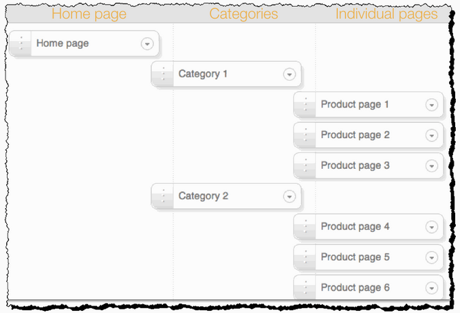
It’s clear from looking at the beaconsglow.com home page that the site follows a similar logical structure. Which is great.
Yet, we can make improvements. The quantity and quality of the links that point at your site are the number one factor influencing Google’s rankings. As a rule of thumb:
More links = better rankings
It’s why SEO consultants like me spend so much of their time building links. 🙂
Yet, for retailers, the picture is slightly more complex. Most retail sites will find they attract links to the home page, yet it’s the product pages that need to rank well if potential customers are to find them.
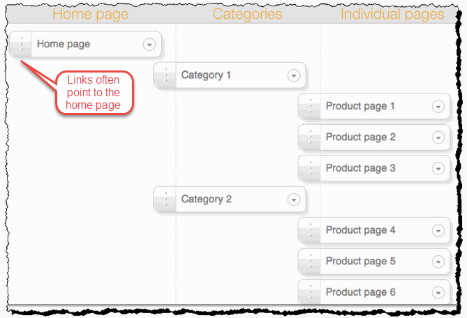
As marketers, we want to build links to the product pages. The easiest way of doing that is to spread the power of the links that point at the home page to other (more *profitable) areas of our site.
Let’s look at an example. Simoney.co.uk is a website that sells name badges. We want its ‘name badges page’ to rank well for the keyword ‘name badges’ and attract lots of traffic.
So, we have created a link from the home page to the site’s name badge page:
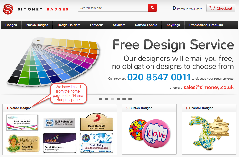
This ‘internal linking’ is one of the most important ways of letting Google know that your content exists and what it’s about. We want to pass the link power of the home page through to the rest of the site. And we do this by creating links from the home page to the category pages and from those pages on to the product pages:
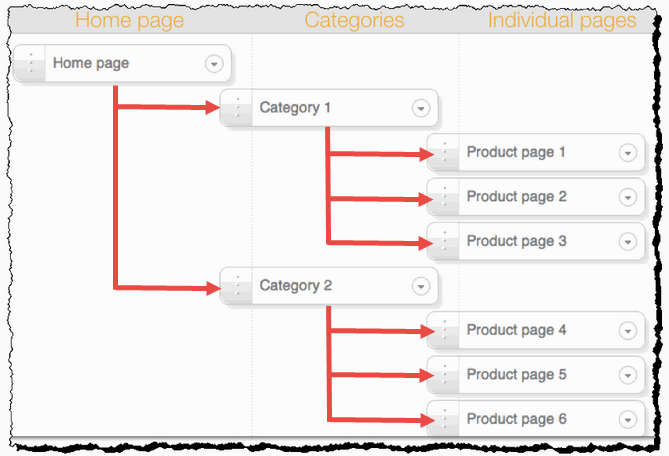
The effect is that the product pages stand a much better chance of ranking well in Google’s results.
You’ll see the same pattern of linking on other, similar sites. For example, Meluba Badges links from its home page to its key sales pages:

These links will help the product pages rank well in Google’s results.
There is lots of good internal linking on the beaconsglow.com home page. But, there is a problem in that there are two sets of site navigation – along the left hand side of the page and at the top of the page. Google only counts the first instance of any link, duplicate links are wasted effort. So I would recommend removing some of the duplicate navigation.
![]()
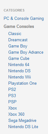
Let’s look at an example of this working in practice. We have another client that sells second hand X-boxes. If we look at the X-box page we can see that there is just one set of navigation links. These help users and search engines find relevant content, but don’t waste that all-important link-juice.
Before removing navigation links, I’d suggest looking in your Google Analytics account.
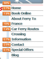
In the left-hand navigation, click on ‘Behavior’, then ‘In Page Analytics’. You’ll be able to see which of your links are most popular with site visitors. You’ll be able to see which are your most clicked links, which will help inform your choices.
This example is from the Ferry to France website and shows that one of the most popular links is ‘Car Ferry Routes’ – we should probably think about making that link more prominent, so that users can find the information they want more easily:
Let’s recap. Your site’s architecture – the way pages are linked together – should be a key part of your marketing planning. It’s crucial to your chances of SEO success. Make sure that pages which attract lots of links (such as your home page and your blog) link to your site’s most profitable pages.
Suggestions from Kurt Scholle, WebsiteSuccessCourse.com
I can figure out what this site is about in just a few seconds, which is good. I like the new products highlighted in the right sidebar. I assume the brands in the left sidebar are familiar to your target personas and that they would want to click those names.
The 3 paths; Our Pledge to You, Free UPS and Free Doll Stand show up above the fold on my large monitor, but not on my laptop, which could be an issue. These types of paths can be critical to the site’s success. I only see the top 2 New Products on my laptop screen. The Featured Products only show when I scroll down. You may benefit from figuring out how to move that content up.
The animation dominates the Home page and the slides appear to be set to a 6-second hold each. Most people make a value judgment within 6-8 seconds of landing on your page, so in many cases only 1 or 2 of your 5 slides will be seen by most people.
There is a feeling in the online marketing world that animations like this are passé and slow down the loading of the site, which can be a major obstacle to good rankings in Google. You may want to consider a smaller animation, which wouldn’t affect load times as much while freeing up some above the fold real estate for your featured products or other Calls To Action. You may get additional insights from Google Webmaster Tools. (Also Bing Webmaster Tools)
The site header is a bit tall and pushes everything down on the page. You might be able to narrow it a bit. There is also a lot of blank space in the header, which would be perfect for your newsletter signup. Many marketers are putting the op-in in the header as it is one of the most widely viewed areas of a web page and building a list is one of the best ways to stay connected with your visitors.
I would make the offer more compelling than “Newsletter Signup” and save 5%. Why not make it a club? Offer subscriber specials, specialized content (video?) or pre-release views. You could occasionally email about the collectibility of these dolls or offer care tips.
Some of the most valuable space on the Home page is the area below the NAV that headlines: “Always Free UPS Ground Shipping for Orders Over $100” That message is duplicated in the path below, so I think you might want to consider replacing that headline with a value statement or the Secure Shopping trust marks at the bottom of the page. Trust marks can significantly decrease shopping cart abandonment.
I prefer the social media icons out of the way, as you have done. They tend to distract buyers. Use social to attract visitors to the site instead.
Another technique is to offer a discount in exchange for a tweet or Facebook share. Clicktotweet is one app that comes to mind. If they share their purchase socially, they get something special. Great viral marketing idea!
I see that you have a testimonials page, but we know from looking at visitor stats that most people don’t view those pages. However, testimonials are powerful influencers and should be included with products. A testimonial on the Home page might be nice too.
It will be fun and interesting to see what you’ll do with this site. I’d love to know if your conversions surge with these changes. Good luck!
Suggestions from Me!
First impression: “How Adorable!”
Second impression: “Why is this site so dark?”
You have some really cute dolls/bears and it’s a good thing (for me) that I don’t collect teddy bears anymore or I’d be in big trouble!
Let’s start at the beginning. While searching for a site like yours, I (obviously) got lots of other web pages showing up in the search engine results pages (SERPS). Most of them made the same mistake: they filled their title tags with a list of keywords.
Just like theirs, your title tag is rather bland, so you don’t stand out among all the others on the page. As I teach in my soon-to-be-updated ebook “Ecommerce Copywriting: Proven Strategies for Boosting Sales and Search Rankings” one of the biggest problems ecomm resellers face is differentiation.
If you’re selling the same, exact products that thousands of others are selling (including the manufacturers) why should I buy from you instead of them? Your title tag doesn’t help me.
What I found next was very unusual: The description snippet in the screenshot below is being pulled from the ALT tag of your newsletter subscription box. Google skipped your description meta tag (which was well-written) in favor of the first text it came to on the page. (Seems as though Googlebot is reading from top to bottom of columns so it came to the newsletter signup form before the free shipping in the next column at the top of the page.)

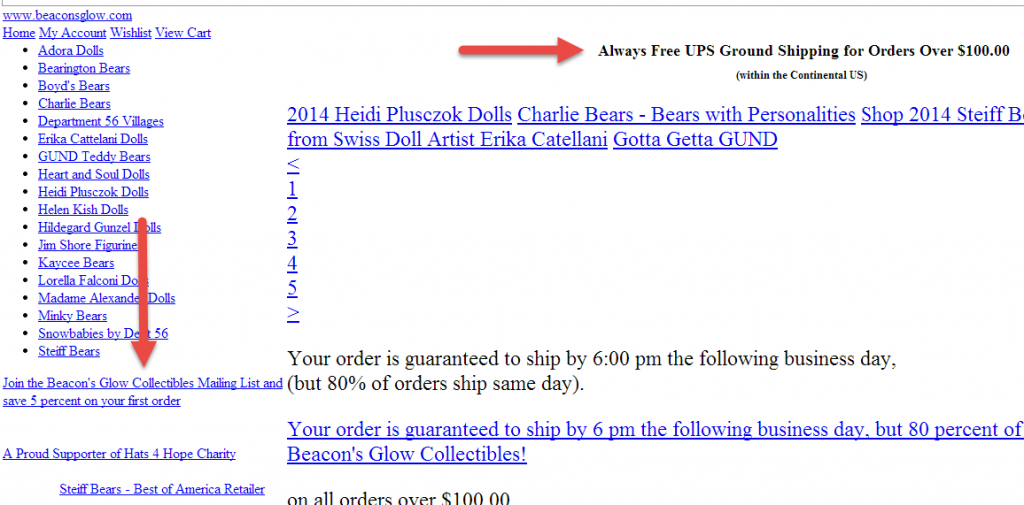
Just goes to show that ALT tags (image attributes) are not dead! The combination of the two bits of text actually made for a good description snippet as it gave three ways to differentiate yourself from other sites (save 5%, sign up for list, free stand).
I’d try to work some of these UCAs (unique competitive advantages) into your title tags and meta description tags on other pages also.
Design Elements
I’m not a big fan of the black. I’m sure what you’re going for is an elegant feeling, but – in my mind – toys are fun! Black doesn’t signify fun to me. I understand that collectors are not the same target audience as children who will play with toys and wear them out, but there’s something about the darkness of the site that is a little off-putting to me, personally.
I’m usually not a fan of rotating banners that take up much of the space above the fold because they have been proven to drastically decrease conversions. In your case, however, you’ve included call-to-action statements and have smartly linked each image to the exact page where the item can be found. While I still think the rotating banner takes up too much space, I think the functionality is better than most.
Top Section/Banner
The top of an ecommerce site is 24 karat gold real estate! I’d recommend testing that area as much as possible to pull every ounce of conversion mojo you can from it. Right now I’m seeing the “free shipping” copy underneath the banner. If you haven’t already, also test copy mentioning the free doll stand and the 5% off with newsletter subscription to see if they pull any better for you.
In addition, you can incorporate some of these into the top banner itself. I also would love to see your phone number up top and visible.
Newsletter Signup
This is a vital area that most ecommerce sites really don’t take advantage of. You know how hard it is to get qualified visitors to your site. Once they are there, make it a no-brainer to sign up for your list.
You give a small discount, which is fine, but also tell me what I will receive in the newsletter. Is it just going to be sales pitches? I get enough of those. Am I going to get updates on new collectibles that are coming out? Maybe advanced notice? Tips on caring for my collectibles? Repairs, valuing my collection? All of these would be of interest. Adding a few bullet points to your registration form would give visitors a better idea of what to expect and make them more likely to fork over their highly-guarded email address.
In addition, I’d strongly recommend that you have a follow-up series of emails in place to generate goodwill and provide an immediate connection between you and your customers so they will want to buy from you again. One of the least-utilized marketing methods ecomm sites employ is email. A shame since it is one of the best-performing.
Copy
There is practically no visible copy on the Home page. I’d suggest that you have at least one paragraph of copy (not including the tiny text way at the bottom with all the brands listed) up in the middle of the page. (Perhaps above the words “Featured Products.”) This copy should be useful to your visitors as well as to Google and could reiterate your UCAs or add new ones to let customers know why they should choose you instead of your competition.
Overall, it’s a great page!
Need help making your ecommerce site reach maximum performance? Karon, Kurt and Justin are available to help through consulting and a variety of services.


What a wonderful surprise! Thanks to you all for reviewing my homepage. I look forward to meticulously going through each and every recommendation. The recommendation that really sticks out is to remove some of the duplicate navigation. I had had an SEO Audit done fairly recently and they insisted that having both sets of navigation links did not adversely affect rankings. But I always had a sneaking suspicion that this was not the case. Thanks so much for clarifying this for me. Once again, many thanks to Karon, Justin, and Kurt!
Hi Brenda
There are a couple of reasons why I’d recommend removing duplicate navigation.
Removing duplicate links will certainly help your SEO. There’s little point in duplicating links on any given page.
Removing duplicate navigation should also help human users find your content more easily and we know that usability is a factor that affects your rankings. What’s more, you’ll free up space – real estate that will allow you to sell more of your products 🙂
Thank you for submitting your page. Hope you get excellent results from the changes. Do come back and let us know how it goes, OK?
Thanks again, Karon, and I most definitely will!
Hi, Karon, and thanks for the clarification. Now, the million dollar question is which navigation to remove (the top or the left side navigation)? As Justin had suggested, I should check Google Analytics to see if there might be some evidence of which navigation structure is preferred by end users. And I also thought that a survey sent out to our customers might be beneficial in determining which navigation scheme they prefer. Thanks again!
Looks like you’ve already chosen the left side… I’d agree. You always want a top nav and a bottom one. I doubt you’d get any valuable info from your customers. Nine times out of 10, customers say one thing and do another. Navigation is something they probably don’t even notice. Once they are asked to think about it, they try to rationalize why they make certain choices and that rationalization is often the exact opposite of why they unconsciously act the way they do.
Morning, Karon! Nice to hear from you and so glad that you are in agreement. And you make a very good point about customer rationalization – too funny. 🙂 Hoping to get to round 2 of changes this evening. All of the comments made by the three of you have been very insightful and helpful. Thanks again, and have a terrific Thursday!
Happy Saturday, Karon! Thanks again for the site review – just about finishing up on implementing site improvement suggestions. The last thing I am researching is the Title tag – finding such a variation in what competitor sites have for a title tag vs. what Google actually picks up. Quick question for you please? I realize how important differentiation is and was wondering if it would be a good idea to use a promo in the title tag? For example, \”New Lower Prices on XXX Dolls\”? Thanks, and Google sure does move fast these days. Incidentally, your review is on page #4 when searching for Beacon\’s Glow Collectibles! Have a terrific weekend, Karon!
Hi Brenda. Promos are great but only if they are long-term. I don’t know that I’d recommend changing title tags too frequently. But, yes… if you can leave “New Lower Prices…” as the title tag for a while, I’d absolutely try it.
Many thanks for your helpful input as always, Karon!