 After spending some time on the home page of Shaver Spares, the panel came up with several recommendations (individually) to improve the search engine rankings, conversions and overall marketing success of this ecommerce store.
If you’re a subscriber of my Marketing Words Newsletter you have the opportunity to submit one page of your site into a monthly drawing. (Just reply to the newsletter with the exact URL you want entered.) Each month’s
winner gets their page reviewed by my team of experts who offer insights, suggestions and point out issues that might require fixing in an effort to bring about improvements. This month’s winner is Shaver Spares, an ecommerce site that sells parts for electric razors.
Suggestions from Kurt Scholle, WebsiteSuccessCourse.com
The Shaver Spares website may be one of the best sites I’ve had the pleasure of reviewing on the Marketing Words blog.
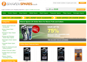
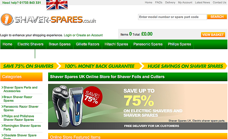
The logo is nice and tells me exactly what the site is about. The search box is well placed and knowing how many items I have in my basket and the order tally is great.
The colors are pleasing and the central image conveys a lot of information without the picture being too large.
The NAV bar allows visitors to quickly find what they are looking for. I assume the brands that are featured are the biggest sellers?
The “Online Store Featured Items” show up well on my big screen monitor, but I only see the header on my MacBook Pro, and not any of the items.
There are a couple of other disparities between screens. It’s a good practice to view your site on different monitors and browsers.
In addition to how much screen real estate is visible, different browsers also render content differently, so you should always check it in different browsers, most importantly Internet Explorer, Chrome, Firefox and Safari.
Looking at your site in Chrome on my 15″ MacBook Pro, there is a white row between your NAV and the yellow band below. (See example) Fixing that will make your site look better and pull some featured items above the fold.

Second, the green font for categories is a little light on my desktop monitor but looks fine on my laptop, which may be fine, but by looking at it on multiple monitors may give you some more information.
Also, notice in the screen shot that the last button on your NAV “Remington Spares” does not show up.
Checking your site for how it looks in mobile browsers is also important with so much traffic coming from mobile these days. This includes smartphones and tablets.
Using W3C mobileOK Checker shows 2 critical failures, including the data related to images, which not only slows page load times on mobile, but laptops and desktops as well. You can click on any of the descriptions for further insights.
There are also issues with your CSS style sheet and Web standards.
Another useful tool is Quicktools Screenfly, which allows you to view a page on desktops, tablets, smartphones and television. Select the device you’d like to check by clicking on the dropdowns. Screenfly also allows you to customize a screen size.
Using Screenfly to view Shaver-Spares.co.uk results in an error, which means you have your work cut out for you or you’re missing a huge chunk of your market: mobile.
I like that you’re using testimonials – they can be powerful influencers. I think they’d work better if a picture of the person giving it were included. It would stand out more and enhance your social proof.
Good luck with the site! It will be interesting to watch your progress.
Suggestions from Me! Ecommerce Copywriting
Ecommerce sites can sometimes have a horrible time with copywriting. The nature of ecommerce home pages creates an online environment that isn’t instinctively supportive of search engine optimization. So, what generally happens is we tuck bits and pieces of text here and there as best we can and the rest gets shoved to the bottom of the page.
The problem with this strategy is that the visitor doesn’t get to understand your differentiating factors with the exception of little blips of copy here and there above the fold.
However, with a little planning, you can get your unique competitive advantages (UCAs) across and also opt to use some well-placed ecommerce copy that benefits your visitors and the search engines.
How Much is too Much?
Google doesn’t just read the copy on your Home page. Its bots assess the HTML code and take into account every keyphrase that is used in your meta tags, navigation structure, ALT tags (also called image attributes) and more.
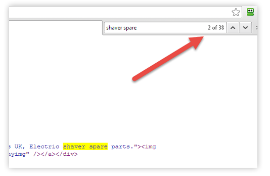
The phrase “shaver spare(s)” is used 14 times on the visible page. I also had a peek behind the scenes of your Home page. The HTML code reveals that the phrase “shaver spare(s)” is used 38 times. That’s a lot!

I would definitely suggest pairing back the use of that search term. Keep in mind also that you don’t have to only use the exact-match keyphrase. As I teach in my Writing With Keywords course, these days it’s not strictly about exact-match search terms. You need to use “shaver spares” (for example) a couple of times, but then use the individual words within the phrase: “shaver” and “spares” separately. Synonyms are also important to incorporate.
Engage, Inform, Convert
The purpose of ecommerce copy is to quickly connect with visitors, explain why they should buy from you instead of the thousands of other sites available and get them to start shopping right away.
My “Ecommerce Copywriting” course walks you through not only how to optimize pages for the search engines, but also how to create compelling copy that accomplishes these three goals.
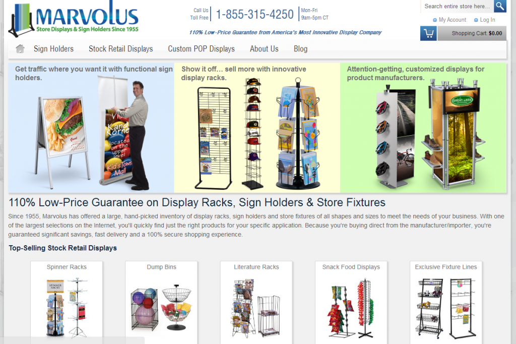
On your Home page, almost all the copy is at the bottom. That’s certainly one option, but my suggestion would be to stagger it throughout the page like this website that sells display racks and sign holders.

If you’ll scroll down the page, you’ll notice copy segments highlight differentiating factors while images help guide shoppers to the right products for them.
You”ll also notice that the copy is very customer-focused instead of company-focused. While it certainly mentions the name of the company, the vast majority of the text is “you” and “your” centered. This is something that could be improved upon in your Home page copy.
I think if you rewrite the copy to:
• be more engaging to and focused on the site visitor
• highlight your unique competitive advantages
• reduce the use of exact-match keyphrases
• incorporate individual keyword as well as synonyms
• stagger copy across the length of the page
… you will find the page works better for your visitors and for Google.
Need help with ecommerce copywriting for your site? We’re accepting new clients. Contact us with your project details to get more information and a custom quote.


I tried the quicktools screenfly for our site to see how it would be displayed on other websites. The IPHONE 5 shows it would be cut off. However when I looked in my phone, I can almost see the full width of our site. I wonder how accurate the quicktools screenfly website is and how useful it might be. My suggestion is test your site in many different browsers and devices yourself. Just thought I’d share. Thanks!
Thanks Debbie. Yes, I agree all sites should be tested to see how they render on different devices.
Hi Karon,This was a very pleasant surprise and highlights areas for improvement, I will make sure I work though these with our web developer and over the next few months make the relevant changes and amendments. Thank you very much, will keep you posted.Kind regardsAndrew.
You are most welcome Andrew! Hope it helps you accomplish your goals.
Hi David. Thanks for stopping by and for the resources. As for your question about “density,” this is not about keyword density ratios (which – in the way most people refer to them – are an SEO myth that refuses to die!). I was looking at the page’s HTML code which contained keyphrases in just about every URL, very image tag… everywhere! 🙂 If we are just talking about copy/content, I usually aim for using exact-match keyphrases once or twice on a page of this length then the keywords the rest of the time as they naturally fit in. Hope that helps.
Use it once or twice. I don’t know about “surrounding” the content with related keywords. Not sure what you mean by that. The goal is not to overload the copy with keywords. Google just doesn’t need that anymore since the Hummingbird algo change. You use the exact-match phrase and then the individual keywords. This explains it better and in much more detail.