Subscribers to my Marketing Words Newsletter get the added bonus of submitting one web page for possible review. Then my collection of web experts and I point out trouble spots the site owner can correct in order to get better rankings and conversions.
If you’re a Marketing Words Newsletter subscriber and want a web page from your site considered for review, send me your name and the URL for the page and I’ll add you to the list.
This month’s feature is the home page of PassionateHorsemanship.com.
From Justin Deville, Receptional.com
This was a really well-timed review, one I particularly enjoyed, as I went for my first proper horse riding lesson this week. I’m hooked!
Yet, despite my new interest in all things equine, I wasn’t immediately sure what the site was about. Even after watching the video, I had to reread the text.
As a marketer, I want it to be immediately obvious what the main objective of the page is. And, that’s not the case.
At my internet marketing agency, Receptional.com, we have a 5-second rule. Within 5 seconds of looking at a page, it must be clear what the objective is. Otherwise the page is failing.
So, my advice would be to decide on a clear objective. What do you want visitors to do? I’ll assume that you want visitors to get in touch with you. Yet, as I say, that isn’t clear. The opportunity to get in touch is only presented at the very bottom of the page. Not many visitors will ever reach that point on the page.
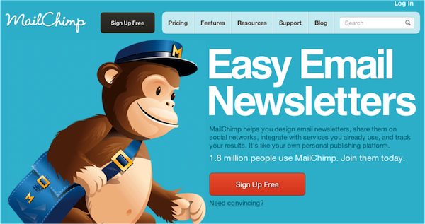
The example I always cite of a well-design home page, with a clear objective and call to action, is MailChimp. Here’s the page:

It is simple, yet so effective:
- Note how clear the call to action is. It’s a strikingly different color to the rest of the page. It’s easily visible. And its message is clear and simple.
- Note, too, the big bold, simple headline: Easy Email Newsletters. Those succinct words sum up the whole business AND include a clear benefit.
- And that’s not all, the text also includes social proof: 1.8 million people use MailChimp. No visitor could be in any doubt that this service is popular.
Let’s take those lessons and translate them to http://www.passionatehorsemanship.com/
First, Kim, I’d recommend adding a clearer call to action. You want people to get in touch, and you might want to add both your email and a phone number. I’d use some of the space in the header bar to add your telephone number: make it big and bold. Make it real easy to spot!
I’d also add a big bright button, so that visitors can more easily send you an email. A good place would be near your video, as it will be visible right away.
Next, I’d want to explain more clearly what your service involves and, crucially, what the benefit is. What experience do your customers have and how do they benefit? At the moment, your strapline is “Developing the Art of Effective Communication between Horse and Rider”. I think we could improve on that. Communication is what you teach, but what benefit does that bring? “Fun without Riding” is a phrase that you use lower down the page. And, that might be a good place to start your thinking.
Also, it would be great to see some testimonials from happy clients. Kim – I’m sure your customers love working with you. In fact, my guess is that time spent with you is the best part of their week. So, I’d love to hear quotes from satisfied customers.
And a final thought. It took me ages to realise that, in the sidebar, you’re offering a free book in return for my email address. The colors of the sidebar makes the text difficult to read. And the headline isn’t clear. Adding two words – Free Download: – to the start of the headline would make the offer clearer.
Justin Deaville is Head of Search at internet marketing consultancy Receptional.com and was previously chief executive officer (CEO) at Wordtracker.com.
From Kurt Scholle, Website ROI Guy
All in all, not a bad site. The header is attractive and conveys what the site is about, but I would try and get the entire horse in heart image in the header. Just shrink it a bit.
The Call To Action (CTA) on the right is well positioned and I like the way you’ve defined the problem (bad habits) and the benefit (how to correct them)!
That said, the image of the book needs improvement. The column allows for a slightly wider image, which currently seems to be cut off. I might make the white font in that headline a bit larger and would recommend using a sans-serif font. I think you can afford to add something to that, such as a testimonial or additional information.
Courses work better than book downloads for lead generation. Consider offering the book in an autoresponder series. After getting 7 lessons delivered once every couple of days, you can follow up with new insights every couple of weeks. Include in all lessons a Call To Action: Buy a course you offer on CD, hire you as a coach, buy affiliate products, etc.
This Home page needs a headline, which will help convey what the site is about and the value of exploring it. It should support the content below it. Something like, “Get More Out of Your Horse.” Then a sub-headline, like “Have More Fun & Rein In on Costs!”
I might include bullet points because you have to interest someone before they’ll fully read your site. Maybe something like, “5 Fun, Free Things Both You and Your Horse Will Enjoy.”
I would delete the line that begins, “Well this is not true, as there is a lot you can do…” Don’t argue. Show them the way.
Stating a problem you can help your readers with is a great way to get them to stay for more than 4-5 seconds. Your “Do any of these things hit home with you?” questions are a good start. You might want to move that above the fold. Move the video down to support the offer you’ll make after you’ve stated the problem.
Your site will benefit from using more links on the Home page to interior site content. Visitors will follow those links and so will the search engines. Try to link to at least one other page from every page on your site. Consider organizing some Home page content into 2 or 3 of your most important “paths” or important pages of your site (such as Services).
We’re only supposed to critique your Home page, but I peeked at the Testimonials page and I have 2 recommendations. First, sprinkle short testimonials throughout the site, including the Home page. Testimonials are powerful influencers. And we know from looking at server logs that most people don’t visit testimonial pages, which wastes them.
Second, the Student Spotlight is a good example of social proof, but I’d be tempted to rename it Case Studies and put in a few of them. You could link these stories to what I imagine you have on your Services page, which I did not look at.
The Exit Pop works well, but the desired outcome is confusing to me. I would use it to build your list. When I see “Horse Agility” I think you’re asking me to sign up for the Horse Agility newsletter, but there’s no signup box.
I think building a list is one of the most important things you can do to market a website, but if you don’t want to go that route and simply want to get people to ask questions, then make that the only objective of the Exit Pop.
I would delete “Leave Contact Details” and move Schedule Appointment elsewhere on the page; perhaps above the eBook offer.
Also in that column, “Follow me on Pinterest” is OK, but you might benefit more from putting pinnable images on your pages.
The font for the Facebook widget at the bottom is fairly unreadable with blue on green.
You have some real opportunities to improve the ROI of your website without a lot of work! I look forward to watching your progress.
Kurt Scholle blogs about website strategy, Internet marketing and social media at www.Website-ROI-Guy.com
From Jill Whalen, High Rankings
- Title tag is just a list of keywords.
- Pop-up window blocks content of the page so I can’t figure out what exactly you do without closing it first.

- This sounds like it’s not even written in English:
Passionate Horsemanship’s Horse Agility:
Fun without riding for all horses and their people, for every reason.
You don’t have to ride to thrive with your horse!No idea what that means. Especially “Fun without riding for all horses and their people, for every reason.” HUH?
- The home page is written in backwards order. Take the stuff from below and move it up to the top starting with:
Passionate Horsemanship’s Horse Agility…
Is a positive option for those who can’t or choose not to ride, are new to horses, or returning to horses after a few years (or more!) off.
Finally you’ve told me what it is. But I may never have made it down that far.
Jill Whalen is an SEO Consultant who’s been helping companies with their website marketing since 1995. Be sure to sign up for Jill’s High Rankings Advisor Newsletter for free and informative SEO advice that’s easy to understand and fun to read!
From Karon Thackston (Me!)
Let’s start with your tag set, Kim, since that’s what will potentially drive traffic to your site. The title tag is simply a list of keywords… and a lot of them. Title tags certainly need to include keyphrases, but they have a dual purpose: to appeal to the search engines, but also to entice human beings to click your search engine snippet/listing instead of the others on the search engine results page (SERP).
Horse Agility, Natural Horsemanship, In-Hand Trail, Horse Trainer, Positive Reinforcement
Your description tag (while not used by the engines for ranking purposes) is still shown to give you a chance to – once again – entice surfers to click to your web page. Even though it plays no role in the ranking of your page, you still want to include keyphrases because they will connect with the surfer and also appear in bold in the SERP.
Passionate Horsemanship is a place where women will learn how to understand and connect with their horse on a deeper level so that they feel safe, confident and enjoy their horse!
Your description tag is all about you. It needs to be all about them. Don’t speak in third person (“where women will learn”). Instead, talk directly to the searcher… “where you will learn.” None of the keyphrases in your title tag appear in your description tag and they should.
This is part of the process of creating good SEO copywriting flow.
The next step would be to then optimize your on-page copy using the same keyphrases you have in your title tag and description tag. The idea is to begin enticing searchers with your title tag then build their interest through the description tag and the copy on your page.
Some of the keyphrases in your title tag are not even used in the copy on your Home page. For a page the length of yours, I’d say to optimize the page for a maximum of 2-3 keyphrases, not 5. Use the other phrases on different pages of your site.
Your tag line could express a benefit to the rider more effectively, I think.

Again, it’s as if it’s speaking about someone else besides the site visitor. Talk to one person through your copy, don’t talk about other people. Developing the art of communication is a feature. What happens after they’ve successfully developed that art? How is the situation improved between rider and horse? That’s your benefit/end result.
I just watched the video and it gave me an entirely different understanding of your Home page. If your site is about agility training for horses (which is what the video suggests), I’d make that clear right from the start. (See comments in previous paragraphs.)
I’d suggest working on your unique competitive advantage (UCA).
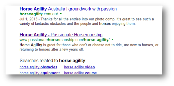
When I type “horse agility” into the query field of Google, you come up in the #10 position (from what I’m seeing on my PC)… but it’s not your Home page. But hey! A top-10 listing is a top-10 listing, Home page or not. 🙂

The headline on your Home page is rather clunky. It also doesn’t communicate a unique benefit to the site visitor.

Questions are always a good way to get readers engaged. But the questions you list are very wordy to me. I’d suggest tightening them up and stating the questions in as few words as possible.
All the questions also suggest that something has to be wrong with either the horse or the rider before agility becomes an option. Is that true? Or is that just your niche?
As for the copy itself, it seems to be attempting to convince me that horse agility is the answer. In my opinion, what the copy should be doing is explaining what you offer in relation to horse agility.
Just saying, “Passionate Horsemanships’s horse agility does this or that” doesn’t let me know what you’re offering. I get that it has to do with agility for horses, but do you want to teach me in person? Do I have to bring my horse to you? Do you come to me? Since horse agility is so new, how does all this work?
Your call-to-action is pretty vague.

Tell me specifically what to do. If you want me to contact you, put a link in the call-to-action, or create a short form where people can contact you right from the Home page.
I see your contact info, but it’s waaay down at the bottom of the page buried under a video in smaller type. Not good. People will not search for a way to contact you. You need to make it ultra-easy, putting the information right in front of them.
If you’re going to give away a free bonus for people subscribing to your list, make it specific to what you’ll offer them. This freebie references breaking 7 bad habits. If you’re pitching horse agility services, your bonus should be about horse agility. The button copy says, “Get Instant Access.” If this is an ebook, you might consider something like, “Download Now” or “Get Your Free Copy” or whatnot.
Karon Thackston is a Certified Landing Page Specialist. Looking for website pages that rank well and convert even better? Contact Karon today for business landing page copywriting or copywriting consulting and start getting results.
If you found this post valuable, others might, too. Please share (below) on your favorite social media sites. Thanks!


Karon
Thanks for including my comments. Kim – I hope you find them useful.
Justin Deaville
You always have great ideas to contribute, Justin. I appreciate you being willing to share.
Yes Justin the comments were very helpful. Thank You!
Hi Karon, Justin, Kurt and Jill,
Thanks for all the great tidbits. I love it when you do actual site reviews Karon, they help so much with detailed understanding of how to actually change things.
Kurt made a great point about how courses work better for lead generation. I’ve also found that to be true.
Also good point about the tag line Karon. You want to speak to ‘one’ person but especially important to include your benefit, so in this case what happens after they’ve successfully developed that art? That’s one that’s easy to forget for me.
Thanks,
Liz 🙂
Hi Liz! Yes, reviews are always enlightening… for the reviewer and the site owner 🙂 Glad you were able to use the info.