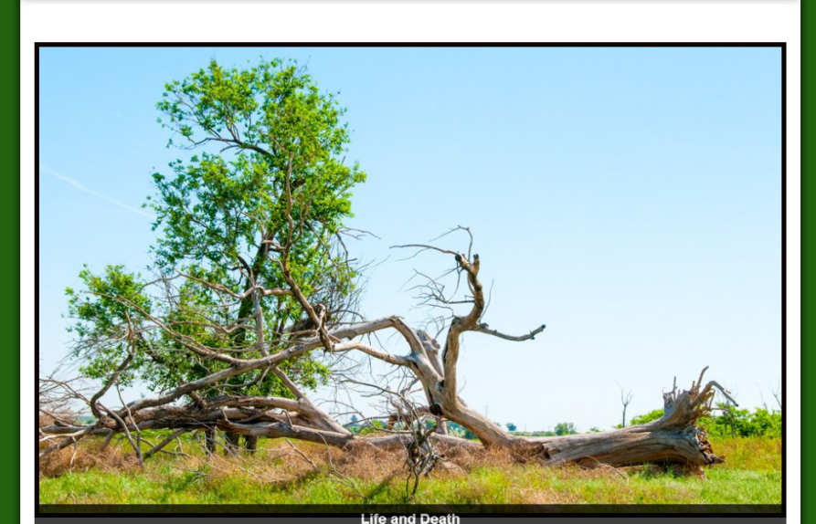
Selling artistic products can be a challenge. Much of what brings a site visitor to the point of purchase is sheer personal taste. That’s what made this particular web page review so interesting.
Subscribers of my Marketing Words Newsletter get the chance to enter their sites into a monthly drawing for a review. (Just reply to the newsletter with the exact URL you want entered.) Each month’s winner gets reviewed by my team of experts who offer ideas and point out issues that might require fixing in an effort to bring about improvements. See what the panel of experts had to say about this site that sells nature photographs.
Suggestions from Kurt Scholle, WebsiteSuccessCourse.com
As a life-long photography buff I am delighted to review your site and help you however possible.
The reviews we’ve done for others are interesting to see because we all have different perspectives. I don’t get to see the other reviews until they get published, but I always learn from my fellow reviewers. Tip #1 is to read the other reviews, which can be found here. Also Google “website reviews” or “website critiques.” You, as a website owner, will gain insights that will benefit you.
Please use Google Analytics to capture Key Performance Indicators of your site. It’s helpful to see how much traffic you get and whether that’s trending higher or lower. Other KPIs include the amount of time spent on site (2.5 to 3 minutes is good), the number of pages viewed per visit (the more the better) and the Bounce Rate, which is the percentage of visitors who come to your site and leave before viewing second page. We usually see Bounce Rates of 75-80% on unsuccessful sites. Anything below 50 is acceptable, but we like to see 25-35% as a sign of engagement.
Setting up Google Webmaster Tools will give you great insights into your site as well because The G will actually tell you if it is having trouble indexing your site or if there are other areas for concern. There is a ton of information about Webmaster Tools and Analytics online. You will benefit from using them.
Pardon The Interruption. Now Let’s Look at Your Site
Your “logo” Tom Potter Photography – Nature Prints for Sale is direct, but underwhelming. You’re a graphical guy. You’ll make more of an impression with something more special. Maybe text over one of your images? Maybe “Tom Potter Photography” in the sky and “Nature Prints for Sale” over a beach or pond?
Frankly, “Nature Prints for Sale” communicates what you’re doing, but you would benefit from better positioning or the benefit of buying one of your images. “Fine Art Nature Photography” or “Fine Art Photos of Colorado” or “Beautiful Colorado Photography” would instantly convey to your visitor what the site is about, convert better and support your prices. Improving your positioning usually results in lowering your Bounce Rate and invites more sampling of pages, which is a good thing.
“Award-Winning Nature Photography” or even “Fine Art Photography That Your Neighbors Will Envy” might have their place as a headline or sub-headline in the page copy. Karon is the content expert here; I’m looking at your site more in terms of converting traffic to buyers. Traffic and conversion being the two most important elements of a website.
No Call To Action!
Your navigation is simple and easy to understand. Google likes to see About and Contact pages, so bravo for including them. But Google likes to see contact information, including an address, on the Home page and you have none. Successful websites have CTAs on every page, if nothing more than a phone number or email address. Your contact information should be on every page of your site, not just on your Contact page. Don’t make me work to contact you.
What is the desired outcome you have for each page of your site, including this Home page?
Home pages are often best used as a site’s table of contents. Your visitors need to immediately understand what the site is about, that it meets their needs or is at least of interest and gives them clickable options. That information needs to be apparent above the fold of your website, but the gallery animation pushes it all down.
A big animation also slows down site load times, which can force visitors to leave before it loads and Google is thought to be penalizing sites for slow loading. But even if you’re not concerned about search rankings, a smaller image or animation will allow the “table of contents” to rise above the fold. Use a big animation on your gallery page. Use something smaller on the Home page or even a couple of static images so we can see more options.
Your Home page CTAs should be links to your primary galleries; Landscapes and Wildlife, which are now only represented by those words in a paragraph. I would put 2 images, side by side at the top of the page, probably instead of the animation with a headline above and maybe a 2-3 sentence paragraph. Those 2 images would become the primary “paths” of your site – the 2 most important outcomes you want on the Home page.
Delete the Rest of the Home Page
Focus on the objective of getting people to view your art and consider purchasing it. Don’t put a “Welcome” on the Home page. We understand that you can only show us a few images and that your portfolio is probably larger. Nobody cares if your site is newly revamped. None of that information supports the job of the site, which is selling your images. It’s just distracting.
The 3 paragraphs beginning with, “My name is Tom Potter” should go on your About page.
The 2 paragraphs on how to buy and do you want it framed should go on the pages where people can order your work.
You can and should keep the testimonials as they are powerful influencers, but I would include 200 pixel thumbnails with each and make the images clickable to a larger popup image. The 2 “path” images and 2 testimonial images would suffice on the Home page.
I would also keep “My prints make great gifts for family or friends – a special gift that will last a lifetime.”
You have at least 5 font colors. That’s at least 3 or 4 too many.
One other suggestion; we bought a large print of an Arizona scene from a photographer we really like and it’s mounted over the fireplace. We also have an 11×14 image on a wall in a hallway from him. And we always buy his calendars. We’ve bought at 3 different price points. Just a thought.
I hope this review helps. I think you have significant opportunities to improve and that will be evidenced by people visiting your site for longer periods of time, including viewing more pages, which will result in more sales!
Comments from Justin Deaville, Receptional Digital Marketing Agency
First, it’s worth saying what wonderful photographs you take. They look fantastic and deserve a wider audience.
Working in your favour – over the past few years, online marketing has become a much more visual medium. I encourage all of our clients to use more photos in their marketing.
So, you’re well placed to promote yourself online.
But photography is a competitive business and, at the moment, your website isn’t helping to showcase your work.
There are a few ways you could help promote your work more effectively.
Make it easy to get in touch
If you’re selling products online, you should make purchasing as easy as possible.
A recent study from Mediahawk Call Tracking showed that most online customers like the option of being able to call a real person when making a purchase.
Mediahawk are call tracking experts. And we can learn from their marketing. Take a look at the top of their web pages. You’ll see that they have a contact number and email displayed prominently:

They make it easy for potential customers to get in touch.
Similarly, we recently ran some tests for a client – Sunrise Care Homes. We wanted to know whether we could attract more enquiries simply by increasing the prominence of the contact details on the website.
You won’t be surprised to hear that the presence of a larger, more colourful phone number meant that we attracted more phone calls.
I would do something similar with your site – add your contact details to the top of the page, as shown:

We try to ensure that all of our clients have contact details prominently displayed. Here is an example from Stair Lift Comparison site we work with. You‘ll notice that the phone number has a call to action “Call us now on …”, which you might want to try on your site too.

Make it easy to buy
If you’ve shopped with Amazon recently, you’ll know how easy it is to buy products online. Their ‘One Click’ purchase button removes the hassle of shopping and shipping that you get on most sites.
In today’s online world, you want to make it really easy for customers to buy from you. Yet I confess that I struggled to find out how to buy your prints.
I tried to follow your instructions: “To view my complete collection, please click on the “Purchase Prints” button on any page.” Yet it took me several clicks before I saw a ‘Buy’ button.
The fact that you have to explain to visitors how to buy suggests that your set-up is nowhere near simple enough.
I would include the price of the print and an option to buy alongside each of the photos on your home page. Your home page is likely to attract a large proportion of your traffic, so don’t miss the opportunity to sell.
Here is an example from a site we work with that sells metal badges. You can see that I have highlighted two key elements – the price and the buy now button. As a general rule, these should be some of the most prominent features on any page where you’re promoting your photos:
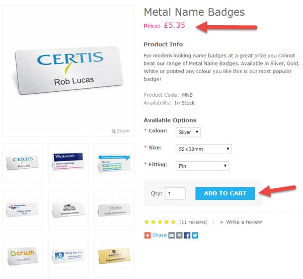
Including pricing information encourages visitors to think about buying. It adds focus, if you’ll forgive the pun.
Testimonials
It is great to see testimonials on your site. They provide fantastic proof that you deliver great service as well as taking great photos.
There are a couple of ways you could draw attention to them. First, you could include photos of the person who provided the testimonial. In this case, it doesn’t matter how professional the shots are – they should look like real people, not airbrushed in any way.
Secondly, you could simplify the design of your site. I was always taught that good design relied on simplicity. So, as a rule, I aim for a maximum of two font styles per page. On your home page, I counted at least 12 different font styles. The section of the page shown below has eight different font styles:
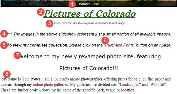
Try reducing the number of fonts you use – it will help declutter the page, so you draw the visitors to the areas of the page you want them to view.
I hope that’s helpful. Good luck with selling your prints!
Suggestions from Me!
As I landed on your home page, my first impressions was, “Wow! What gorgeous photos! Professional, stunning … just breathtaking.” I continued down the page and as I scrolled the brand (so to speak) turned from distinctive and professional to rather amateurish.
We leave the above-the-fold space with eye-catching photos and are driven into a wall of unattractive words.
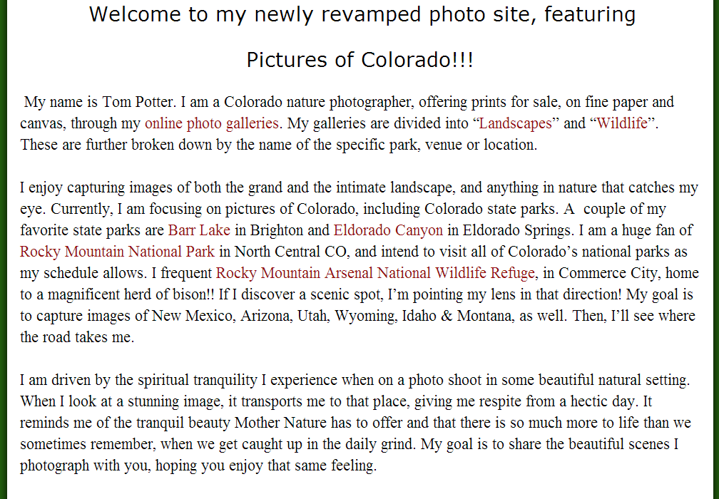
As Kurt and Justin have pointed out, the copy that is currently on your home page isn’t very helpful. In fact, it’s rather unnecessary. Your name is in the header of your site so it isn’t necessary to repeat. The information about your current projects, etc. should be on your About page (as Kurt, mentioned).
I would change the link in your navigation bar from “purchase prints” to just “prints.” People who see “purchase prints” might automatically think this is only for those who are ready to buy. If you just label the page “prints,” those who are browsing or buying would feel equally safe clicking there.
Rather than the horizontal bars and statements about your blog, I’d insert a subscription form right on the home page with some enticement. Most people are very protective about giving their email addresses to others. You’ll want to provide something in exchange for the emails.
Who are your customers? Why are they interested in your photos? If they are homeowners looking for unique pictures to decorate their homes with, perhaps you can offer a free report with ideas related to that. You can also let potential subscribers know that they will get advanced notice (and possibly a discount?) on new prints you have available.

I like the idea you had with the first testimonial (pointing out the image). I would, however, take it a step or two further. Put a thumbnail of the image beside each testimonial. Then, rather than “see” the image, end the customers’ comments with “Buy the same image _______ loved” and link it to the purchase page for that photo.

What type of copy should you include? The kind that allows visitors to feel as if they are standing in Colorado with you. Invite them to bring a piece of Colorado into their homes to express their individual style, etc. Make it about them, not about you.
When referencing everything the customer has available to them, use bullet points. They are easier to spot and break up the huge blocks of text.
One more thought: I’d consider changing the slider (rotating banner) at the top of your page. Countless studies have shown that these can seriously hinder conversions because people don’t understand how to use them.
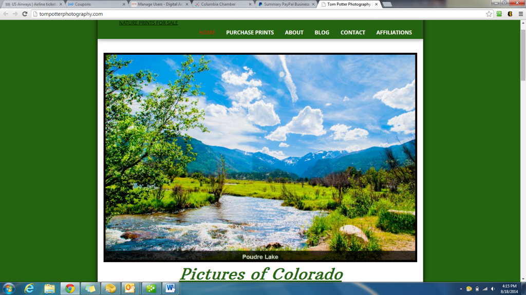
Yours is a classic example. The images aren’t clickable so a visitor might land on your home page and love the picture of the lake. They attempt to click the image in an effort to be taken to the page where they can buy this photo. But nothing is clickable. In addition, with the slider taking up the entire upper portion of the page, no visitors will see that there is copy below… copy that they might need/want to read to help them in making a buying decision.
Yes, the focal point of a photography site should be the pictures. However, if the tool you’re using to display those images is hurting your site’s performance, it’s worth your consideration to make changes.
I was also going to offer some suggestions about your SEO, but I wasn’t able to view the source code for your home page for some reason. In your title tag, I only noticed one keyphrase: nature prints for sale. If this is your only keyphrase, I’d consider adding more as this term is vague and broad.
You really do produce gorgeous photos! Best of luck with your site.
Need help making your site reach maximum performance? Karon, Kurt and Justin are available to help through consulting and a variety of services.



I enjoy reading these reviews. I agree with Justin on improve the order process and with Karon on clickable images.
These are very interesting to do and I greatly appreciate your participation.
Thank you very much for reviewing my site! I very much appreciate it. You have given me many great suggestions and solid advice. I will be making changes to my Home Page sometime over the next few days, based on your review.
Thanks Again!
You are most welcome, Tom! Glad it was helpful to you.