

 Sometimes we tend to view our own websites as if everyone who visits will understand what we’ve done and how to find what they need. As this local, public library finds out, taking into consideration who your audience is, what they want and where you position your information can be paramount.
Would you like a page from your site reviewed? As a subscriber to my monthly Marketing Words Newsletter, you can submit one page of your site into our monthly drawing. (Just reply to the newsletter with the exact URL you want.) If you are selected the team will provide detailed feedback and suggestions to help improve your conversions, SEO and design. See what the panel of experts had to say about this library.
Comments from Justin Deaville, Receptional Digital Marketing Agency
Every site review I complete for Marketing Words presents a unique challenge. I’ve not worked on a library site before, so I can’t claim any great experience in the area. However, there are some simple questions we can ask that are often revealing:
– Who is the audience?
– What is the objective?
Let’s take each in turn.
Who is the audience?
Usually when assessing a site, I have access to the site’s analytics so it’s possible to see lots of information about the site’s visitors. Google recently added demographic information to Google Analytics, which can be helpful.
In the absence of that level of detail, let’s consider the different reasons why people may be visiting a website.
I would suggest that there are three different types of searches: navigational, informational, and transactional.
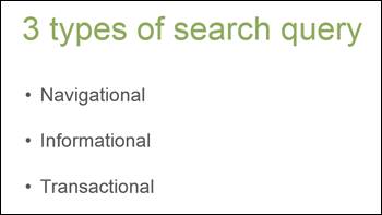
Hopefully it’s obvious what each type of searcher is looking for. In this case, navigational visitors are likely to be looking for contact details. Informational searchers may be looking to see whether the library stocks a particular title. Transactional visitors, however, are likely to be interested in finding the fastest way of borrowing.
It’s important that we cater to each of these groups on the home page. And, in fact, the library site does a pretty good job.
Taking each area in turn:
• Navigational: the library’s contact details appear at the top of the page and in the site’s footer. So, they are easy to find.
• Informational: the navigation is clear and simple. It appears exactly where we would expect – at the top of the page. On the home page there are blocks of information that will be relevant to different groups – what’s new; upcoming programs, and readers’ favorites. And there’s a search bar at the top of the page. It’s nicely done.
• Transactional: Within a couple of clicks, I’m able to start borrowing. Again, that works for me.
What’s more, the site is mobile-friendly. It’s likely to work well on mobiles and tablets as well as desktop computers.
What is the objective?
We’ve already started talking about visitors’ objectives when they reach the site. But, it’s worth asking the question from our perspective too. As a marketer, I’m always keen to encourage visitors to take action as a result of visiting the site.
So, what action would we like visitors to take? How clearly are we asking?
Here, the site fares less well. Too much of the page, in my opinion, lacks a clear purpose.
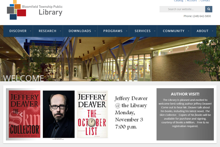
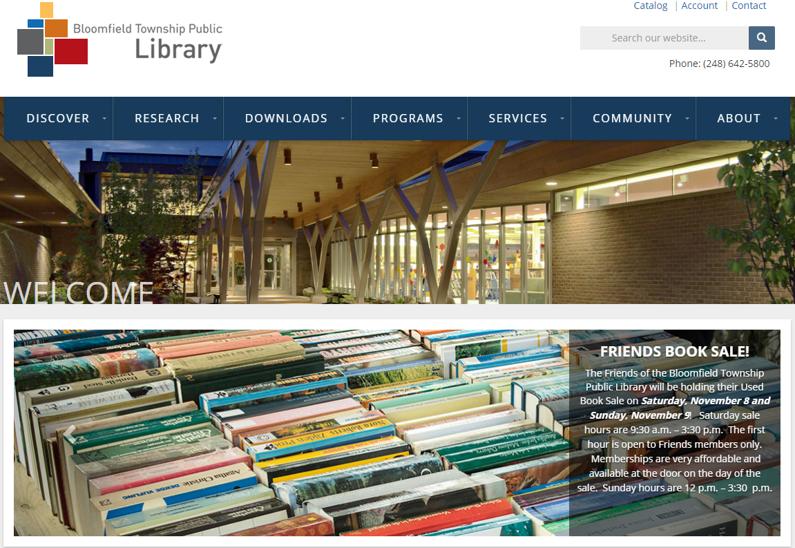
Here’s how the home page appears on my PC. You’ll note that I have highlighted the main image: why is it there and what is its purpose? I am unclear.
I’m sure the site’s designer would argue that the image has two functions: it shows the library, so users can identify which site they’re on, and it’s decorative – it helps the site look great.
However, the image has been placed in one of the most important positions on the page. If we want visitors to take action – to engage with the site – this is where we should be placing our main call to action.
At the moment, the space is largely wasted. As an improvement, I would suggest removing the image. The result would be that the useful information on the page – including the main call to action – would be made more prominent.
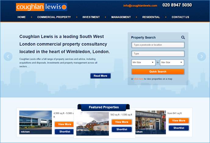
As a useful comparison, I’d like to take a look at two of my clients’ websites. I suspect I’d be hard pushed to convince you that either is beautifully designed. But, both contain a clear call to action on the site’s home page.
Coughlan Lewis is a London-based commercial property agency. As you can probably see, its home page features a slider. These are very fashionable at the moment, but they should be used with care. Visitors need to be allowed sufficient time to navigate a site and decide what action to take. The danger of sliders is that they remove key marketing information just as the visitor is about to respond.
That said, Coughlan Lewis gets around the problem by including a clear call to action on every slide:
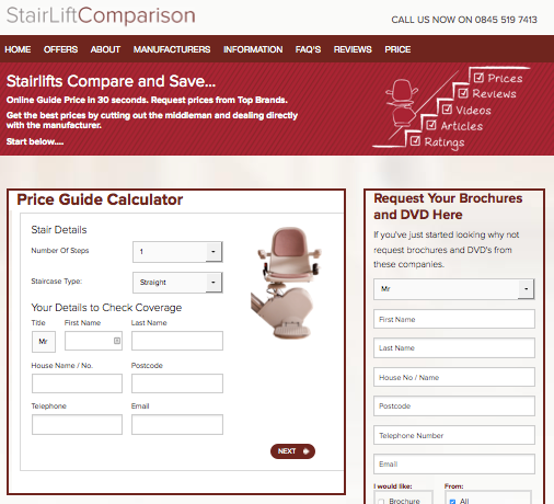
Stair Lift Comparison is a site that pretty much does what the name suggests – it helps visitors find the best stair lift for their needs. Again, it is by no means a beautiful design, but you can see how the main calls to action are placed prominently on the page:
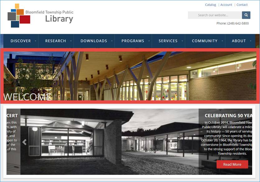
The design of the Bloomfield library site, on the other hand, has pushed its key content well down the page. As a result, visitors will have to make more effort than they’d like to find the information they’re looking for.
Suggestions from Kurt Scholle, WebsiteSuccessCourse.com
This is a beautiful site. I love the images and I think the Home page needs to be an overall promoter of What’s New and Events as you have done with the site. Home pages work well as a broad table of contents as long as they also deliver information that the visitor expects. What do your visitors expect? The clues may reveal themselves in your most popular interior pages, and you can get that from your analytics package.
Who are the library’s target personas and what are they looking for? What are their most frequently asked questions and are they being served by this Home page? I would make the information easy to find and above the fold. For instance, I’ll bet that one critical piece of information is hours of operation. I might move that information from the bottom of the page to the top, possibly in the header. Consider making the phone number bigger too.
My critical eye goes immediately to the big white section in the center of the header, which is prime real estate. Maybe you move the logo there and put hours where the logo currently is? Or maybe use that space to promote your biggest What’s New or Event? Library hours might then go to the top of a sidebar.
The header and the exterior image take up too much of the screen. On both my laptop and larger desktop, the fold goes about half way down the slider. Consider placing the outside image in the center of the white header.
I think you would benefit from moving Home page content up as much as possible so people see it above the fold.
If you choose not to move the outside (welcome) image to the white header, then I would make the white header 20-30% shorter. You’ll need to reduce the logo size a smidge, but it will help overall by moving more content above the fold.
You could combine the “welcome” image of the exterior of the library with the slider below it. There isn’t much benefit in welcoming someone to a website, so I’d use 3-4 images on the slider to promote and include text on all images and make the slider images clickable to interior pages. The right two-thirds of the current image of the library’s exterior would be a good place to list hours of operation.
The overall objective would be to have 4 slides of the slider promote what’s most important in the 8-10 seconds visitors will use to decide if the site provides the solutions they are looking for. These slides should be in order of importance with the first slide being most important.
That all should move the What’s New and Upcoming Programs above the fold, to your benefit.

I hope that helps! The site is clean and there is plenty of white space. I think if you consolidate the header, “welcome” and slider into 2 spaces instead of 3 and move more information up on the page, will help considerably.
Suggestions from Me! MarketingWords.com
Your library seems to offer some exceptional programs for adults and children. However, upon my first visit, I likely would have missed out on these if I were an ordinary visitor. That’s because most everyday folks don’t automatically scroll to see if more information can be found lower on the page if the above-the-fold section looks complete.
With the top banner and the carousel taking up all of that extremely valuable real estate, my guess would be that most of your visitors would not realize there was more to be seen down under.
Carousels (rotating banners, sliders, etc.) are very popular these days, however they have numerous flaws. The first is that average people who are not web designers don’t understand how to work them. Many have controls that allow visitors to stop or pause the slides (I didn’t see those on yours).
While you do offer arrows so that people can move forward and backward, they are barely visible.
Secondly, your current advance rate is about four seconds. That’s not enough time for me to read the block of text on each slide and, without pause or stop buttons, I’m forced to either sit through all the slides until mine comes around again or give up and leave.
Lastly, there are few obviously clickable sections on the slides which leads to further frustration. Visitors may see something they are interested in finding out more about, but have no way to get that information.
If the carousel is something you must use on your home page, my suggestions would be to:
• Greatly reduce the amount of text on each slide or increase the advance rate to around seven seconds instead of four.
• Add highly visible stop, pause, forward and backward buttons.
• Make an obvious way to click for more details on each slide.
However, ultimately, I think you would be better off to ditch the carousel and opt for a static page that doesn’t intimidate visitors.
Below the fold, I recommend jazzing up the text a bit and redesigning the layout to pique more interest.
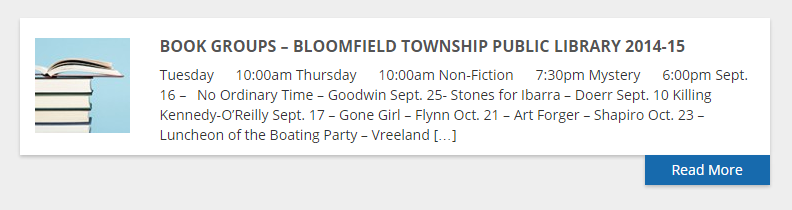
The left column is pulling copy (text) directly from the tops of the associated web pages. While it’s convenient to have this automated process in place, many of those boxes contain information that could be more engaging. If you’re going to keep this in place, you will want to rework the copy on your individual pages with an eye toward creating the beginnings of each page so that it also works as a promotion or advertisement for each program.
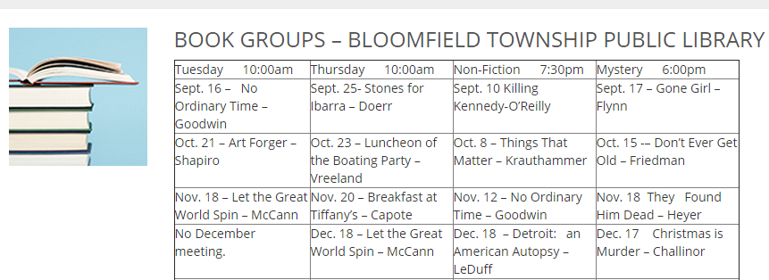
For instance, this one is confusing to read because it has nothing but dates pulled from a table.
It would be simple enough to include an introductory paragraph on the top of this page that compelled book lovers to want to read more and find out about the groups.
Since each of your pages could potentially end up featured on the home page at one point or another, I recommend taking a look at each to ensure that the bits of copy pulled would be enticing enough to get a visitor to click through from the home page snippet to the page with full detail.
In a similar fashion, the “Upcoming Programs” block might serve you better if you removed the dates/times and instead include a compelling sentence describing the program.
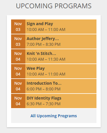
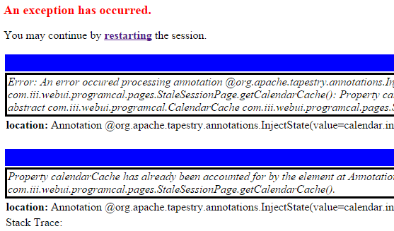
What is “Sign and Play”? Why would I care about this program? Who is it for? Consider using something along the lines of “Children ages birth to 3 years and their caregivers learn sign language through songs, stories, and play activities.” (By the way, I’m getting an error when I try to click on the orange box. A screenshot is below.)
By thinking through who is coming to your home page, what they want and how they interact with the site, you can create more enticing snippets of copy that draw visitors through to your inner pages. Once captivated by all the library has to offer, they are sure to register for the wonderful array of programs available.
Need help getting your site to maximum performance? Karon, Kurt and Justin are available to help through consulting and a variety of services.
Want more information about creating copy for your website without all the typical online hype? Join me for Marcia Yudkin’s No-Hype Copywriting Telesummit this week (Nov. 3 – 7, 2014) LIVE daily at 4:00pm EASTERN time. (I’ll be featured on Friday.)

Great advice in an easy-to-absorb format! Thanks
Thanks Tom! That’s what we strive for around here 😉 If you find the posts valuable, please share with others!