It was a unique experience for a group of web designers and copywriters to review a site about web design and copywriting. Sometimes it’s easier to spot areas of improvement on other’s sites 😉 The recommendations made for Words & Images could easily be applied to many other types of sites as well so read on to see what nuggets you might pick up.
Suggestions from Kurt Scholle, WebsiteSuccessCourse.com
I’ll go easy. We’re in the same business and I’m guilty of some of the things I’d like to see you fix on this site. (My new sites for my company and blog are coming soon!)

My first impression is that the site does not pop. I’d like to see more color and images. My eye was first drawn to your header “Word & Images” and the sub headline defining what the site is about, web content and design. The header needs some color, maybe making Words and Images a royal blue. I thought about making the & red or forest green, but I think it would be best to draw attention to the 2 words that quickly define what the site is about. The sub-headline “Web Content + Website Design by Simon Burt” should be stronger color too, maybe black.
The NAV bar needs a fresh coat of paint. How about the royal blue to match the logo? I like that you have obvious labels on the button, but I wonder if the order is right. It’s a good practice to order the NAV by importance and maybe the current order works for you, but I might think about moving “What I Do” and “Portfolio” in front of “About Me.”
When you use the words me or I, I think it positions you as a one-man band, and maybe you are. Simply using “About” or “About Us” or “What We Do” or “Services” is much less limiting.
Here’s an even better idea. Your NAV should reference your 2 primary services, so I would replace “What I Do” with “Web Content” and “Website Design” so that wherever anyone is on your site, they can access your primary services. This is especially important for people who land on your site somewhere other than your Home page.
Make space on the NAV bar by deleting the Testimonials page. We know from server logs that testimonial pages are not visited very often. But testimonials are powerful influencers! So put them next to content throughout the site, just as you have on the Home page. Try and get a headshot (pro or casual) of the testimonial giver. Helps it stand out and increases authenticity. Video is even better, but not always available.
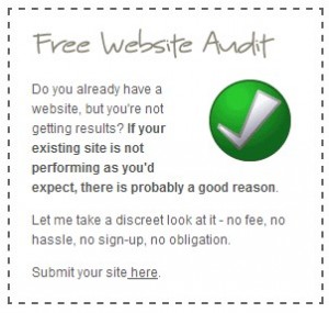
I like having “Website Audits” in your NAV bar because I think you’re using it to engage prospects. I think having the graphical Call To Action (CTA) in prime space above the fold. But the content is too difficult to read and absorb, in part because the font is gray. (The bolded text comes through at the expense of the others.) I think you would benefit from having BENEFITS of your audit in the box, which is nice sized. Something like…
Free Website Audit
Find out why your website isn’t more successful!
• Usability
• Content
• Calls To Action (CTA)
• Technical Troubles
• Searchability
Click here to get started!
I’m sometimes in favor of slider images like you have at the top of your content section, but other experts are discontinuing their use. A video seems to be a more favored form of content that attracts attention. The problem I have with the one you’re using is that you’re using 7 slides when 3 to 5 is plenty. The hold time for each slide is 5 seconds and that may be too long. Most people make a value judgment of a website in 5-8 seconds, barely enough time to see one or 2 of your 7 slides. Don’t forget that each slide increases the load time for the page, which Google may penalize you for. That may be why many people have stopped using them.
I get that some of the slides are screenshots of sites that you’ve built, but you really can’t read some of the content or appreciate some of the images, which I find frustrating. I like the benefit headlines you use at the bottom of the slides, such as having your site display perfectly on all devices, get more traffic and building an online store. I would put the headlines at the top of the image, make them bolder and use simple images and a few words to support your offers. Each slide should link to a page for more specific information.
The rest of the page content can be enhanced with some graphics for each paragraph and less text overall. Maybe cut back to just 2 paragraphs, one for design and one for content?
I look forward to watching your progress, Simon!
Comments from Justin Deaville, Receptional Digital Marketing Agency
Hmm. Karon asked me to review a site that’s run by a web designer and copywriter?
Where to begin? What will I say? What could I possibly add to his expertise?
Well, let’s start with the good stuff. What’s working?
Here are a few thoughts:
– The site has a lovely clean white design.
– There’s clear navigation to the site’s key pages.
– The contact details are obvious – the telephone number stands out
– There is a giveaway on the home page – a free site audit that, no doubt, helps generate prospects details
– There are plenty of testimonials from satisfied customers.
Which is all fantastic.
In fact, there’s so much good stuff going on that changing the copy and layout is unlikely to give us any big wins SEO-wise. Those lie elsewhere.
Let’s take a step back and think about how Google ranks sites in its results pages. There are really two major factors at work: what you say about yourself (on-page factors) and what others say about you (off-page factors).
In Simon’s case, his site speaks eloquently. On-page changes are unlikely to make a big difference to the site’s ability to jump up the rankings and attract more traffic. So, there’s very little we would change.
As I say, the opportunity lies elsewhere, in link building – attracting links from other sites.
We know that Google wants to send traffic to authoritative sites. The search engine measures a website’s authority by assessing the quality and quantity of the links it has attracted from other sites.
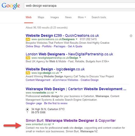
We can see from a search on Google – for ‘web design wairarapa’ that Simon’s site ranks well. It is listed in second place in the organic listings (beneath the Ads).

As a result, the site is likely to be attracting relevant traffic.
Yet, if we were able to rank one place higher – in first position – it’s likely that the site would be generating 2-3 times as much traffic for this keyword.
The quickest way of moving from 2nd to 1st position is to attract more links from other sites.
There are a number of tactics available for attracting links.
I’d always start with quick wins. So, if you belong to any industry bodies or the local chamber of commerce, ask them to link to you. If you have suppliers, encourage them to link to you. If you have clients that would be willing to provide a testimonial, ask them to link to you.
You get the idea. All those offline relationships you cultivate so carefully – make sure they’re replicated online. We want to demonstrate to Google that you are a valued member of your community.
There are many more tactics you might consider:
– Blogging: as a copywriter you could showcase your skills by creating and promoting good quality blog content on your own site. Canadian-based copywriter Nick Usborne runs a number of blogs, including this coffee site, to showcase his abilities.
– Guest posts: Guest posts on external sites can be a great way of building links and profile. Offer to write for industry sites in return for a link back to your site.
– How-to guides (PDFs): One of the best ways of adding subscribers to your email list is to publish PDF guides, which prospective customers can download. Receptional has published a variety of PDFs, both on our own site and for clients. You can see an example here: “A printer’s guide to logo design” If you were able to create a simple PDF for your audience, it would be a good way of attracting relevant traffic (and links).
– Infographics and videos: It’s often possible to repurpose content ideas in different ways. For example, you might turn a blog post into an infographic, or video. You could offer to publish these on another site – along with a link back to your original post. You can click here to see an example of an infographic we created for Paddy Power.
I hope those ideas are useful. I’m sure, with a few more links, you’ll be able to improve your rankings and attract more traffic.
Suggestions from Me!
I must say it takes some guts to put your web design/copywriting site out there for other web designers/copywriters to critique. All of us have things we can do better on our sites so, like Kurt and Justin, I’ll begin by saying that I am sometimes guilty of doing more for my clients than I do for my own business. (The saying “the cobbler’s children have no shoes” comes to mind.)
While design is extremely personalized and everyone has different taste, I’ll begin by saying that – to me – the black and white is a bit too minimalistic. While I don’t care for sites that seem to incorporate every new bell and whistle, I would be more impressed by a web design site that showed some good use of color schemes, use of graphics or other techniques. Since my forte is copywriting, I’ll devote the rest of my comments to that area of your home page.
If I simply scan the sub-heads on your page I don’t get very much unique information.
![]()
So will every other web design company online. This comes across to me like a statement of the obvious: a feature, if you will. But no benefit is associated with it. You mention that most people get a pretty site, but not one that delivers.
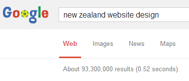
How will your design projects deliver? What does this entail? Why will a site designed by you work (deliver) better than a site designed by any of the 93,300,000 sites that come up when I search Google for “New Zealand website design?”

![]()
This is actually a bit of a mis-statement. It takes no effort to get your website “found” by Google. The Googlebot visits/finds practically every website automatically once changes are made. I think what you mean to say is that your design work will help others find your website on Google.
Two of the copywriting practices I preach most is differentiation and proof of performance. If everybody else can make the claims you’re making (or very close to it) you need another way to set yourself apart.
One of my favorite ways to do that if with proof of performance. Said another way, let others sing your praises and do it in full detail. You had this testimonial on your site which lets me know you understand how to do this. You’re doing it for your clients so I’d put those same practices in place for yourself.
“His 5-star work is imaginative, creative, and quickly establishes a ‘point of difference’ over other websites in the same industry. Add to this his ability to get the job on time – at its original quoted price – and you have a winner!”
I think, once you give more specifics about how you’re better than others in your area and how your clients will benefit from that expertise you’ll could see more leads coming from your site.
Need help making your site reach maximum performance? Karon, Kurt and Justin are available to help through consulting and a variety of services.


