 Once a month, I pull a web page out of a virtual pot of entries (from my Marketing Words Newsletter subscribers) and that page gets a complimentary review from my panel of web marketing experts. The advice given helps the site owners improve rankings, conversions and sales.
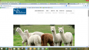
This month’s feature is the home page of a bedding manufacturer. Follow along and see if your site is making these same mistakes (and how to fix them).
From Kurt Scholle, WebsiteSuccessCourse.com
What I like about this site are the large pictures and the simplicity. That may also contribute with what is wrong with the site.
First: I think you should make it more apparent what the site is about. I thought you were selling Alpacas at first.
I would like to see the “Kelly & Windsor – Australia’s Premium Alpaca Bedding Company” positioning statement moved higher on the page. That will help people better understand what the site is about. Consider putting it tight under the header.
Second: I’m all for white space and less clutter on websites, but the gap between the header and the slider is way too tall. It’s valuable real estate that is going unused, but it also pushes to much content down below the fold. I might also try and tighten the gap between the top of the header and the top of the browser.
Third: The slider height is acceptable, but I might reduce it to bring more content up from below the fold. I think the picture of the Alpacas needs some context. You don’t sell them, but you should add some text to the slide that mentions the benefit of using them to make bedding.
The picture of the 3 products does nothing for the visitor. You might bunch them together with a bullet list of benefits or features of your products.
For the picture of the woman in bed, why not tell us what she is thinking about her bed linens? Great opportunity to place a testimonial!
Your slider would accomplish 3 goals: tell people why Alpaca products are superior, why your product is better and deliver social proof from ‘the lady in bed.’
I think you should reduce the transition time between slides. Currently, it’s about a 10 second hold. Visitors will be exposed to more of those messages if you set the intervals to 5-6 seconds. Visitors make a value judgment of a website in 6-8 seconds, so some of them will evaluate your site seeing only one slide.
Fourth: Using the 3 paths, Products, News and About helps get people to navigate your website, but you can make them more compelling with additional words that will appeal to your target customers on an emotional level.
For the Our Products page, I’d replace Shop Now (which is your goal) with something that references Luxury or Comfort. Something like “Feel the Luxury of Kelly & Windsor Bedding” or “Kelly & Windsor – Your Most Comfortable Night’s Sleep.”
The Featured Products are right-sized, but I think you should use more text to promote quality or comfort; For Alpaca Bamboo 600, something additional like “Luxuriously soft with a warm snuggle” will get more clicks.
For Alpaca OptiFill Pillows, add something like, “Warmth, Softness & Comfort.”
It will be interesting to see how you incorporate any of the recommendations you make as a result of this review. I wish you nothing but the best!
From Justin Deville, Receptional.com
You already know that including keywords on your website is the first step towards ranking well in Google’s results.
That much is clear from the title of your page, which is:
<title>Home – Kelly and Windsor – Australia’s Premium Alpaca Quilts – Bedding</title>
The title contains relevant keywords, which is great. But my feeling is that we can improve on your keyword targeting.
For example, there’s no need to include Home in your title. It doesn’t tell Google anything useful about the content of the page. But, before we delve into the detail, let’s go back to basics.
You probably know that the title tag is one of the most important factors for ranking well in the search engines results: it tells Google what your page is about. You can see your page’s title tag in Google’s listings, it looks like this:

Your computer’s web browser may show the page title, too. Here, you can see how the page title appears on my computer:

Some Don’ts and Do’s
Let’s work through some do’s and don’ts for including a title on your webpage. First, think of it, not as a title, but a headline! The text will appear in the search results, so you should write a title that encourages readers to click through to your site. There’s little point in getting listed if you don’t get clicks.
Your prospects are scanning the results quickly – to find a match for their keyword. So make sure your offer is direct and straight to the point!
When creating your title, focus on a primary and a secondary keyword for your page.
Put your primary keyword at the beginning. And your secondary keyword at the end, but in a different way. Here is an example that would apply to one of my clients, the online gift retailer, Presents for Men.
Presents for Men | Gifts for Men
If your titles are longer than 8-10 words then scanning becomes more difficult and your page may be overlooked.
Google recently redesigned its pages listings. It used to be the case that it was possible to fit 69 characters into the title. That’s no longer the case.
Nowadays, Google cuts off the title when it runs out of space on the page, which is usually around 57 characters.
But, as some characters take up more space than others, it’s best to check to see how the listing appears once its published. If you’re using lots of CAPITALS, or wide letters, it’s worth cutting back on the number of characters you include.
As a rule of thumb aim for 6-8 words and no more than 57 characters. Any longer and it’s possible Google will simply chop off the end – as we see in this listing for NCS Cleaning Supplies. Google has replaced some of the keywords with …

Rewriting your Title
So, how can we improve on your existing title tag? We’ll start by using a keyword research tool, such as Google’s Keyword Planner (you must have an AdWords account to use this) to look for keyword ideas. Let’s have a look at alpaca-related terms.
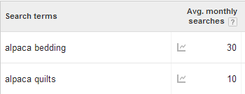
We’ve researched the keywords you mention in your headline. Google tells us that there aren’t many searches each month: 30 for Alpaca bedding and 10 for Alpaca quilts. If you were to rank in first position for both of those terms your site might attract 20 visits per month (ie, half of the available traffic):

There’s no doubt that those keywords are important, but it’s important to target high traffic keywords on your home page. You may be targeting a niche that’s too narrow.
It might be worth mixing up your keywords, so that you also target a more popular term such as ‘designer bedding’ (4,400 searches/month); or ‘luxury bedding’ (14,400 searches/month). Your title tag might then read:
Alpaca quilts and bedding | Luxury bedding | Kelly and Windsor
Next steps
I hope that’s helpful. I’m aware that there’s lots more you can do to improve the page, but I thought it would be useful to look at the title in detail, as it’s so important to your site’s SEO efforts.
Justin Deaville is Managing Director at UK-based digital marketing agency Receptional and was previously chief executive officer (CEO) at Wordtracker.com.
From Karon Thackston (Me!) www.MarketingWords.com
I like the clean design and the easy-to-find navigation. But after visiting your home page, I’m left with more questions than answers. The “Shopping Bag” box in the upper right corner leads me to believe this is an ecommerce site, but the home page isn’t set up like a typical ecommerce site would be.
With news, about us and other information closer to the top and featured products way at the bottom, I wondered what the primary purpose of your home page was. There is very little to go on based on this page and a clearer roadmap would be beneficial to your visitors.
Here are a few things I would recommend testing.
1. Remove the rotating banner. These are notorious for causing declines in conversions. They take up a huge chunk of your most valuable above-the-fold real estate and offer no usable information. Yours has no banner text, no visible controls and isn’t clickable. This space could be used for bigger gains by having pointers to whatever your primary goal is (selling products, lining up distributors/wholesalers, etc.).
2. Create a more descriptive tagline. While I did see a tagline under your logo, it could be more defined. As it is, I’m only able to tell that you have something to do with Alpaca bedding and you’re in Australia.
Kelly & Windsor – Australia’s Premium Alpaca Bedding Company
I’d rather see a tag line that speaks TO your customers instead of ABOUT your company. Some popular ones include:
Melts in your mouth, not in your hands. M&Ms Candies
When it absolutely, positively has to be there overnight. Federal Express Corporation
The Nighttime, Sniffling, Sneezing, Coughing, Aching, Stuffy Head, Fever, So-You-Can-Rest Medicine. Nyquil Cold Medicine
You might choose something like:
For a Night to Remember
Warmth without Weight (from your alpaca fleece page)
MicroCombed for Ultra-Softness (from your alpaca fleece page)
Weightless Warmth, Luxurious Softness
3. Focus on your most-important goals. Are you strictly an ecommerce site? Are you looking to private label products for other retailers? Who you’re selling to and what you hope to accomplish will determine what goes on your home page.
4. Add copy. As it is, there is virtually no copy on the home page. Words (whether written or spoken via a video) are how we communicate with site visitors. Words bring clarity, provide information and persuade customers to take action. In addition, copy plays a large role in gaining good search engine positioning.
5. Clean up the white space. While a little space is needed to prevent the page from seeming too crowded, there is far too much white space between the top navigation and the rotating banner.
I think you have a good start, but need focus, clarity and direction so that your home page can perform at its best for you.
Karon Thackston is a Certified Landing Page Specialist. Looking for website pages that rank well and convert even better? Contact Karon today for business landing page copywriting or copywriting consulting and start getting results.


Thanks for taking the time to do these reviews! I love them and find them extremely valuable.
I’m so glad, Susan! We like doing them. It’s a great way to share with others and to learn some new things for myself, too 🙂
Thanks Karon and the team for your very helpful comments on my site – priceless.
Setting up and running a web site is a real learning experience and any help along the way is greatly appreciated.
You are most welcome, Trevor! Come back and post again when you get some changes made. We’d love to see what you do!