 These days nutritional supplements are a dime a dozen. It seems every company has their own brand of a variety of products. What makes one different/better than the other has to be communicated clearly through design and copy in order to convert visitors into buyers. That’s what the panel focused on when giving advice to one Swiss supplement manufacturer.
Would you like a page from your site reviewed? As a subscriber to my monthly Marketing Words Newsletter, you can submit one page of your site into our monthly drawing. (Just reply to the newsletter with the exact URL you want.) If you are selected the team will provide detailed feedback and suggestions to help improve your conversions, SEO and design. See what the panel of experts had to say about this site that sells colostrum supplements.
Comments from Justin Deaville, Receptional Digital Marketing Agency
A few months ago, my wife gave birth to a gorgeous baby. Madeleine is now three months old and – I know I’m biased – she has the most beautiful smile I’ve ever seen.
Her arrival has also been great preparation for this site review. Until three months ago, I would have had no idea what colostrum is, or why it’s needed.
If you’re in the same boat, dear reader, you’ll want to know that colostrum is in mother’s milk. Specifically the milk that is produced in the first few days after the baby is born when the ‘milk’ is more nutritious and intensely life-giving than at any other time.
Enough preamble. Let’s start our review of the swissbiocolostrum.com site.
When I arrived at the home page, I was greeted by a page in a foreign language. Which I assume is German (and I’m sure someone will correct me if it’s not), but is of little help to a language dunce like me.
Clearly, if you’re working internationally, it’s crucial that your audience sees a version of your site that’s tailored to their needs – in terms of local content and language. I won’t go into the technical detail of how to let Google know which pages it should be presenting – just know that it’s very possible, and you’ll find more background on international SEO here.
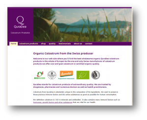
Let’s assume that I’ve navigated to the English language version of the website. We’re going to look at the page section by section. Here’s the top of the page – the most important area for engaging new visitors. I would recommend using this area to highlight the benefits of your products. Yet, what does it say about the products and services you offer? I’d suggest: very little.
There are many ways in which colostrum is beneficial. And there are many reasons why we’d want to buy colostrum – after all, it helps and benefits our babies. And what could be more precious and perfect than a baby? There are loads of emotional triggers that we can use to engage our readers. But, we’re not taking advantage of them. In short, this area of the page is a missed opportunity:

One of the website’s objectives should be to generate new business enquiries. While the home page looks good, I feel more could be done to encourage visitors to get in touch, or to send them to a page where they can buy online. There is no obvious call to action and no contact details.
I would want to test:
- Whether making contact details more clearly visible increases the site’s response rate. Often visitors will want to use the phone to ask questions.
- Whether showing some of the most popular products would help increase sales.
- Whether adding testimonials to the home page increases the number of enquiries. Reviews from happy customers would inspire confidence.
Looking further down the page, the message is much the same. While there is more information about the product, there is no mention of a benefit until the fourth paragraph.
There is no call to action – apart from a link to a list of ingredients.
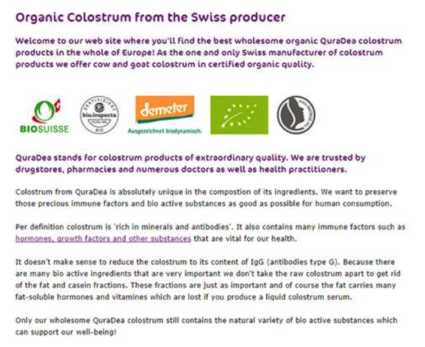
These are important omissions. I would expect the site to have a poor conversion rate – few visitors are likely to be buying its products.
By way of comparison, here is the home page of a client of ours that sells gifts for men. We have spent a lot of time this year testing the site to see if we can improve usability – helping customers find the products they want.
You can see from the image below that:
- The contact details (and search button) feature prominently.
- Some of the site’s most popular products are in prime position – along with a call to action encouraging visitors to click.
- There is a list of reasons why customers should have confidence in the business.
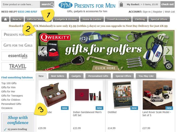
The page contains a lot more information – no pixel is wasted. Every inch of the page is used to engage visitors.
You might take a note or two from sites like these to help improve the user experience and conversions of yours.
Suggestions from Kurt Scholle, WebsiteSuccessCourse.com
I have a problem with this website on several levels. But we can help you develop a site that is more engaging and profitable!
For starters, I’m not sure what the JOB of the website is. Sell online? Build the brand and support local sales? Develop the distribution channel?
On our last review I suggested the importance of using the Key Performance Indicators of Google Analytics to help determine where your website is winning and losing. Overall KPIs are great, but the real value is in zeroing in individual pages that are influencing overall results, especially the under performers.
I think the Home page would fail on many levels and I’ve gotten pretty good at guessing overall KPIs for sites. With SwissBioColostrum, I’d say that…
- people are spending less than a minute and 45 seconds on the site (1:45) and you’d want them to be on for 2:30 or longer. 50-100% more time will result in higher sales.
- the Bounce Rate is exceptionally high; at least 80%. Bounce Rate is the percentage of site traffic that visits one page of your site and doesn’t click to another page. Bounce Rate should be 50% or less and sometimes you shoot for 30-40%. If the Bounce Rate is high, your visitors are not resonating with your content, so fix it.
- the average number of pages visited is low, probably less than 2 pages per visit and maybe closer to 1.5 pages per visit. Three+ is your goal. You want them to hit your Home or landing pages, check a few product pages and ultimately the shopping cart.
All 3 of those metrics are related. Visiting fewer pages means you spend less duration on the site, which shows up as a high bounce rate. When people don’t resonate with the site, they don’t visit other pages on the site and therefore don’t send much time on it.
See if you can see which pages visitors look at before they buy. You’ll need to set up goals to do that, then work on the parts that interfere with a sale. (Super important!)
My first impression of the site is the picture in the header. It means absolutely nothing to me. Something about some grass, a rock, a lake, some trees and mountains. It’s fuzzy. It’s not colorful. If you love the picture, then I might suggest adding positioning statement text over it. But I think it would be better to use images of smiling healthy people who represent your target market and possibly an image of product packaging.
The logo is nice, but I think you’d benefit from saying more than “Colostrum Produkte.” That’s certainly to the point, but even adding “Swiss” would make it more meaningful. “Swiss Colostrum Produkte.
I think you would benefit from adding a positioning statement or slogan at the top of the page (and every page.)
“Wholesome Organic Colostrum Products from the #1 Swiss Manufacturer!”
Or something similar. Karon can help you with that.
The slogan would allow you to eliminate the first paragraph, which serves no purpose whatsoever. Do not say “Welcome to my website.” You have just 5-8 seconds for them to decide if your site is of interest. Spend your online resources telling them what you offer and the benefits of buying from you.
I think we’ve begun lowering the Bounce Rate for Home page. But wait, there’s more!
I’d change the second paragraph to:
“Colostrum products of extraordinary quality and trusted by leading drugstores, pharmacies, doctors and health practitioners.”
I would put that second paragraph below 3-4 graphical “paths.” The Home page is often used as a table of contents and this site desperately needs images.
You’ll have to decide what your primary targets are and then use the paths to show them that they are in the right place and help them know where to click next without having to think about it too much. Graphical paths do that very well.
The Bounce Rate just dropped a bit more and we are about to see more pages visited, which will result in more time being spent on the site. All of this will ultimately lead to higher conversions.
Your paths might be Products, Quality and About, where people can access your products quickly, you talk about the quality of QuraDea and what sets it apart and then more about the company and its advantages.
Maybe rather than About, the third path goes to a page that supports building more business, such as wholesaling or affiliate sales?
Or maybe you have just two primary paths, Products and Quality?
I think a graphical showing of Featured Products would work well and you might even promote specials or highlight news about your product or company.
Don’t make it too busy. Use white space.
You would benefit from more onsite linking. Every page on your site should link to other pages, especially from the Home page and that’s one of the reasons why paths are so important.
The remaining 4 paragraphs on the Home page are more suited for other pages. Remove them.
The trust icons near to top of the page are important, especially on pages where products are being sold. They benefit the Home page, but I would put them at the bottom of the page, replacing the 4 paragraphs I suggested that you move.
The 3 KPIs mentioned above are improving! But I have three other ideas that will improve traffic and conversion, which are my top keys to website success.
- Consider adding a blog to help attract people that your products would help. You don’t need a lot of content to attract people especially when you focus on case studies that are optimized for keywords people would use looking for your products. Each post should have a specific Call To Action (CTA), either at the end of the post or in a graphical CTA above the fold. Or both.
- One of the best marketing tactics is to build email lists. You might benefit from offering a healthy living newsletter to your general audience and something more specific to people who have bought your products. Make it go viral! Encourage sharing of your content and consider running contests for people who are on your lists, which will help build them.
- Finally, delete the Testimonials page and distribute them to other pages of your site to support product sales or even the value of being on your email list. We know from server logs that most people do not visit testimonial pages, but testimonials are powerful influencers and should be used often.
Once you have made changes based on our recommendations, I would love to see how it affects your Google Analytics, if you don’t mind sharing. I think you’ll see some improvements across the board.
I think you have some great opportunities to build an engaged community of avid buyers! I’ll be watching! Good luck.
Suggestions from Me! MarketingWords.com
Wow! With so many awesome suggestions, I’m not sure there is much left for me to say. I agree with Justin about making the necessary changes to allow Google to serve your English version to English-speaking visitors, French version to French visitors, etc. In the meantime, however, you could at least make the links to those versions more visible. I had to scroll carefully through the page to find where to click to get my preferred language.

Near that link, I also saw a place to click for your newsletter. However, I was not taken to a newsletter page, but rather to your online store. Confusing! On the store page, I did see (in small print in the sidebar) another link to your newsletter. Clicking it brought me to this message:
 Not very enticing. I’d rather hear about all the uses of colostrum I’ll be told about, the benefits of using it or how it’s helpful for people and pets.
 SIDEBAR: True Story
I had a Lhasa Apso named Savannah for 15 years. At about age 2 she began to have horrible allergies. After many vet visits, lots of cortisone and other meds, and ultimately a trip to the doggie allergist, I found out about colostrum and its powerful part in developing a good immune system.
I began giving Savannah colostrum every day and – after 11 months – she was allergy free and never needed another shot again.
These types of stories about people and pets who have used colostrum and it has made a significant difference in their lives should be featured in your newsletter. The option to subscribe should be plainly available on your Home page and it should use a form that is enticing and easy to find.
I, personally, use Aweber and love how easy they make it to create beautiful forms that integrate flawlessly with your site design.
Is this Native English?
As I read the site, the verbiage chosen was a little awkward sounding. Yes, it was English, but it sounded like English that had been translated by someone who was not a native English-speaking person. For instance:

Organic Colostrum from the Swiss producer could be better stated to make your point as “Organic Colostrum from the Only Swiss Producer.” ‘The best wholesome organic QuraDea colostrum products in the whole of Europe” is another strange phrase. I’d likely rewrite that as “Wholesome, organic colostrum products from QuraDea are considered by many to be the best in all of Europe.”
Going one step further… why should someone in the U.S., U.K., Australia, Canada or other English-speaking countries think that Swiss-produced colostrum is different or better than what is available in our own countries? We also have organic colostrum where we are. If you’re selling to an International audience (or even if you’re selling to a local audience) you have to be able to answer this question with confidence or visitors will simply click away.
I think the rest of your page attempts to explain this, however, it is written in such an obscure way with phrases like this:
It doesn’t make sense to reduce the
colostrum to its content of IgG (antibodies type G).
… that it is difficult to make out the points you are trying to get across.
You may have an awesome product that is easily worth our attention, confidence and money, but your English copy is failing you in getting that message across.
Ecommerce Platform?
Ask Kurt mentioned in his review, it is difficult to tell whether this is meant to be an ecommerce site or a branding site. The home page does not encourage someone to shop and buy products. If that is your primary goal, I’d recommend a design change.
Justin showed a good example of an ecommerce site. Here are a couple of others that have a good mix of information while offering visitors an immediate opportunity to start shopping.
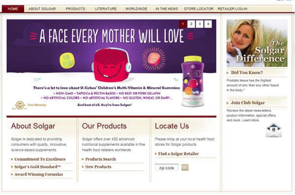
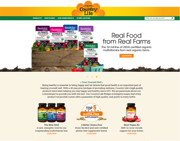
I think, with copy that is clearer and more enticing, your site could do a much better job of attracting and converting English-speaking visitors.
Need help getting your site to maximum performance? Karon, Kurt and Justin are available to help through consulting and a variety of services.
