It takes some guts to submit your website for public critique, so I always extend my sincere thanks to those who offer up their work for my group of pros to pick apart in the name of improvement. We all recognize how hard it is to design & optimize a site that works well and also that everyone has their own opinions.
With that said, each of us took a look at the home page not following any particular criteria. We’ve given our honest feedback on how we believe the site can be improved.
The professionals commenting on this site have not seen what the others have written. Pay close attention to suggestions that are repeated across multiple reviews – that usually indicates a big stumbling block.
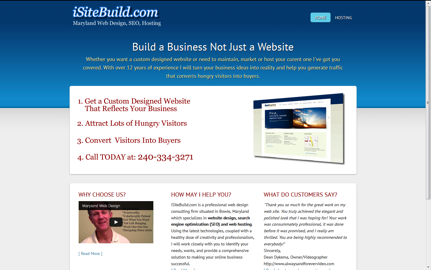
In this web page review, we’re looking at a web design, SEO and hosting company from Maryland (USA) called iSiteBuild.com. Owner Herman Drost operates this one-man show that promises to deliver a turnkey solution for organizations in need of a web presence.
Comments/Suggestions from Jill Whalen:
- Confusing to have no top navigation. I felt like it was just a one page site which makes me leery. I did see more navigation at the bottom, but some may miss it.
- While I think I understand that you’re just trying to convert people, I’ve always found that the more information you can provide people before trying to convert them, the better it will be for everyone. You’ll have less to do on your sales calls because they’ll be more familiar with what you offer, and they’ll have a better sense of who you are.
- You should especially feature a link to the blog much more prominently. That’s where all the information that provides you with credibility is, and right now, most won’t even see it. (Wait, I just noticed that the blog takes one to another site DrostDesigns. What’s up with that? I’d highly recommend making it part of your main site and 301 redirecting that other one over to the main one.)
- Do not rely on SEO for your visitors as Web design / SEO / Hosting is way too saturated of a market to get your visitors that way. Be sure that you’re doing lots of other forms of marketing, particularly local stuff.
Jill Whalen is an SEO Consultant who’s been helping companies with their website marketing since 1995. Be sure to sign up for Jill’s High Rankings Advisor Newsletter for free and informative SEO advice that’s easy to understand and fun to read!
Comments/Suggestions from Brian Massey, The Conversion Scientist
Brian Massey is the author of the book for website managers called Your Customer Creation Equation: Unexpected Website Formulas of The Conversion Scientist. Get a free chapter and more at http://CustomerCreationEquation.com.
Comments/Suggestions from Justin Deville:
The page design is clear and simple. There’s an obvious structure. And the main sales message fits neatly ‘above the fold’. i.e., I don’t need to scroll down the page to see the key sales points.
The four numbered bullet points give me a clear sense of the service that’s on offer.
That said, there are a number of areas that I reckon could easily be improved.
There are lots of companies offering web hosting and design. So, I’d want this page to answer: what’s the main benefit of using the service? For example, the strap line could do more to explain the benefits of the service.
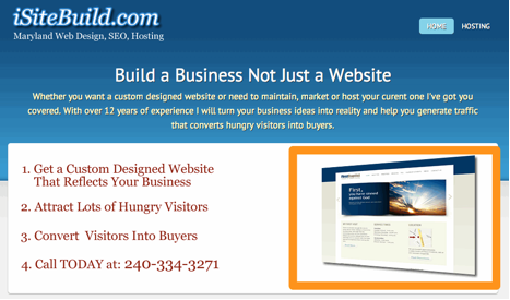
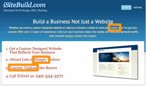
On the home page design, the image that’s used on the right-hand side of the page is illegible. It does nothing to sell the service. I might test a video in that position, showing off examples of websites that iSiteBuild has built. Or, another possibility would be to use a slider to show screenshots.
I’m also unclear what the main objective of the page is. I’d guess that the site owner wants me to call: 240-334-3271. In which case, I’d make that call to action clearer. And I might offer an alternative means of contact for outside office hours. There’s no harm in repeating that number elsewhere on the page.
The site contains testimonials from existing clients, which is great to see. I might also add photos of the customers, as these can improve conversion.
Given that the site offers a web design service, I would expect to see best practice demonstrated. Yet, it fails in some obvious ways. I would usually expect to see the site navigation at the top of the page. Yet, the navigation only appears at the bottom of the page and is inconsistent across the site. There is no clear, standard navigation. Almost every page has a different navigation. As result, it’s difficult to find my way around. Here are three examples of navigation, though there are probably more:


In other words, the site fails a basic usability test which doesn’t inspire me to make a purchase.
The home page shows a lack of attention to detail. There’s a spelling mistake and an unwanted double space. I’d also question whether ‘hungry’ is the best way of describing site visitors. Unless, of course, your site promotes a restaurant!
Justin Deaville is Head of Search at internet marketing consultancy Receptional.com and was previously chief executive officer (CEO) at Wordtracker.com.
Comments/Suggestions from Kurt Scholle, Web Asylum
I like that the header is thin, allowing for more content to show above the fold.
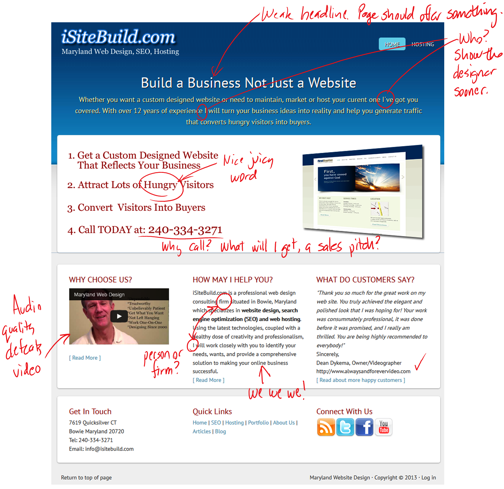
The headline, “Build a Business, Not Just a Website” is OK, but I think it needs to pop more. The verbiage below it is too much to read. I might suggest presenting a tight sub-headline rather than a paragraph.
Bullet points 1-3 make sense. The CTA should not be part of the benefits bullets. Is “Call Today…” the best CTA? Can I email you if its 10pm Sunday? Maybe there should be a lead magnet opt-in, such as an autoresponder sequence or eBook? The email is listed below left on the page, but it’s not clickable.
The graphic is difficult to see or sell why it supports the benefits of the offer.
I’d like to see an animation or video showing off sites that are clickable to case studies supporting the sites shown.
Overall, the design is nothing special.
“How May I Help You” path headline isn’t as strong as something more suggestive, like “Who Wants to Double Their Business?”
Oh, the firm is “situated in Bowie, Maryland?” I live in Chicago, this must not be for me. Maybe that whole paragraph should define the process (bullets?). Scannable content is better here, I think.
Back to the paragraph under the headline; don’t begin with the word “Whether.”
“I’ve got you covered?” Weak. Using “We” instead of I projects that this is a team, not a one-man shop.
“With over 12 years of experience..” is also weak and supports the idea that this firm has limited capabilities.
I might put the social media icons above the fold. It will get you more conversations.
Kurt Scholle is Principal of Web Asylum, a Chicago web design firm.
Comments/Suggestions from me (Karon Thackston from Marketing Words)!
I am actually getting ready to redesign one of my websites. While I already have a web designer, I decided to approach iSiteBuild.com as if I were in search of design services.
The copy and headline in the opening paragraph left me with a couple of thoughts.

I already have a business. I’m looking for a redesign, not a first-time design, so right off the bat I felt like this wasn’t for me. There are a lot of “I’s” in the copy: “I’ve” got you covered… “I” will turn your business ideas… (And “curent” is misspelled.) It seems to be more about you than about me, the customer.
The copy is very broad and general. Nothing specific is promised. I don’t see that you have a unique competitive advantage (UCA) that clearly lets me know why I should use you instead of others.
Nothing in the four bullet points is different than thousands of other web design companies will also tell me. You keep mentioning “hungry visitors” (twice within a 16-word span).
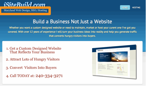
“Maryland Website Design, SEO and Hosting” (top, left corner) makes me think you only work with clients in Maryland. I clicked to the About page and found it was actually your portfolio. I decided to have a look while I was on this page. When I scrolled to the bottom, I found a few bullet points that gave a tiny bit of information about you/the company.
Because everybody is pretty much saying the same things, I need proof of performance. Testimonials from clients, case studies with before-and-after info and/or quantifiable data that shows without question that something improved due to your work. (I see you do have a testimonials page, but most of them are just saying how you completed the work on time, were nice to work with, etc. Every designer has these types of testimonials.)

You have a video, which is good, but the editing is a little strange. It looks like your head keeps jerking to the left every time you start a new sentence. The edits are very obvious. The video isn’t reinforcing your UCA.
The “How May I Help You?” section is confusing. You ask how you may help then proceed to tell me all about you 🙂 You refer to your business as a consulting firm. That makes me think you consult and that you do not actually do design/SEO work. You need to be clear about what you’re offering.
When I click the link for more information, I am taken to a page about submitting your site to the engines and keyword density. You really need to update the old information on your site as it makes you look like you’re using outdated techniques.
The site navigation seems to change location on various pages and also the links that are included, which makes it hard for me to find my way around. Many times there is no “Home” link.
They keywords you’ve selected for the Home page are very broad (unless you’re strictly going local which I wasn’t able to determine). The copy isn’t really optimized for these terms, they are just scattered around a bit.
Looking for conversion, copywriting or SEO help for your site? Contact Karon at Marketing Words today.
If you found this post valuable, others might, too. Please share (below) on your favorite social media sites. Thanks!


Wow…thanks for the all the feedback. It truly shows the value of getting an objective review and will be implementing the suggestions you all made. Thanks Karen for this service…I’m glad I found you.
Karon,
Is this exercise of reviewing sites an ongoing function? I wouldn’t mind a review by your experts but before I formally commit to such a a roasting, I would like the opportunity to first explain how my site got to the point it is presently at. I am 71 years young and therefore I wasn’t brought up in the computer era. There is a relevant story behind the website design that will explain the rationale of certain of the site’s characteristics. Mainly that concerns the fact that I have had to do everything myself, which in turn meant a lot of research on how to do basic things, how to extricate oneself from the many dry gullies I found myself in while still keeping a focus on both the big picture and the small details.
If I can submit a bit of background first to set the stage, I wouldn’t mind being a guinea pig.
sincerely,
Graham
Herman, you are most welcome! Glad you found some action steps you can take.
Graham, we review 1 web page (not the entire site) about once a month and reviews are open to subscribers of my Marketing Words Newsletter. (I think you already subscribe.) I sent out a notice a week or so ago via the newsletter on how to apply. We’ve got a good number lined up for future issues, but if you want to add your page for consideration, reply to today’s issue of the newsletter (it should be in your inbox by now) and give me the URL for 1 of your pages. Thanks!
I learned a lot from this and I was one of the reviewers! Somewhat gratified that the other reviews saw some of the same things I did. Somewhat ashamed that I missed some of the things the others found.
I’m a stickler for spelling and I missed “curent?” I’m going to have to tear up my AnalRetentiveGerman membershipo card.
Hats off to you Karon! This is a great process to go through and everybody learns more about making their website better! I look forward to more comments.
Love having you on board, Kurt. Really respect your opinion 🙂
I’m so glad I read this. This is so informative that I learned a lot from this. Thanks for sharing this with all of us! 🙂
I am so glad you learned from it. We’ll do these about once a month so look for new ones in the future. If you subscribe to the Marketing Words Newsletter, you’ll get notification of when they are posted.